js-cloudimg-responsive
Advanced tools
js-cloudimg-responsive - npm Package Compare versions
Comparing version 1.0.0 to 1.0.1
@@ -85,3 +85,6 @@ 'use strict'; | ||
| return width; | ||
| var letPadding = width && parentNode && parseInt(window.getComputedStyle(parentNode).paddingLeft); | ||
| var rightPadding = parseInt(window.getComputedStyle(parentNode).paddingRight); | ||
| return width + (width ? -letPadding - rightPadding : 0); | ||
| }; | ||
@@ -177,3 +180,6 @@ | ||
| var getSizeLimit = function getSizeLimit(currentSize) { | ||
| return currentSize <= 25 ? '25' : currentSize <= 50 ? '50' : currentSize <= 100 ? '100' : currentSize <= 200 ? '200' : currentSize <= 300 ? '300' : currentSize <= 400 ? '400' : currentSize <= 500 ? '500' : currentSize <= 600 ? '600' : currentSize <= 700 ? '700' : currentSize <= 800 ? '800' : currentSize <= 900 ? '900' : currentSize <= 1000 ? '1000' : currentSize <= 1100 ? '1100' : currentSize <= 1200 ? '1200' : currentSize <= 1300 ? '1300' : currentSize <= 1400 ? '1400' : currentSize <= 1500 ? '1500' : currentSize <= 1600 ? '1600' : currentSize <= 1700 ? '1700' : currentSize <= 1800 ? '1800' : currentSize <= 1900 ? '1900' : currentSize <= 2400 ? '2400' : currentSize <= 2800 ? '2800' : '3600'; | ||
| if (currentSize <= 25) return '25'; | ||
| if (currentSize <= 50) return '50'; | ||
| return (Math.ceil(currentSize / 100) * 100).toString(); | ||
| }; | ||
@@ -180,0 +186,0 @@ |
| { | ||
| "name": "js-cloudimg-responsive", | ||
| "version": "1.0.0", | ||
| "version": "1.0.1", | ||
| "main": "dist/index.js", | ||
| "description": "Cloudimage responsive plugin will make your website load the exact image size you need depending on your user's screen size. Multiple pixel ratios are supported.", | ||
| "description": "Cloudimage Responsive will smartly resize, compress and accelerate images across the World in your site for all devices. The plugin supports lazy loading technique with fancy animation on image load.", | ||
| "author": "scaleflex", | ||
@@ -46,3 +46,3 @@ "license": "MIT", | ||
| "dependencies": { | ||
| "throttle-debounce": "^2.0.1" | ||
| "throttle-debounce": "^2.1.0" | ||
| }, | ||
@@ -58,14 +58,14 @@ "devDependencies": { | ||
| "babel-preset-stage-2": "^6.24.1", | ||
| "bootstrap": "=3.3.7", | ||
| "css-loader": "^2.0.0", | ||
| "css-loader": "^2.1.1", | ||
| "extract-text-webpack-plugin": "^1.0.1", | ||
| "gh-pages": "^2.0.1", | ||
| "highlight.js": "^9.15.6", | ||
| "html-webpack-plugin": "^3.2.0", | ||
| "mini-css-extract-plugin": "^0.5.0", | ||
| "style-loader": "^0.23.1", | ||
| "webpack": "^4.28.4", | ||
| "webpack-cli": "^3.2.1", | ||
| "webpack-dev-server": "^3.1.14", | ||
| "webpack": "^4.29.6", | ||
| "webpack-cli": "^3.3.0", | ||
| "webpack-dev-server": "^3.2.1", | ||
| "webpack-stream": "^3.1.0" | ||
| } | ||
| } |
243
README.md
@@ -1,2 +0,2 @@ | ||
| [](https://github.com/scaleflex/js-cloudimage-responsive/releases) | ||
| [](https://github.com/scaleflex/js-cloudimage-responsive/releases) | ||
| [](https://www.cloudimage.io/en/home#b38181a6-b9c8-4015-9742-7b1a1ad382d5) | ||
@@ -13,3 +13,3 @@ [](#contributing) | ||
| alt="The Lounge" | ||
| src="https://scaleflex.airstore.io/filerobot/filerobot-cloudimage.png?sanitize=true"> | ||
| src="https://demo.cloudimg.io/height/350/n/https://scaleflex.airstore.io/filerobot/filerobot-cloudimage.png?sanitize=true"> | ||
| </p> | ||
@@ -31,14 +31,11 @@ | ||
| The plugin detects the width of image's container and pixel ratio | ||
| density of your device to load the exact image size you need. | ||
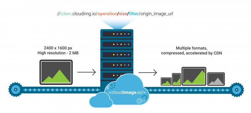
| It process images via Cloudimage.io service which offers comprehensive | ||
| automated image optimization solutions. | ||
| This plugin detects the width of any image container as well as the device pixel ratio | ||
| density to load the optimal image size needed. | ||
| Images are resized on-the-fly via the <a href="https://cloudimage.io" target="_blank">Cloudimage service</a>, thus offering a comprehensive | ||
| automated image optimization service. | ||
| When an image is first loaded on your website or mobile app, | ||
| Cloudimage's resizing servers will download your origin image from | ||
| your origin server, resize it and deliver to your user via rocket fast | ||
| Content Delivery Networks (CDNs). Once the image is resized | ||
| in the format of your choice, Cloudimage will push it to a Content | ||
| Delivery Network, which will in turn deliver it rocket fast to | ||
| your visitors, responsively across various screen sizes. | ||
| Cloudimage's resizing servers will download the origin image from | ||
| the source, resize it for the client's screen size and deliver to your users through one or multiple | ||
| Content Delivery Networks (CDNs). The generated image formats are cached in the CDN and will be delivered rocket fast on any subsequent request. | ||
@@ -51,3 +48,7 @@ **NOTE:** Your original (master) images should be stored on a server | ||
|  | ||
| <p align="center"> | ||
| <img | ||
| alt="The Lounge" | ||
| src="https://demo.cloudimg.io/width/1400/n/https://demo.cloudimg.io/width/800/none/sample.li/Cloudimage_diagram.jpeg?sanitize=true"> | ||
| </p> | ||
@@ -60,8 +61,9 @@ powered by [Cloudimage](https://www.cloudimage.io/) | ||
| * [Demo](#demo) | ||
| * [Installation](#installation) | ||
| * [Simple Usage](#quick_start) | ||
| * [Requirements](#requirements) | ||
| * [Step 1: Installation](#installation) | ||
| * [Step 2: Initialize](#initialize) | ||
| * [Step 3: Implement](#implement) | ||
| * [Configuration](#configuration) | ||
| * [Image properties](#image_properties) | ||
| * [Lazy Loading](#lazy_loading) | ||
| * [Lazy loading](#lazy_loading) | ||
| * [Browser support](#browser_support) | ||
@@ -82,9 +84,18 @@ * [Filerobot UI Family](#ui_family) | ||
| ## <a name="installation"></a> Installation | ||
| ## <a name="requirements"/> Requirements | ||
| To use the Cloudimage Responsive plugin, you will need a | ||
| Cloudimage token to deliver your images over CDN. Don't worry, it only takes seconds to get one by | ||
| registering [here](https://www.cloudimage.io/en/register_page). | ||
| Once your token is created, you can configure it as described below. | ||
| This token allows you to use 25GB of image cache and 25GB of worldwide | ||
| CDN traffic per month for free. | ||
| ## <a name="installation"></a>Step 1: Installation | ||
| Add script tag with link to js-cloudimage-responsive | ||
| ```javascript | ||
| <script src="https://scaleflex.airstore.io/filerobot/js-cloudimage-responsive/v1.0.1.min.js"></script> | ||
| ``` | ||
| <script src="https://scaleflex.airstore.io/filerobot/js-cloudimage-responsive/v1.0.0.min.js"></script> | ||
| ``` | ||
@@ -97,5 +108,7 @@ or using npm | ||
| ## <a name="quick_start"></a> Simple Usage | ||
| ## <a name="initialize"></a>Step 2: Initialize | ||
| ``` | ||
| After adding the js-cloudimage-responsive lib, simply iniatialize it with your **token** and the **baseUrl** of your image storage: | ||
| ```javascript | ||
| <script> | ||
@@ -111,3 +124,3 @@ const ciResponsive = new window.CIResponsive({ | ||
| or in new style with npm | ||
| or in new style with npm: | ||
@@ -120,3 +133,3 @@ ```javascript | ||
| token: 'demo', | ||
| baseUrl: 'https://cloudimage.public.airstore.io/demo/' | ||
| baseUrl: 'https://cloudimage.public.airstore.io/demo/' # optional | ||
| }); | ||
@@ -127,4 +140,6 @@ | ||
| and just use the `ci-src` instead of the `src` attribute in image tag. | ||
| ## <a name="implement"></a>Step 3: Implement in img tag | ||
| Finally, just use the `ci-src` instead of the `src` attribute in image tag: | ||
| ```html | ||
@@ -134,14 +149,4 @@ <img ci-src="magnus-lindvall.jpg" ratio="1.5"/> | ||
| NOTE: "ratio" is recommended to prevent page layout jumping and to | ||
| leverage visibility checking and thus lazy loading. | ||
| NOTE: "ratio" is recommended to prevent page layout jumping. The parameter is used to calculate image height to hold the image position while image is loading. | ||
| ## <a name="requirements"/> Requirements | ||
| To use the Cloudimage Responsive plugin, you will need a | ||
| Cloudimage token. Don't worry, it only takes seconds to get one by | ||
| registering [here](https://www.cloudimage.io/en/register_page). | ||
| Once your token is created, you can configure it as described below. | ||
| This token allows you to use 25GB of image cache and 25GB of worldwide | ||
| CDN traffic per month for free. | ||
| ## <a name="configuration"></a> Config | ||
@@ -156,15 +161,21 @@ | ||
| Cloudimage account to get one. The subscription takes less than a | ||
| minute and is totally free | ||
| minute and is totally free. | ||
| ### lazyLoading | ||
| ### baseUrl | ||
| ###### Type: **Bool** | Default: **true** | _required_ | ||
| ###### Type: **String** | Default: **"/"** | _optional_ | ||
| Only load images close to the viewport | ||
| Your image folder on server, this alows to shorten your origin image URLs. | ||
| ### <a name="lazy_loading_config"></a>lazyLoading | ||
| ###### Type: **Bool** | Default: **false** | _optional_ | ||
| Only images close to the client's viewport will be loaded, hence accelerating the page loading time. If set to **true**, an additional script must be included, see [Lazy loading](#lazy_loading) | ||
| ### imgLoadingAnimation | ||
| ###### Type: **Bool** | Default: **true** | _required_ | ||
| ###### Type: **Bool** | Default: **true** | _optional_ | ||
| Nice effect for preview transition | ||
| Applies a nice interlacing effect for preview transition | ||
@@ -175,7 +186,8 @@ ### filters | ||
| Parameters like fcontrast, fpixelate, fgaussian, backtransparent, | ||
| rotation to apply filters on your image by default | ||
| [see doc](https://docs.cloudimage.io/go/cloudimage-documentation/en/filters/) | ||
| Applies default Cloudimage filters to your image, e.g. fcontrast, fpixelate, fgaussian, backtransparent, | ||
| rotation... Multiple filters can be applied, separated by "```.```" (dot). | ||
| [Full documentaiton here.](https://docs.cloudimage.io/go/cloudimage-documentation/en/filters/) | ||
| ### placeholderBackground | ||
@@ -185,10 +197,4 @@ | ||
| Placeholder background while the image or preview image is loading | ||
| Placeholder colored background while the image is loading | ||
| ### baseUrl | ||
| ###### Type: **String** | Default: **"/"** | _optional_ | ||
| Your image folder on server. | ||
| ### presets | ||
@@ -201,17 +207,28 @@ | ||
| ```javascript | ||
| { | ||
| xs: '(max-width: 575px)', // to 575 PHONE | ||
| sm: '(min-width: 576px)', // 576 - 767 PHABLET | ||
| md: '(min-width: 768px)', // 768 - 991 TABLET | ||
| lg: '(min-width: 992px)', // 992 - 1199 SMALL_LAPTOP_SCREEN | ||
| xl: '(min-width: 1200px)' // from 1200 USUALSCREEN | ||
| } | ||
| <script> | ||
| const ciResponsive = new window.CIResponsive({ | ||
| token: 'demo', | ||
| baseUrl: 'https://cloudimage.public.airstore.io/demo/', | ||
| presets: { | ||
| xs: '(max-width: 575px)', // up to 575 PHONE | ||
| sm: '(min-width: 576px)', // 576 - 767 PHABLET | ||
| md: '(min-width: 768px)', // 768 - 991 TABLET | ||
| lg: '(min-width: 992px)', // 992 - 1199 SMALL_LAPTOP_SCREEN | ||
| xl: '(min-width: 1200px)' // from 1200 USUALSCREEN | ||
| } | ||
| }); | ||
| ciResponsive.init(); | ||
| </script> | ||
| ``` | ||
| Breakpoints shortcuts to use in image size property. | ||
| Breakpoints shortcuts to use in image size property, can be overwridden. | ||
| ## <a name="image_properties"></a> Image properties | ||
| ### src | ||
| Cloudimage responsive plugin will make image on your page responsive if you replace the `src` with `ci-src` attribute in the `<img>` tag: | ||
| ### ci-src | ||
| ###### Type: **String** | Default: **undefined** | _required_ | ||
@@ -222,14 +239,20 @@ | ||
| ### operation/o | ||
| **NOTES:** | ||
| [see doc](https://docs.cloudimage.io/go/cloudimage-documentation/en/operations/) | ||
| The plugin uses a special algorithm to detect the width of image container and set the image size accordingly. This is the recommended way of using the Cloudimage Responsive plugin. | ||
| Images where `ci-src` is not used will be delivered in a standard, non-responsive way. | ||
| ### operation (or o) | ||
| ###### Type: **String** | Default: **width** | _optional_ | ||
| **width** - to resize with a specific width | ||
| Operation allows to customize the behaviour of the plugin for specific images: | ||
| **height** - to resize with a specific height | ||
| **width** - to resize with a specific width. This is useful when you want to have a fixed width, regardless of screen size. | ||
| **crop** - to crop the image at the center | ||
| **height** - to resize with a specific height. This is useful when you want to have a fixed height, regardless of screen size. | ||
| **crop** - to crop the image around the center | ||
| **fit** - to resize the image in a box and keeping the proportions of the source image | ||
@@ -239,6 +262,12 @@ | ||
| ### size/s | ||
| **NOTES:** | ||
| ###### Type: **String** | Default: **undefined** | _optional_ | ||
| When you use an operation, you must specify the size for each screen size, see below | ||
| Full documentation of all operations available [here](https://docs.cloudimage.io/go/cloudimage-documentation/en/operations/) | ||
| ### size (or s) | ||
| ###### Type: **String** | Default: **undefined** | _optional_ but _required_ when using operation | ||
| Size of an image which is used as a base for creating retina ready and responsive image element. | ||
@@ -248,19 +277,58 @@ | ||
| **[width]**: s="250" => width: 250 * PR (px); height: auto; | ||
| **[width]**: | ||
| **[width x height]**: s="125x200" => width: 125 * PR (px); height: 200 * PR (px); | ||
| ```jsx | ||
| <img | ||
| operation="width" | ||
| ci-src="dino-reichmuth-1.jpg" | ||
| size="250"/> | ||
| ``` | ||
| => width: 250 * PR (px); height: auto; | ||
| **[width x height]**: | ||
| ```jsx | ||
| <img | ||
| operation="width" | ||
| ci-src="dino-reichmuth-1.jpg" | ||
| size="125x200"/> | ||
| ``` | ||
| => width: 125 * PR (px); height: 200 * PR (px); | ||
| **[Width and height for different screen resolutions]**: | ||
| s="sm 800x400, (min-width: 620px) 200x20, md 1000x1350, lg 1400x1200, xl 1600x1000" | ||
| ```jsx | ||
| <img | ||
| operation="crop" | ||
| ci-src="dino-reichmuth-1.jpg" | ||
| size=" | ||
| sm 800x400, | ||
| (min-width: 620px) 200x20, | ||
| md 1000x1350, | ||
| lg 1400x1200, | ||
| xl 1600x1000 | ||
| "/> | ||
| ``` | ||
| *You can drop some breakpoints, for example s="md 1000x1350, lg 1400x1200 | ||
| You can drop some breakpoints, for example: | ||
| ```jsx | ||
| <img | ||
| operation="crop" | ||
| ci-src="dino-reichmuth-1.jpg" | ||
| size="md 1000x1350, lg 1400x1200"/> | ||
| ``` | ||
| **NOTE:** if size is not set, the plugin uses a special algorithm to | ||
| detect the width of image container and set the image size accordingly. | ||
| detect the width of image container and set the image size accordingly. This is the recommended way of using the Cloudimage Responsive plugin. | ||
| ### filters/f | ||
| For example: | ||
| [see doc](https://docs.cloudimage.io/go/cloudimage-documentation/en/filters/) | ||
| ```jsx | ||
| <img ci-src="dino-reichmuth-1.jpg"/> | ||
| ``` | ||
| ### filters (or f) | ||
| ###### Type: **String** | Default: **none** | _optional_ | ||
@@ -282,13 +350,15 @@ | ||
| ### ratio/r | ||
| Full documentation of all filters available [here](https://docs.cloudimage.io/go/cloudimage-documentation/en/filters/) | ||
| ### ratio (or r) | ||
| ###### Type: **Number** | _optional_ | ||
| it is recommended to prevent page layout jumping and to leverage | ||
| visibility checking and thus lazy loading. | ||
| It is recommended to prevent page layout jumping. The parameter is used to calculate image height to hold the image position while image is loading. | ||
| To see the full cloudimage documentation [click here](https://docs.cloudimage.io/go/cloudimage-documentation) | ||
| ## <a name="lazy_loading"></a> Lazy Loading | ||
| Lazy loading is not included into js-cloudimage-responsive by default. | ||
| There are a few great libraries to do it. | ||
| Lazy loading is not included into js-cloudimage-responsive by default. If you [enable lazy loading](#lazy_loading_config) in the configuration, you need to add an additional library. | ||
@@ -300,3 +370,3 @@ The example below uses [lazysizes](https://github.com/aFarkas/lazysizes) | ||
| ``` | ||
| ```javascript | ||
| <script src="https://scaleflex.airstore.io/filerobot/plugins/js-cloudimage-responsive.v0.0.5.min.js"></script> | ||
@@ -312,12 +382,10 @@ <script> | ||
| ``` | ||
| ```javascript | ||
| <script> | ||
| const ciResponsive = new window.CIResponsive({ | ||
| token: 'demo', | ||
| baseUrl: 'https://cloudimage.public.airstore.io/demo/', | ||
| filters: 'q35.foil1', | ||
| lazyLoading: true | ||
| baseUrl: 'https://cloudimage.public.airstore.io/demo/', # optional | ||
| lazyLoading: true # optional | ||
| }); | ||
| ciResponsive.init(); | ||
@@ -349,6 +417,3 @@ lazySizes.init(); | ||
| ## <a name="license"></a>License | ||
| Filerobot Uploader is provided under the [MIT License](https://opensource.org/licenses/MIT) | ||
| JS Cloudimage Responsive is provided under the [MIT License](https://opensource.org/licenses/MIT) | ||
| *** | ||
| To see the full cloudimage documentation [click here](https://docs.cloudimage.io/go/cloudimage-documentation) |
Sorry, the diff of this file is not supported yet
New alerts
License Policy Violation
LicenseThis package is not allowed per your license policy. Review the package's license to ensure compliance.
Found 1 instance in 1 package
Fixed alerts
License Policy Violation
LicenseThis package is not allowed per your license policy. Review the package's license to ensure compliance.
Found 1 instance in 1 package
Improved metrics
- Total package byte prevSize
- increased by4.17%
56499
- Lines of code
- increased by0.2%
997
- Number of lines in readme file
- increased by19.46%
399
Dependency changes
Updatedthrottle-debounce@^2.1.0