powered by Cloudimage
(Watch the video here)
Cloudimage JS Plugin
Cloudimage Responsive plugin will resize, compress and accelerate images across the World in your application. It leverages the HTML5 <picture> and srcset elements to deliver the right image size based on the client's screen size and pixel ratio (retina or non-retina).
NOTE: Your original (master) images should be stored on a server or storage bucket (S3, Google Cloud, Azure Blob...) reachable over HTTP or HTTPS by Cloudimage. If you want to upload your master images to Cloudimage, contact us at hello@cloudimage.io.
Demo
To see the Cloudimage Responsive plugin in action, please check out the Demo page. Play with your browser's viewport size and observe your Inspector's Network tab to see how Cloudimage delivers the optimal image size to your browser, hence accelerating the overall page loading time.
Installation
Add script tag with link to js-cloudimage-responsive
<script src="https://scaleflex.airstore.io/filerobot/plugins/js-cloudimage-responsive.v0.0.4.min.js"></script>
or using npm
$ npm install --save js-cloudimage-responsive
Simple Usage
<script>
const ciResponsive = new window.CIResponsive({
  token: 'demo',
  baseUrl: 'https://cloudimage.public.airstore.io/demo/'
});

ciResponsive.init();
</script>
or in new style with npm
import 'js-cloudimage-responsive';

const ciResponsive = new window.CIResponsive({
  token: 'demo',
  baseUrl: 'https://cloudimage.public.airstore.io/demo/'
});

ciResponsive.init();
and just use the ci-src instead of the src attribute in image tag.
<img ci-src="magnus-lindvall.jpg" ratio="1.5"/>
NOTE: "ratio" is recommended to prevent page layout jumping and to leverage visibility checking and thus lazy loading. Every other means to make the image have a certain height is also ok.
Requirements
To use the Cloudimage Responsive plugin, you will need a Cloudimage token. Don't worry, it only takes seconds to get one by registering here. Once your token is created, you can configure it as described below. This token allows you to use 25GB of image cache and 25GB of worldwide CDN traffic per month for free.
Config
token
Type: String | Default: "demo" | required
Your Cloudimage customer token. Subscribe for a Cloudimage account to get one. The subscription takes less than a minute and is totally free
lazyLoading
Type: Bool | Default: true | required
Only load images close to the viewport
imgLoadingAnimation
Type: Bool | Default: true | required
Nice effect for preview transition
lazyLoadOffset
Type: Number | Default: 100 | required
Preload an image even if it's e.g. 100px below the viewport
(user have to scroll 100px more to see this image)
filters
Type: String | Default: 'n' | optional
Parameters like fcontrast, fpixelate, fgaussian, backtransparent,
rotation to apply filters on your image by default
placeholderBackground
Type: String | Default: '#f4f4f4' | optional
Parameters like fcontrast, fpixelate, fgaussian, backtransparent,
rotation to apply filters on your image by default
baseUrl
Type: String | Default: "/" | optional
Your image folder on server.
Image properties
src
Type: String | Default: undefined | required
Original image hosted on your web server.
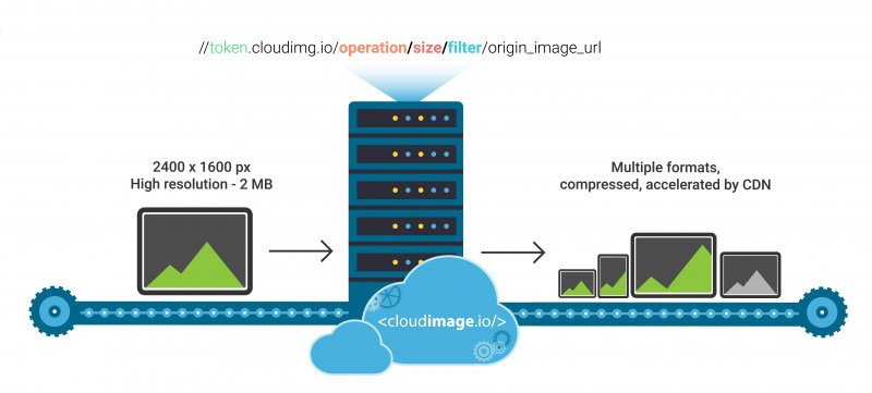
operation/o
see doc
Type: String | Default: width | optional
width - to resize with a specific width
height - to resize with a specific height
crop - to crop the image at the center
fit - to resize the image in a box and keeping the proportions of the source image
cover - to resize the image in a box without keeping the proportions of the source image
size/s
Type: String/Object | Default: undefined | optional
Size of an image which is used as a base for creating retina ready and responsive image element.
Examples (PR - stands for your device Pixel Ratio):
[width]: s="250" => width: 250 * PR (px); height: auto;
[width x height]: s="125x200" => width: 125 * PR (px); height: 200 * PR (px);
[Width and height for different screen resolutions]:
s={{ xs: '50x100', sm:'100x125', md: '150x150', lg:'200x175', xl:'300x200' }}
*You can drop some breakpoints, for example s={{ sm:'100x125', xl:'300x200' }}
NOTE: if size is set to undefined, Cloudimage uses a special
algorithm to detect the width of image container and set the image size
accordingly.
filters/f
see doc
Type: String | Default: none | optional
Filters allow you to modify the image's apperance and can be added on top of the resizing features above.
fgrey - apply a greyscale filter on the image
fgaussian[0..10] - apply a gaussian blur filter on the image
fcontrast[-100..100] - apply a contrast filter on the image
fbright[0..255] - apply a brightness filter on the image
fpixelate[0..100] - apply a pixelate filter on the image
fradius[0..500] - create a radius on the corners
ratio/r
Type: Number | optional
it is recommended to prevent page layout jumping and to leverage visibility checking and thus lazy loading. Every other means to make the image have a certain height is also ok.
To see the full cloudimage documentation click here


