keyboard-css
Advanced tools

Comparing version 1.1.0 to 1.1.1
| { | ||
| "name": "keyboard-css", | ||
| "version": "1.1.0", | ||
| "version": "1.1.1", | ||
| "description": "A CSS to show keyboard keys.", | ||
@@ -22,3 +22,8 @@ "main": "css/main.min.css", | ||
| }, | ||
| "keywords": [], | ||
| "keywords": [ | ||
| "css", | ||
| "scss", | ||
| "sass", | ||
| "keyboard" | ||
| ], | ||
| "author": "Dharmen Shah", | ||
@@ -29,3 +34,3 @@ "license": "MIT", | ||
| }, | ||
| "homepage": "https://github.com/shhdharmen/keyboard-css#readme", | ||
| "homepage": "https://shhdharmen.github.io/keyboard-css/", | ||
| "devDependencies": { | ||
@@ -32,0 +37,0 @@ "@commitlint/cli": "^11.0.0", |
210
README.md
@@ -1,2 +0,1 @@ | ||
| <!-- markdownlint-disable --> | ||
@@ -16,4 +15,6 @@ <p align="center"> | ||
| <!-- prettier-ignore-start --> | ||
| <!-- markdownlint-disable --> | ||
| # Keyboard CSS <!-- omit in toc --> | ||
| Keyboard CSS is a library of ready-to-use, cross-browser compatible keyboard like button UI for use in your web projects. Great for showing off your keyboard shortcuts. | ||
| [](https://www.npmjs.com/package/keyboard-css) | ||
@@ -23,13 +24,24 @@ [](https://github.com/shhdharmen/keyboard-css/blob/main/LICENSE) | ||
| [](https://github.com/prettier/prettier) | ||
| <!-- ALL-CONTRIBUTORS-BADGE:START - Do not remove or modify this section --> | ||
| [](#contributors-) | ||
| <!-- ALL-CONTRIBUTORS-BADGE:END --> | ||
| <!-- markdownlint-restore --> | ||
| <!-- prettier-ignore-end --> | ||
| # Keyboard CSS | ||
| [](https://github.com/semantic-release/semantic-release) | ||
| ## Getting Started | ||
| ## Table of Contents <!-- omit in toc --> | ||
| Simplest way to use this is through link tag (thanks to <https://unpkg.com/>): | ||
| - [Installation](#installation) | ||
| - [Usage](#usage) | ||
| - [Basic Usage](#basic-usage) | ||
| - [Remove Surface Border](#remove-surface-border) | ||
| - [Sizing](#sizing) | ||
| - [States](#states) | ||
| - [Colors](#colors) | ||
| - [Usage with Javascript](#usage-with-javascript) | ||
| - [Advanced Configuration Options with SASS](#advanced-configuration-options-with-sass) | ||
| - [License and Contributing](#license-and-contributing) | ||
| - [Contributing](#contributing) | ||
| - [Code of Conduct](#code-of-conduct) | ||
| - [Contributors ✨](#contributors-) | ||
| ## Installation | ||
| Add it directly to your webpage using a `link` tag, thanks to <https://unpkg.com>: | ||
| ```html | ||
@@ -39,3 +51,3 @@ <link rel="stylesheet" href="https://unpkg.com/keyboard-css/css/main.min.css" /> | ||
| You can also install it from npm: | ||
| or install it with npm: | ||
@@ -46,6 +58,178 @@ ```bash | ||
| with yarn: | ||
| ```bash | ||
| yarn add keyboard-css | ||
| ``` | ||
| ## Usage | ||
| Visit <https://shhdharmen.github.io/keyboard-css/#usage>. | ||
| ### Basic Usage | ||
| You just have to add a single class to apply the related styles, i.e. kbc-button, preferably to a `<button>` or `<a>`: | ||
| ```html | ||
| <button class="kbc-button">K</button> | ||
| ``` | ||
|  | ||
| Great! Your button is now a Keyboard key. Congrats! | ||
| ### Remove Surface Border | ||
| To remove surface border, simply add `no-container` class. | ||
| ```html | ||
| <button class="kbc-button no-container">K</button> | ||
| ``` | ||
|  | ||
| ### Sizing | ||
| Total 5 sizes are available. You can add respective class to see the effect: | ||
| | Size | Use case | Class | | ||
| | ----------------- | ------------------------------------------- | ----------------- | | ||
| | Extra-extra Small | In inputs, like searchbox | `.kbc-button-xxs` | | ||
| | Extra Small | In links, like footer or credit | `.kbc-button-xs` | | ||
| | Small | Same as above, but for more prominent cases | `.kbc-button-sm` | | ||
| | Large | In banners or jumbotrons | `.kbc-button-lg` | | ||
| ```html | ||
| <button class="kbc-button kbc-button-xxs">XXS</button> | ||
| <button class="kbc-button kbc-button-xs">XS</button> | ||
| <button class="kbc-button kbc-button-sm">SM</button> | ||
| <button class="kbc-button">MD</button> | ||
| <button class="kbc-button kbc-button-lg">LG</button> | ||
| ``` | ||
| 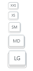 | ||
| ### States | ||
| Like all buttons, this also have 4 states: `:hover`, `:focus`, `:active`, and `:disabled`. You can add classes with same state name to see it statically. | ||
| ```html | ||
| <button class="kbc-button hover">Hovered</button> | ||
| <button class="kbc-button focus">Focused</button> | ||
| <button class="kbc-button active">Activated</button> | ||
| <button class="kbc-button disabled">Disabled</button> | ||
| ``` | ||
| 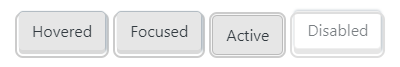 | ||
| ### Colors | ||
| Colors are inspired from [Bootstrap theme colors](https://getbootstrap.com/docs/4.5/getting-started/theming/#theme-colors). | ||
| ```html | ||
| <button class="kbc-button">Default</button> | ||
| <button class="kbc-button kbc-button-primary">Primary</button> | ||
| <button class="kbc-button kbc-button-secondary">Secondary</button> | ||
| <button class="kbc-button kbc-button-success">Success</button> | ||
| <button class="kbc-button kbc-button-danger">Danger</button> | ||
| <button class="kbc-button kbc-button-info">Info</button> | ||
| <button class="kbc-button kbc-button-light">Light</button> | ||
| <button class="kbc-button kbc-button-dark">Dark</button> | ||
| ``` | ||
| 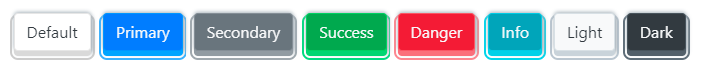 | ||
| ## Usage with Javascript | ||
| You can do a whole bunch of other stuff with Keyboard CSS when you combine it with Javascript. A simple example: | ||
| ```javascript | ||
| const element = document.querySelector('.my-element'); | ||
| element.classList.add('kbc-button', 'kbc-button-dark'); | ||
| ``` | ||
| You can also bind keyboard events: | ||
| ```html | ||
| <button class="kbc-button" data-keyboard-key="K">K</button> | ||
| ``` | ||
| ```javascript | ||
| document.addEventListener('keydown', (ev) => { | ||
| const key = ev.key; | ||
| const element = document.querySelector( | ||
| '[data-keyboard-key="' + key.toUpperCase() + '"]' | ||
| ); | ||
| element.classList.add('active'); | ||
| }); | ||
| document.addEventListener('keyup', (ev) => { | ||
| const key = ev.key; | ||
| const element = document.querySelector( | ||
| '[data-keyboard-key="' + key.toUpperCase() + '"]' | ||
| ); | ||
| element.classList.remove('active'); | ||
| }); | ||
| ``` | ||
| ## Advanced Configuration Options with SASS | ||
| I have used [sass](https://sass-lang.com/) to create this build. Mostly, everything is handled through [sass variables](https://sass-lang.com/documentation/variables), so you can easily override the defaults, thanks to [!default](https://sass-lang.com/documentation/variables#default-values) flag. | ||
| For example, to change the default base font-size to 20px, you can do like below: | ||
| ```scss | ||
| // assuming you have already done: npm i keyboard-css | ||
| // define variables first | ||
| $kbc-font-size-base: 20 / 16 * 1rem; | ||
| // and then import | ||
| @import "../../node_modules/keyboard-css/sass/main"; | ||
| ``` | ||
| or with new [@use](https://sass-lang.com/documentation/at-rules/use) rule, you can achieve the same using below code: | ||
| ```scss | ||
| // assuming you have already done: npm i keyboard-css | ||
| @use "path/to/node_modules/keyboard-css/sass/main" with ( | ||
| $kbc-font-size-base: 20 / 16 * 1rem | ||
| ); | ||
| ``` | ||
| You can also introduce your new size: | ||
| ```scss | ||
| // add size in $kbc-btn-size-map | ||
| $kbc-btn-size-map: ( | ||
| "xlg": ( | ||
| "padding-y": 0.75rem, | ||
| "padding-x": 1.25rem, | ||
| "font-size": 1.5rem, | ||
| "line-height": 1.5, | ||
| "depth": 11, | ||
| "after-border-width": 0.125rem, | ||
| "after-adjust-x": -0.125rem, | ||
| "after-adjust-y": -5, | ||
| "after-border-radius": 0.5rem, | ||
| ), | ||
| ); | ||
| // and then import | ||
| @import "path/to/node_modules/keyboard-css/sass/main"; | ||
| ``` | ||
| You can check all the variables at [_variables.scss](./src/sass/abstracts/_variables.scss) file. | ||
| ## License and Contributing | ||
| Keyboard CSS is licensed under the [MIT](./LICENSE) license. | ||
| ### Contributing | ||
| 🙏 I would ❤️ for you to contribute to Keyboard CSS and help make it even better than it is today! Checkout [contributing](./CONTRIBUTING.md) guidelines for more details. | ||
| ### Code of Conduct | ||
| This project and everyone participating in it are governed by the [Contributor Covenant Code of Conduct](./CODE_OF_CONDUCT.md). By participating, you are expected to uphold this code. Please report unacceptable behavior to <shhdharmen@gmail.com>. | ||
| ## Contributors ✨ | ||
@@ -52,0 +236,0 @@ |
Sorry, the diff of this file is not supported yet
Sorry, the diff of this file is not supported yet
Sorry, the diff of this file is not supported yet
Sorry, the diff of this file is not supported yet
Sorry, the diff of this file is not supported yet
Sorry, the diff of this file is not supported yet
Improved metrics
- Total package byte prevSize
- increased by2.58%
662826
- Number of lines in readme file
- increased by278.79%
250
Worsened metrics
- Number of package files
- decreased by-4.76%
20
- Lines of code
- decreased by-0.16%
1264