Research
/Security News
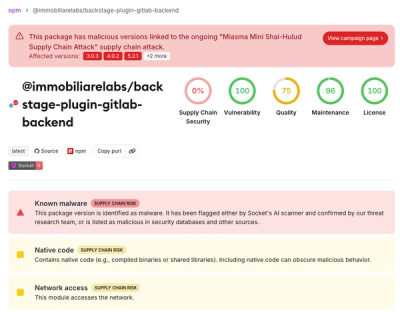
Miasma Mini Shai-Hulud Hits ImmobiliareLabs npm Packages
Miasma Mini Shai-Hulud hits @immobiliarelabs Backstage plugins, targeting GitLab and LDAP auth packages on npm.
By Socket Research Team - Jun 26, 2026
Lightweight Lit components with shadcn-inspired theming, Tailwind CSS v4 styling, and Lucide icons.
View Live Demo & Interactive Documentation → Explore all components with live examples, copy-paste code snippets, and interactive playgrounds.
dark classnpm install lit litcn
npm install -D @tailwindcss/vite
// vite.config.ts
import { defineConfig } from "vite";
import tailwindcss from "@tailwindcss/vite";

export default defineConfig({
   plugins: [tailwindcss()],
});
npm install -D @tailwindcss/cli
// package.json scripts
"scripts": {
  "dev": "tailwindcss -i ./src/app.css -o ./dist/app.css --watch",
  "build": "tailwindcss -i ./src/app.css -o ./dist/app.css --minify"
}
/* src/app.css */

/* Import theme (includes dark mode and utilities) */
@import "litcn/styles/themes/default.css";

/* Tell Tailwind to scan litcn components */
@source "../node_modules/litcn/dist";

/* Import Tailwind */
@import "tailwindcss";
If you're using LitElement components with decorators (custom elements or your own components extending LitElement), you must configure TypeScript properly:
// tsconfig.json
{
  "compilerOptions": {
    "experimentalDecorators": true,
    "useDefineForClassFields": false  // Critical for LitElement reactivity!
  }
}
Note: useDefineForClassFields: false is essential for LitElement's @property() and @state() decorators to work correctly. Without this setting, reactive properties won't trigger updates properly.
import { html, render } from "lit";
import { Button } from "litcn/dist/Button.js";
import { Card } from "litcn/dist/Card.js";
import { icon } from "litcn/dist/icons.js";
import "litcn/dist/ThemeToggle.js";
import { Send } from "lucide";
import "./app.css";

const App = () => html`
   <div class="p-8 bg-background text-foreground min-h-screen">
      <!-- litcn components with internal state are full LitElement instances with custom tags -->
      <theme-toggle class="fixed top-4 right-4"></theme-toggle>

      <!-- litcn components without internal state are functional components returning TemplateResult -->
      ${Card(html`
         <h1 class="text-2xl font-bold mb-4">Hello litcn!</h1>

         ${Button({
            children: html`
               ${icon(Send, "sm")}
               <span>Send Message</span>
            `,
         })}
      `)}
   </div>
`;

render(App(), document.body);
Stateless components that return TemplateResult:
import { Button, Card, Badge } from "litcn";

// Use directly in templates
${Button({ variant: "primary", children: "Click me" })}
${Badge({ children: "New" })}
Stateful components that extend LitElement:
// Custom elements are automatically registered when using the main import
import "litcn";

// Use as HTML tags
<theme-toggle></theme-toggle>
<code-block .code=${"console.log('Hello')"} language="javascript"></code-block>
IMPORTANT: The root index (litcn) now only exports core utilities (component system, i18n, and icons). Individual components are not exported from the root to encourage optimal tree-shaking.
// ✔ Optimal - only includes what you use (~50-100KB)
import { Button } from "litcn/dist/Button.js";
import { Card } from "litcn/dist/Card.js";
import { icon } from "litcn/dist/icons.js";
import "litcn/dist/ThemeToggle.js";

// ⚠️ Root index only exports core utilities (NOT components)
import { i18n, setTranslations, createComponent } from "litcn";
What's exported from the root index:
ComponentLitBase, createComponent, defineComponent, styleComponent, and related typesi18n, setTranslations, setLanguage, getCurrentLanguage, defaultEnglish, defaultGermanicon function and related utilitiesAvailable component paths:
/dist/Button.js, /dist/Card.js, /dist/Input.js, /dist/Select.js, /dist/Checkbox.js, etc./dist/ThemeToggle.js, /dist/CodeBlock.js, /dist/MarkdownBlock.js, /dist/LanguageSelector.js, etc./dist/mini.js (fc, createState, refs)Bundle Size:
litcn uses shadcn/ui compatible themes with CSS custom properties for colors, borders, and shadows.
default - Clean, modern themeclaude - Claude-inspired themeSwitch themes by importing a different CSS file:
@import "litcn/styles/themes/claude.css";
Toggle dark mode via the dark class:
document.documentElement.classList.toggle("dark");
Or use the built-in <theme-toggle> component.
For custom themes and theme generators:
declare module "litcn" {
   interface i18nMessages extends LiteCNRequiredMessages {
      Welcome: string;
      Settings: string;
      cartItems: (count: number) => string;
      greeting: (name: string, time: string) => string;
   }
}
import { setTranslations, defaultEnglish, defaultGerman } from "litcn";

const translations = {
   en: {
      ...defaultEnglish, // Includes required messages like "Copy", "Copied!"
      Welcome: "Welcome",
      Settings: "Settings",
      cartItems: (count: number) =>
         count === 0 ? "Your cart is empty" : count === 1 ? "1 item in your cart" : `${count} items in your cart`,
      greeting: (name: string, time: string) => `Good ${time}, ${name}!`,
   },
   de: {
      ...defaultGerman, // Includes required messages like "Kopieren", "Kopiert!"
      Welcome: "Willkommen",
      Settings: "Einstellungen",
      cartItems: (count: number) =>
         count === 0
            ? "Ihr Warenkorb ist leer"
            : count === 1
              ? "1 Artikel im Warenkorb"
              : `${count} Artikel im Warenkorb`,
      greeting: (name: string, time: string) => `Guten ${time}, ${name}!`,
   },
};

setTranslations(translations);
import { i18n, getCurrentLanguage, setLanguage } from "litcn";

// Simple strings
${i18n("Welcome")}
${i18n("Settings")}

// Functions with parameters
${i18n("cartItems")(3)}  // "3 items in your cart"
${i18n("greeting")("Alice", "morning")}  // "Good morning, Alice!"

// Language management
getCurrentLanguage()  // "en" or "de"
setLanguage("de")     // switches to German, reloads page

// Add language selector to UI
<language-selector></language-selector>
The litcn repository includes both the component library and a comprehensive example gallery showcasing all components.
# Clone the repository
git clone https://github.com/shaneholloman/litcn.git
cd litcn

# Install dependencies
npm install
Run the development server with hot module replacement:
npm run dev
This command orchestrates:
/src, outputting to /dist)/example), automatically picking up the latest litcn buildsOpen the URL displayed by Vite (typically http://localhost:5173) to view the example gallery. Any changes to either the litcn source code or the example application will trigger automatic rebuilds and browser updates through HMR.
litcn/
├── src/              # litcn component library source
├── dist/             # Compiled library output
├── styles/           # Theme CSS files
├── example/          # Interactive component gallery
│   └── src/
│       └── pages/    # Individual component demos
└── package.json      # Library package configuration
Run formatting and linting checks for both the library and example:
npm run check
This command:
# Build the library
npm run build

# Build the example gallery
cd example && npm run build
# Build and publish the library to npm
npm run build
npm publish --access public
# Quick sync (when only source files changed)
./scripts/run.sh sync

# Full deploy (when Docker/infrastructure changed)
./scripts/run.sh deploy
The sync command builds and syncs files without restarting services, while deploy also restarts the Docker containers on the server.
See the /example directory for a complete working example with all components, or visit the live demo.
MIT
FAQs
Lightweight Lit components with shadcn-inspired theming and Tailwind CSS integration
We found that litcn demonstrated a healthy version release cadence and project activity because the last version was released less than a year ago. It has 1 open source maintainer collaborating on the project.
Did you know?

Socket for GitHub automatically highlights issues in each pull request and monitors the health of all your open source dependencies. Discover the contents of your packages and block harmful activity before you install or update your dependencies.
Research
/Security News
Miasma Mini Shai-Hulud hits @immobiliarelabs Backstage plugins, targeting GitLab and LDAP auth packages on npm.

Security News
Rolldown paused Rust React Compiler integration after a 5MB binary size increase raised concerns about shipping React-specific code to all Vite users.

Security News
/Research
Mini Shai-Hulud expands into the Go ecosystem after hitting LeoPlatform npm packages and targeting GitHub Actions workflows.