Luna UI
Cascading Style Sheet
UI Styles and/or Webcomponents for use on the LunaSphere Landing Page & Future Projects.
Components
The navigation system is currently relatively simple, but more may be added later. A "logo" element can be added at any point which receives almost double the padding to the other navigation items.
Preview:

Source:
<div class="navbar">
<div class="nav-menu nav-left">
<div class="nav-item nav-logo">
<a class="nav-link">
LOGO
</a>
</div>
<div class="nav-item">
<a class="nav-link">Home</a>
</div>
<div class="nav-item">
<a class="nav-link">About</a>
</div>
<div class="nav-item">
<a class="nav-link">Account</a>
</div>
</div>
<div class="nav-menu nav-right">
<div class="nav-item">
<a class="nav-link">Help</a>
</div>
</div>
</div>
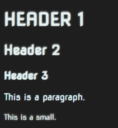
2. Typograhpy
The current typography utilises the "Nova Square" font in it's entirety. You'll have to add this seperately if you want to use it, but it's freely available from Google WebFonts:
<link rel="preconnect" href="https://fonts.googleapis.com">
<link rel="preconnect" href="https://fonts.gstatic.com" crossorigin>
<link href="https://fonts.googleapis.com/css2?family=Nova+Square&display=swap" rel="stylesheet">
All major headings (h1, h2, h3) have been styled, alongside basic changes to paragraph (p) and small (small) elements. More change to come!
Almost all text receives a small text shadow to give it that subtle glow effect!
Preview:
Source:
<h1>Header 1</h1>
<h2>Header 2</h2>
<h3>Header 3</h3>
<p>This is a paragraph.</p>
<small>This is a small.</small>
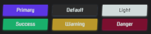
3. Buttons
Button styles are once again heavily inspired by Bootstrap, with classes for a variety of colours.
All "btn btn-xxx" items will receive a box shadow as well as the standard text effects to add that extra pop on their glows.
Filled Style
Preview:
Source:
<button class="btn-fill primary text-light">Primary</button>
<button class="btn-fill">Default</button>
<button class="btn-fill light">Light</button>
<button class="btn-fill success text-light">Success</button>
<button class="btn-fill warning text-light">Warning</button>
<button class="btn-fill danger text-light">Danger</button>
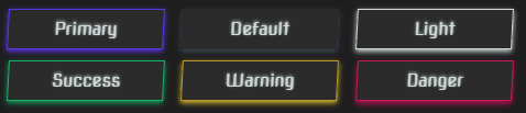
Outline Style
Preview:
Source:
<button class="btn-outline primary text-light">Primary</button>
<button class="btn-outline">Default</button>
<button class="btn-outline light">Light</button>
<button class="btn-outline success text-light">Success</button>
<button class="btn-outline warning text-light">Warning</button>
<button class="btn-outline danger text-light">Danger</button>
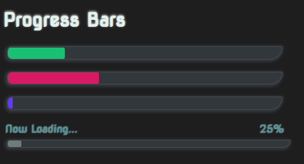
4. Progress Bars
Progress bars are currently just fancy styled divs. There is no JavaScript code to power these and allow you to change their progress values, however the inner "progress-fill" div can have it's width changed at any time and the transition property will automatically smooth its movement for you.
Preview:
Source:
<div class="progress" role="progressbar" style="width: 350px;">
    <div class="progress-fill bg-success" style="width: 0%;"></div>
</div>

<div class="progress" role="progressbar" style="width: 350px;">
    <div class="progress-fill bg-danger" style="width: 0%;"></div>
</div>

<div class="progress" role="progressbar" style="width: 350px;">
    <div class="progress-fill bg-primary" style="width: 0%;"></div>
</div>

<div class="progress-content" style="width: 360px;">
    <div class="readout">
        <p>Now Loading...</p>
        <p>25%</p>
    </div>
    <div class="progress">
        <div class="progress-fill"></div>
    </div>
</div>
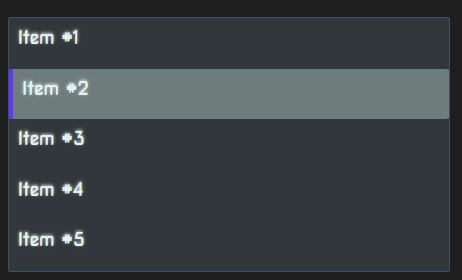
5. List Groups
List groups are again styled divs, and do not have any functional components yet. The selection property is controlled by the "active" class which gives you options. You can use this for navigation, or you could use this as a radio selection menu. It's also possible with the right code to use this as a multi-selection (checkbox) style system.
Preview:
Source:
<div class="list-group" style="width: 400px;">
    <div class="list-group-item">Item #1</div>
    <div class="list-group-item active">Item #2</div>
    <div class="list-group-item">Item #3</div>
    <div class="list-group-item">Item #4</div>
    <div class="list-group-item">Item #5</div>
</div>
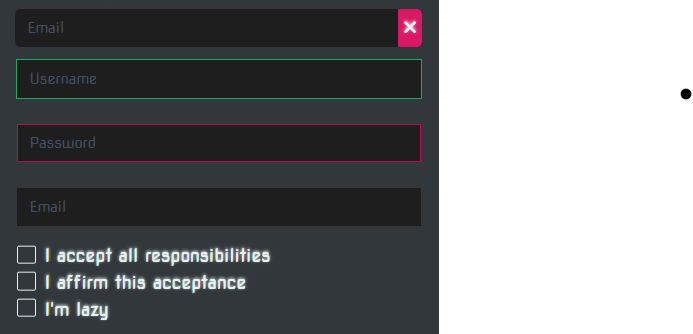
6. Forms
Form elements are all styled with some defaults and also some reactive classes have been added.
These are briefly shown in the below screenshot. Any active elements receives the Luna primary colour, then any fields with the "valid" or "success" class receive a green outline and "invalid" or "error" (or also the html standard :invalid state) receives a red outline.
Styling is also supported on checkbox fields with specially styled boxes to represent selected/de-selected.
Preview:
Source:
<form>
    <div class="form-group">
        <input type="email" class="input-control" placeholder="Email"/>
        <div class="form-group-append bg-danger">
            <span class="fas fa-times"></span>
        </div>
    </div>
    <input type="text" class="input-control valid" placeholder="Username"/>
    <input type="password" class="input-control invalid" placeholder="Password"/>
    <input type="email" class="input-control" placeholder="Email"/>

    <br>

    <div class="form-check">
        <input type="checkbox" id="acceptCheck"/>
        <label for="acceptCheck">I accept all responsibilities</label>
    </div>
    <div class="form-check">
        <input type="checkbox" id="acceptVerify"/>
        <label for="acceptVerify">I affirm this acceptance</label>
    </div>
    <div class="form-check">
        <input type="checkbox" id="lazyVerify"/>
        <label for="lazyVerify">I'm lazy</label>
    </div>
</form>
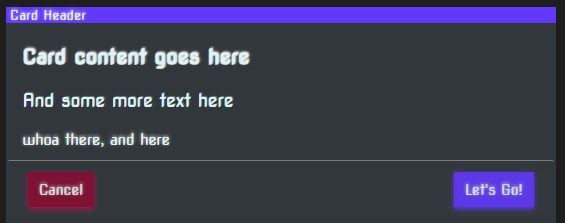
7. Sections (Cards)
Sections work similar to bootstrap cards. They're inspired a little like modern dialogs but have any number of uses. You could place several of these in a grid layout or use them as a dialog template.
Preview:
Source:
<div class="section" style="width: 500px;">
    <div class="title">
        Card Header
    </div>
    <div class="content">
        <h3>Card content goes here</h3>
        <p>And some more text here</p>
        <small>whoa there, and here</small>
    </div>
    <div class="footer">
        <button class="btn btn-danger btn-sm">Cancel</button>
        <button class="btn btn-primary btn-sm float-right">Let's Go!</button>
    </div>
</div>


