Product
Introducing Enhanced Alert Actions and Triage Functionality
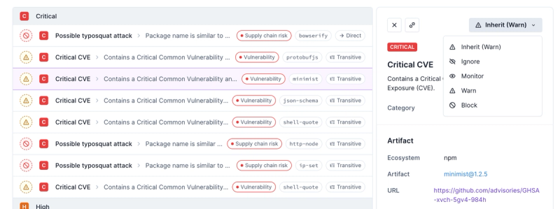
Socket now supports four distinct alert actions instead of the previous two, and alert triaging allows users to override the actions taken for all individual alerts.
material-ui-audio-player
Advanced tools
Changelog
1.5.0 - 2020-11-27
Readme
Audio player for material ui design developed with react.js. Requires Material UI 4 version.
Demo: https://werter12.github.io/material-ui-audio-player/
Just add your audio link to src and your ready to go.
import { createMuiTheme, ThemeProvider } from '@material-ui/core';
import AudioPlayer from 'material-ui-audio-player';

const muiTheme = createMuiTheme({});

<ThemeProvider theme={muiTheme}>
  <AudioPlayer src="https://www.soundhelix.com/examples/mp3/SoundHelix-Song-1.mp3" />
</ThemeProvider>;
A bunch of props will help to customize component.
import { createMuiTheme, ThemeProvider } from '@material-ui/core';
import AudioPlayer from 'material-ui-audio-player';

const muiTheme = createMuiTheme({});

const src = [
  'https://converter-audio-example-1.s3.eu-central-1.amazonaws.com/Russell%2C%2BMale%2B-%2BEnglish%2C%2BAustralian+(1)+(online-audio-converter.com).wav',
  'https://converter-audio-examples.s3.eu-central-1.amazonaws.com/Russell%2C+Male+-+English%2C+Australian.mp3',
];

<ThemeProvider theme={muiTheme}>
  <AudioPlayer
    elevation={1}
    width="100%"
    variation="default"
    spacing={3}
    download={true}
    autoplay={true}
    order="standart"
    preload="auto"
    loop={true}
    src={src}
  />
</ThemeProvider>;
srcCould accept audio link or array of audio links.
string | arraywidthCorresponds to style property width.
100%stringvariationComponent view variation.
defaultdefault, primary, secondarystringdownloadDisplay download button (icon) with dropdown of available audio tracks for download.
falsebooleanautoplayCorresponds to HTML audio autoplay attribute.
falsebooleanelevationShadow depth. Corresponds to elevation prop of Material Ui Paper component.
1numberroundedRounded corners of the container. Corresponds to square prop of Material Ui Paper component.
falsebooleanspacingSpacing for root Grid container. Corresponds to spacing prop of Material Ui Grid component.
3 (2 - mobile)numberorderOrder of Slider and controls buttons.
standartstandart, reversestringloopDisplay loop button.
falsebooleanpreloadCorresponds to HTML audio attribute preload.
autostringonPlayedThis callback triggers when the player started play after pause or initial state
funconPausedThis callback triggers when the player paused after the play
funconFinishedThis callback triggers when the player finish playing
functimeThis prop helps to customize time displaying. double - means that two timers will be present. single - only one.
doubledouble, singlestringtimePositionThis prop helps to position single timer before (start) or after (end) the slider.
startstart, endstringuseStylesThe attribute for customizing component styles. Accept the result of
makeStyles function.
funciconsProvide custom icon component from Material-ui icons for specific icon.
object const icons = {
PlayIcon: PlayCircleFilledWhite,
ReplayIcon: Replay,
PauseIcon: PauseCircleFilled,
VolumeUpIcon: VolumeUp,
VolumeOffIcon: VolumeOff
}
import { createMuiTheme, ThemeProvider } from '@material-ui/core';
import AudioPlayer from 'material-ui-audio-player';

const muiTheme = createMuiTheme({});

const useStyles = makeStyles((theme) => {
  return {
    root: {
      [theme.breakpoints.down('sm')]: {
        width: '100%',
      },
    },
    loopIcon: {
      color: '#3f51b5',
      '&.selected': {
        color: '#0921a9',
      },
      '&:hover': {
        color: '#7986cb',
      },
      [theme.breakpoints.down('sm')]: {
        display: 'none',
      },
    },
    playIcon: {
      color: '#f50057',
      '&:hover': {
        color: '#ff4081',
      },
    },
    replayIcon: {
      color: '#e6e600',
    },
    pauseIcon: {
      color: '#0099ff',
    },
    volumeIcon: {
      color: 'rgba(0, 0, 0, 0.54)',
    },
    volumeSlider: {
      color: 'black',
    },
    progressTime: {
      color: 'rgba(0, 0, 0, 0.54)',
    },
    mainSlider: {
      color: '#3f51b5',
      '& .MuiSlider-rail': {
        color: '#7986cb',
      },
      '& .MuiSlider-track': {
        color: '#3f51b5',
      },
      '& .MuiSlider-thumb': {
        color: '#303f9f',
      },
    },
  };
});

<ThemeProvider theme={muiTheme}>
  <AudioPlayer
    width="500px"
    useStyles={useStyles}
    src="https://www.soundhelix.com/examples/mp3/SoundHelix-Song-1.mp3"
    loop={true}
  />
</ThemeProvider>;
FAQs
Audio player for material ui design
The npm package material-ui-audio-player receives a total of 463 weekly downloads. As such, material-ui-audio-player popularity was classified as not popular.
We found that material-ui-audio-player demonstrated a not healthy version release cadence and project activity because the last version was released a year ago. It has 1 open source maintainer collaborating on the project.
Did you know?

Socket for GitHub automatically highlights issues in each pull request and monitors the health of all your open source dependencies. Discover the contents of your packages and block harmful activity before you install or update your dependencies.

Product
Socket now supports four distinct alert actions instead of the previous two, and alert triaging allows users to override the actions taken for all individual alerts.

Security News
Polyfill.io has been serving malware for months via its CDN, after the project's open source maintainer sold the service to a company based in China.

Security News
OpenSSF is warning open source maintainers to stay vigilant against reputation farming on GitHub, where users artificially inflate their status by manipulating interactions on closed issues and PRs.