material-ui-dropzone
Material-UI-dropzone is a React component using Material-UI and is based on the excellent react-dropzone library.
This components provide either a file-upload dropzone or a file-upload dropzone inside of a dialog.
The file-upload dropzone features some snazzy "File Allowed/Not Allowed" effects, previews and alerts.
Installation
npm install --save material-ui-dropzone
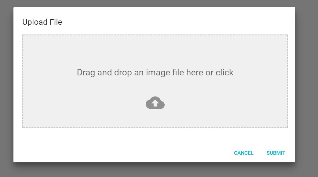
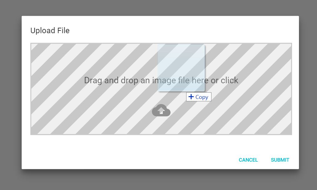
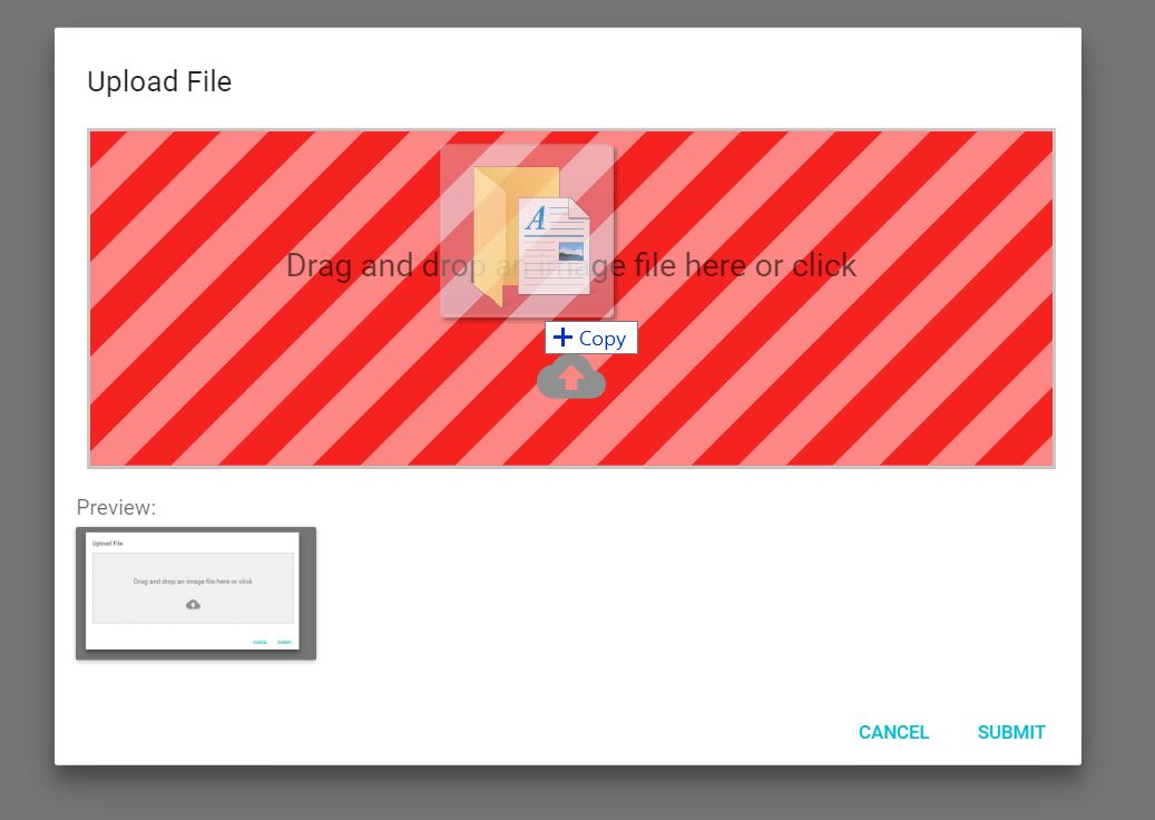
Screenshots
This is the component:
When you drag a file onto the dropzone, you get a neat effect:
And if you drop in a wrong type of file, you'll get yelled at:
DropzoneArea Component
This components creates the dropzone, previews and snackbar notifications without a dialog
Usage
import React, {Component} from 'react'
import {DropzoneArea} from 'material-ui-dropzone'

class DropzoneAreaExample extends Component{
  constructor(props){
    super(props);
    this.state = {
      files: []
    };
  }
  handleChange(files){
    this.setState({
      files: files
    });
  }
  render(){
    return (
      <DropzoneArea
        onChange={this.handleChange.bind(this)}
        />
    )
  }
}

export default DropzoneAreaExample;
DropzoneArea Component Properties
| acceptedFiles | Array | ['image/*', 'video/*', 'application/*'] | A list of file mime types to accept. Does support wildcards. |
| filesLimit | Number | 3 | Maximum number of files that can be loaded into the dropzone |
| maxFileSize | Number | 3000000 | Maximum file size (in bytes) that the dropzone will accept |
| dropzoneText | String | 'Drag and drop an image file here or click' | Text in dropzone |
| showPreviews | Boolean | false | Shows previews BELOW the Dropzone |
| showPreviewsInDropzone | Boolean | true | Shows preview INSIDE the dropzone |
| showAlerts | Boolean | true | shows styled snackbar alerts when files are dropped, deleted or rejected. |
| dropZoneClass | String | null | Custom CSS class name for dropzone container. |
| dropzoneParagraphClass | String | null | Custom CSS class name for text inside the container. |
| showFileNamesInPreview | Boolean | false | Shows file name under the image |
DropzoneArea Component Events
| onChange | files(array) | Fired when the user drops files into dropzone or deletes a file. Returns all the files currently loaded into the dropzone. |
| onDrop | files(array) | Fired when the user drops files into the dropzone. Returns the files dropped |
| onDropRejected | files(array) | Fired when a file is rejected because of wrong file type, size or goes beyond the filesLimit. Returns the files that were rejected |
| onDelete | file | Fired when a file is deleted from the previews panel. |
DropzoneDialog Component
This component provides the dropzone inside of a dialog.
Usage
import React, { Component } from 'react'
import {DropzoneDialog} from 'material-ui-dropzone'
import Button from '@material-ui/core/Button';
export default class DropzoneDialogExample extends Component {
constructor(props) {
super(props);
this.state = {
open: false,
files: []
};
}
handleClose() {
this.setState({
open: false
});
}
handleSave(files) {
this.setState({
files: files,
open: false
});
}
handleOpen() {
this.setState({
open: true,
});
}
render() {
return (
<div>
<Button onClick={this.handleOpen.bind(this)}>
Add Image
</Button>
<DropzoneDialog
open={this.state.open}
onSave={this.handleSave.bind(this)}
acceptedFiles={['image/jpeg', 'image/png', 'image/bmp']}
showPreviews={true}
maxFileSize={5000000}
onClose={this.handleClose.bind(this)}
/>
</div>
);
}
}
DropzoneDialog Component Properties
| open | Boolean | false | Required. Sets whether the dialog is open or closed |
| acceptedFiles | Array | ['image/*', 'video/*', 'application/*'] | A list of file mime types to accept. Does support wildcards. |
| filesLimit | Number | 3 | Maximum number of files that can be loaded into the dropzone |
| maxFileSize | Number | 3000000 | Maximum file size (in bytes) that the dropzone will accept |
| showPreviews | Boolean | false | Shows previews BELOW the Dropzone |
| showPreviewsInDropzone | Boolean | true | Shows preview INSIDE the dropzone |
| showAlerts | Boolean | true | shows styled snackbar alerts when files are dropped, deleted or |
DropzoneDialog Component Events
| onSave | files(array) | Fired when the user clicks the Submit button. |
| onClose | event | Fired when the modal is closed |
| onChange | files(array) | Fired when the user drops files into dropzone OR deletes a file. Returns all the files currently loaded into the dropzone. |
| onDrop | files(array) | Fired when the user drops files into the dropzone. Returns the files dropped |
| onDropRejected | files(array) | Fired when a file is rejected because of wrong file type, size or goes beyond the filesLimit. Returns the files that were rejected |
| onDelete | file | Fired when a file is deleted from the previews panel. |
License
MIT


