Product
Introducing Enhanced Alert Actions and Triage Functionality
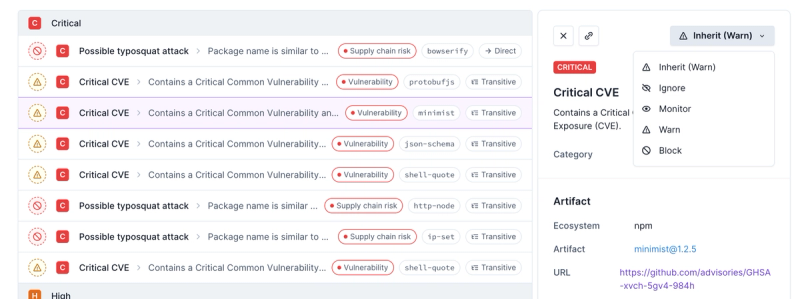
Socket now supports four distinct alert actions instead of the previous two, and alert triaging allows users to override the actions taken for all individual alerts.
material-ui-popup-state
Advanced tools
Readme
Takes care of the boilerplate for common Menu, Popover and Popper use cases.
Provides a Custom React Hook that keeps track of the local state for a single popup, and functions to connect trigger, toggle, and popover/menu/popper components to the state.
Also provides a Render Props Component that keeps track of the local state for a single popup, and passes the state and mutation functions to a child render function.
npm install --save material-ui-popup-state
import * as React from 'react'
import Button from '@material-ui/core/Button'
import Menu from '@material-ui/core/Menu'
import MenuItem from '@material-ui/core/MenuItem'
import PopupState, { bindTrigger, bindMenu } from 'material-ui-popup-state'

const MenuPopupState = () => (
  <PopupState variant="popover" popupId="demoMenu">
    {popupState => (
      <React.Fragment>
        <Button variant="contained" {...bindTrigger(popupState)}>
          Open Menu
        </Button>
        <Menu {...bindMenu(popupState)}>
          <MenuItem onClick={popupState.close}>Cake</MenuItem>
          <MenuItem onClick={popupState.close}>Death</MenuItem>
        </Menu>
      </React.Fragment>
    )}
    }
  </PopupState>
)

export default MenuPopupState
import React from 'react'
import PropTypes from 'prop-types'
import { withStyles } from '@material-ui/core/styles'
import Typography from '@material-ui/core/Typography'
import Button from '@material-ui/core/Button'
import Popover from '@material-ui/core/Popover'
import PopupState, { bindTrigger, bindPopover } from 'material-ui-popup-state'

const styles = theme => ({
  typography: {
    margin: theme.spacing.unit * 2,
  },
})

const PopoverPopupState = ({ classes }) => (
  <PopupState variant="popover" popupId="demoPopover">
    {popupState => (
      <div>
        <Button variant="contained" {...bindTrigger(popupState)}>
          Open Popover
        </Button>
        <Popover
          {...bindPopover(popupState)}
          anchorOrigin={{
            vertical: 'bottom',
            horizontal: 'center',
          }}
          transformOrigin={{
            vertical: 'top',
            horizontal: 'center',
          }}
        >
          <Typography className={classes.typography}>
            The content of the Popover.
          </Typography>
        </Popover>
      </div>
    )}
  </PopupState>
)

PopoverPopupState.propTypes = {
  classes: PropTypes.object.isRequired,
}

export default withStyles(styles)(PopoverPopupState)
import React from 'react'
import PropTypes from 'prop-types'
import { withStyles } from '@material-ui/core/styles'
import Typography from '@material-ui/core/Typography'
import Popover from '@material-ui/core/Popover'
import PopupState, { bindHover, bindPopover } from 'material-ui-popup-state'

const styles = theme => ({
  popover: {
    pointerEvents: 'none',
  },
  paper: {
    padding: theme.spacing.unit,
  },
})

const HoverPopoverPopupState = ({ classes }) => (
  <PopupState variant="popover" popupId="demoPopover">
    {popupState => (
      <div>
        <Typography {...bindHover(popupState)}>
          Hover with a Popover.
        </Typography>
        <Popover
          {...bindPopover(popupState)}
          className={classes.popover}
          classes={{
            paper: classes.paper,
          }}
          anchorOrigin={{
            vertical: 'bottom',
            horizontal: 'center',
          }}
          transformOrigin={{
            vertical: 'top',
            horizontal: 'center',
          }}
          disableRestoreFocus
        >
          <Typography>The content of the Popover.</Typography>
        </Popover>
      </div>
    )}
  </PopupState>
)

HoverPopoverPopupState.propTypes = {
  classes: PropTypes.object.isRequired,
}

export default withStyles(styles)(HoverPopoverPopupState)
import React from 'react'
import PropTypes from 'prop-types'
import { withStyles } from '@material-ui/core/styles'
import Typography from '@material-ui/core/Typography'
import Button from '@material-ui/core/Button'
import Popper from '@material-ui/core/Popper'
import PopupState, { bindToggle, bindPopper } from 'material-ui-popup-state'
import Fade from '@material-ui/core/Fade'
import Paper from '@material-ui/core/Paper'

const styles = theme => ({
  typography: {
    padding: theme.spacing.unit * 2,
  },
})

const PopperPopupState = ({ classes }) => (
  <PopupState variant="popper" popupId="demoPopper">
    {popupState => (
      <div>
        <Button variant="contained" {...bindToggle(popupState)}>
          Toggle Popper
        </Button>
        <Popper {...bindPopper(popupState)} transition>
          {({ TransitionProps }) => (
            <Fade {...TransitionProps} timeout={350}>
              <Paper>
                <Typography className={classes.typography}>
                  The content of the Popper.
                </Typography>
              </Paper>
            </Fade>
          )}
        </Popper>
      </div>
    )}
  </PopupState>
)

PopperPopupState.propTypes = {
  classes: PropTypes.object.isRequired,
}

export default withStyles(styles)(PopperPopupState)
import * as React from 'react'
import Button from '@material-ui/core/Button'
import Menu from '@material-ui/core/Menu'
import MenuItem from '@material-ui/core/MenuItem'
import { usePopupState, bindTrigger, bindMenu } from 'material-ui-popup-state/hooks'

const MenuPopupState = () => {
  const popupState = usePopupState({variant: 'popover', popupId: 'demoMenu'})
  return (
    <div>
      <Button variant="contained" {...bindTrigger(popupState)}>
        Open Menu
      </Button>
      <Menu {...bindMenu(popupState)}>
        <MenuItem onClick={popupState.close}>Cake</MenuItem>
        <MenuItem onClick={popupState.close}>Death</MenuItem>
      </Menu>
    </div>
  )
)

export default MenuPopupState
import React from 'react'
import PropTypes from 'prop-types'
import { withStyles } from '@material-ui/core/styles'
import Typography from '@material-ui/core/Typography'
import Button from '@material-ui/core/Button'
import Popover from '@material-ui/core/Popover'
import {
  usePopupState,
  bindTrigger,
  bindPopover,
} from 'material-ui-popup-state/hooks'

const styles = theme => ({
  typography: {
    margin: theme.spacing.unit * 2,
  },
})

const PopoverPopupState = ({ classes }) => {
  const popupState = usePopupState({
    variant: 'popover',
    popupId: 'demoPopover',
  })
  return (
    <div>
      <Button variant="contained" {...bindTrigger(popupState)}>
        Open Popover
      </Button>
      <Popover
        {...bindPopover(popupState)}
        anchorOrigin={{
          vertical: 'bottom',
          horizontal: 'center',
        }}
        transformOrigin={{
          vertical: 'top',
          horizontal: 'center',
        }}
      >
        <Typography className={classes.typography}>
          The content of the Popover.
        </Typography>
      </Popover>
    </div>
  )
}

PopoverPopupState.propTypes = {
  classes: PropTypes.object.isRequired,
}

export default withStyles(styles)(PopoverPopupState)
import React from 'react'
import PropTypes from 'prop-types'
import { withStyles } from '@material-ui/core/styles'
import Typography from '@material-ui/core/Typography'
import Button from '@material-ui/core/Button'
import Popper from '@material-ui/core/Popper'
import {
  usePopupState,
  bindToggle,
  bindPopper,
} from 'material-ui-popup-state/hooks'
import Fade from '@material-ui/core/Fade'
import Paper from '@material-ui/core/Paper'

const styles = theme => ({
  typography: {
    padding: theme.spacing.unit * 2,
  },
})

const PopperPopupState = ({ classes }) => {
  const popupState = usePopupState({ variant: 'popper', popupId: 'demoPopper' })
  return (
    <div>
      <Button variant="contained" {...bindToggle(popupState)}>
        Toggle Popper
      </Button>
      <Popper {...bindPopper(popupState)} transition>
        {({ TransitionProps }) => (
          <Fade {...TransitionProps} timeout={350}>
            <Paper>
              <Typography className={classes.typography}>
                The content of the Popper.
              </Typography>
            </Paper>
          </Fade>
        )}
      </Popper>
    </div>
  )
}

PopperPopupState.propTypes = {
  classes: PropTypes.object.isRequired,
}

export default withStyles(styles)(PopperPopupState)
material-ui-popup-state exports several helper functions you can use to
connect components easily:
bindMenu: creates props to control a Menu component.bindPopover: creates props to control a Popover component.bindPopper: creates props to control a Popper component.bindTrigger: creates props for a component that opens the popup when clicked.bindToggle: creates props for a component that toggles the popup when clicked.bindHover: creates props for a component that opens the popup while hovered.To use one of these functions, you should call it with the props PopupState
passed to your child function, and spread the return value into the desired
element:
import * as React from 'react'
import Button from '@material-ui/core/Button'
import Menu from '@material-ui/core/Menu'
import MenuItem from '@material-ui/core/MenuItem'
import PopupState, { bindTrigger, bindMenu } from 'material-ui-popup-state'

const MenuPopupState = () => (
  <PopupState variant="popover" popupId="demoMenu">
    {popupState => (
      <React.Fragment>
        <Button variant="contained" {...bindTrigger(popupState)}>
          Open Menu
        </Button>
        <Menu {...bindMenu(popupState)}>
          <MenuItem onClick={popupState.close}>Cake</MenuItem>
          <MenuItem onClick={popupState.close}>Death</MenuItem>
        </Menu>
      </React.Fragment>
    )}
  </PopupState>
)

export default MenuPopupState
PopupState Propsvariant ('popover' or 'popper', required)Use 'popover' if your popup is a Popover or Menu; use 'popper' if your
popup is a Popper.
Right now this only affects whether bindTrigger/bindToggle/bindHover return
an aria-owns prop or an aria-describedby prop.
popupId (string, optional but strongly encouraged)The id for the popup component. It will be passed to the child props so that
the trigger component may declare the same id in an ARIA prop.
children ((popupState: InjectedProps) => ?React.Node, required)The render function. It will be called with an object containing the following
props (exported as the InjectedProps type):
open(eventOrAnchorEl): opens the popupclose(): closes the popuptoggle(eventOrAnchorEl): opens the popup if it is closed, orcloses the popup if it is open.
setOpen(open, [eventOrAnchorEl]): sets whether the popup is open.`eventOrAnchorEl` is required if `open` is truthy.
isOpen: true/false if the popup is open/closedanchorEl: the current anchor element (null when the popup is closed)popupId: the popupId prop you passed to PopupStatevariant: the variant prop you passed to PopupStatematerial-ui-popup-state/hooks exports several helper functions you can use to
connect components easily:
bindMenu: creates props to control a Menu component.bindPopover: creates props to control a Popover component.bindPopper: creates props to control a Popper component.bindTrigger: creates props for a component that opens the popup when clicked.bindToggle: creates props for a component that toggles the popup when clicked.To use one of these functions, you should call it with the object
returned by usePopupState and spread the return value into the desired
element:
import * as React from 'react'
import Button from '@material-ui/core/Button'
import Menu from '@material-ui/core/Menu'
import MenuItem from '@material-ui/core/MenuItem'
import {
  usePopupState,
  bindTrigger,
  bindMenu,
} from 'material-ui-popup-state/hooks'

const MenuPopupState = () => {
  const popupState = usePopupState({ variant: 'popover', popupId: 'demoMenu' })
  return (
    <div>
      <Button variant="contained" {...bindTrigger(popupState)}>
        Open Menu
      </Button>
      <Menu {...bindMenu(popupState)}>
        <MenuItem onClick={popupState.close}>Cake</MenuItem>
        <MenuItem onClick={popupState.close}>Death</MenuItem>
      </Menu>
    </div>
  )
}

export default MenuPopupState
usePopupStateThis is a Custom Hook that uses useState internally, therefore the Rules of Hooks apply to usePopupState.
usePopupState Propsvariant ('popover' or 'popper', required)Use 'popover' if your popup is a Popover or Menu; use 'popper' if your
popup is a Popper.
Right now this only affects whether bindTrigger/bindToggle/bindHover return
an aria-owns prop or an aria-describedby prop.
popupId (string, optional but strongly encouraged)The id for the popup component. It will be passed to the child props so that
the trigger component may declare the same id in an ARIA prop.
usePopupState return valueAn object with the following properties:
open(eventOrAnchorEl): opens the popupclose(): closes the popuptoggle(eventOrAnchorEl): opens the popup if it is closed, orcloses the popup if it is open.
setOpen(open, [eventOrAnchorEl]): sets whether the popup is open.`eventOrAnchorEl` is required if `open` is truthy.
isOpen: true/false if the popup is open/closedanchorEl: the current anchor element (null when the popup is closed)popupId: the popupId prop you passed to PopupStatevariant: the variant prop you passed to PopupStateFAQs
easiest way to create menus, popovers, and poppers with material-ui
The npm package material-ui-popup-state receives a total of 181,408 weekly downloads. As such, material-ui-popup-state popularity was classified as popular.
We found that material-ui-popup-state demonstrated a healthy version release cadence and project activity because the last version was released less than a year ago. It has 1 open source maintainer collaborating on the project.
Did you know?

Socket for GitHub automatically highlights issues in each pull request and monitors the health of all your open source dependencies. Discover the contents of your packages and block harmful activity before you install or update your dependencies.

Product
Socket now supports four distinct alert actions instead of the previous two, and alert triaging allows users to override the actions taken for all individual alerts.

Security News
Polyfill.io has been serving malware for months via its CDN, after the project's open source maintainer sold the service to a company based in China.

Security News
OpenSSF is warning open source maintainers to stay vigilant against reputation farming on GitHub, where users artificially inflate their status by manipulating interactions on closed issues and PRs.