
Mobile Select


A multi-function mobile phone scrolling selector, support single to multi-select, support multi-level cascade, provide callback function, provide update function redraw, relocation function, compatible pc drag and so on.
English Docs | 中文文档
🎨 Features
- A mobile select component with vanilla js, do not dependent on any library
- Can be passed to an ordinary array or json array
- According to the length of the parameters passed, automatically render the corresponding number of columns, support for individual to multiple options
- Automatic identification is cascading
- Provide a custom callback function 'onChange()'
- After each gesture sliding, it also provides a callback function 'onTransitionEnd()'
- Provide update function, pass the other parameters to render again
- Provide relocation function
📺 Preview
Use mobile phone scan code to preview:

Gif preview:
🏷️ Main npm package files
dist/
├── mobile-select.umd.js (UMD, default)
├── mobile-select.esm.js (ECMAScript Module)
├── mobile-select.iife.js (Immediately-invoked Function Expression)
├── mobile-select.iife.min.js (Immediately-invoked Function Expression, compressed)
├── mobile-select.d.ts (TypeScript Declaration File)
├── style/
├── mobile-select.css
└── mobile-select.less
📚 Setup and scripts
script include:
<link rel="stylesheet" type="text/css" href="dist/style/mobile-select.css" />
<script type="text/javascript" src="dist/mobile-select.iife.min.js" ></script>
CDN Path:
https://unpkg.com/mobile-select@latest/dist/
https://cdn.jsdelivr.net/npm/mobile-select@latest/dist/
npm/pnpm/yarn:
Using npm:
npm install mobile-select
Using pnpm:
pnpm add mobile-select
Using Yarn:
yarn add mobile-select
Import in your file:
import MobileSelect from "mobile-select";
🧩 Use in Platforms Demo
📗 Quick Start
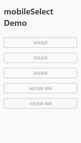
①Ordinary array format - Non-cascade
<div id="day"></div>
<script type="text/javascript">
var mobileSelect1 = new MobileSelect({
trigger: "#day",
title: "单项选择",
wheels: [
{ data: ["周日", "周一", "周二", "周三", "周四", "周五", "周六"] },
],
initValue: "周二",
});
</script>
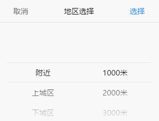
②Json format - Non-cascade
<div id="area"></div>

<script type="text/javascript">
  var mobileSelect2 = new MobileSelect({
    trigger: "#area",
    title: "地区选择",
    wheels: [
      {
        data: [
          { id: "1", value: "附近" },
          { id: "2", value: "上城区" },
          { id: "3", value: "下城区" },
          { id: "4", value: "江干区" },
          { id: "5", value: "拱墅区" },
          { id: "6", value: "西湖区" },
        ],
      },
      {
        data: [
          { id: "1", value: "1000米" },
          { id: "2", value: "2000米" },
          { id: "3", value: "3000米" },
          { id: "4", value: "5000米" },
          { id: "5", value: "10000米" },
        ],
      },
    ],
    onChange: function (data, indexArr, msInstance) {
      console.log(data);
    },
  });
</script>
Example:
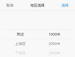
③Json format - Cascade
<div id="area2"></div>
<script type="text/javascript">
var mobileSelect3 = new MobileSelect({
trigger: "#area2",
title: "地区选择-联动",
wheels: [
{
data: [
{
id: "1",
value: "附近",
childs: [
{ id: "1", value: "1000米" },
{ id: "2", value: "2000米" },
{ id: "3", value: "3000米" },
{ id: "4", value: "5000米" },
{ id: "5", value: "10000米" },
],
},
{ id: "2", value: "上城区" },
{ id: "3", value: "下城区" },
{ id: "4", value: "江干区" },
{ id: "5", value: "拱墅区" },
{ id: "6", value: "西湖区" },
],
},
],
initValue: "附近 2000米",
onChange: function(data, indexArr, msInstance) {
console.log(data);
},
});
</script>
Example:
④How to use in React or Vue
Use in React demo:
import { useState, useRef, useEffect } from "react";
import MobileSelect from "mobile-select";
export default function MsComponent(props) {
const tirggerRef = useRef(null);
const [selectedVal, setSelectedVal] = useState('');
let msInstance = null;
useEffect(() => {
if(!msInstance){
msInstance = new MobileSelect({
wheels: [
{ data: ["周日", "周一", "周二", "周三", "周四", "周五", "周六"] },
],
trigger: tirggerRef.current,
triggerDisplayValue: false,
onChange: (data) => {
setSelectedVal(JSON.stringify(data));
},
});
}
return () => {
msInstance?.destroy();
};
}, []);
return (
<div>
<div className="ms-default-trigger" ref={ tirggerRef }>
<div className="your-classname">{ selectedVal || 'please select...' }</div>
</div>
</div>
);
}
Use in Vue demo:
<template>
<div>
<div ref="tirggerRef">
<div class="your-classname">{{ selectedVal || "please select..." }}</div>
</div>
</div>
</template>
<script>
import MobileSelect from "mobile-select";
export default {
name: "mobile-select",
data: () => ({
msInstance: null,
selectedVal: "",
}),
mounted() {
this.msInstance = new MobileSelect({
trigger: this.$refs.tirggerRef,
wheels: [
{ data: ["周日", "周一", "周二", "周三", "周四", "周五", "周六"] },
],
triggerDisplayValue: false,
onChange: (data) => {
this.selectedVal = JSON.stringify(data);
},
});
},
unmounted() {
this.msInstance.destroy();
},
};
</script>
⑤Json format - Data field mapping
<div id="trigger6"></div>
<script type="text/javascript">
var mobileSelect6 = new MobileSelect({
trigger: "#trigger6",
title: "keyMap",
wheels: [
{
data: [
{
id: "1",
title: "A",
children: [
{ id: "A1", title: "A-a" },
{ id: "A2", title: "A-b" },
{ id: "A3", title: "A-c" },
],
},
{
id: "1",
title: "B",
children: [
{ id: "B1", title: "B-a" },
{ id: "B2", title: "B-b" },
{ id: "B3", title: "B-c" },
],
},
],
},
],
keyMap: {
id: "id",
value: "title",
childs: "children",
},
onChange: function(data, indexArr, msInstance) {
console.log(data);
},
});
</script>
Options
| Option | Default | Type | Version | Description |
|---|
| trigger | Required parameter. No default value | String or HTMLElement | | DOM selector string or HTMLElement element
e.g. '#my-trigger' or document.querySelector('#my-trigger') |
| wheels | Required parameter. No default value | Array | | The data displayed on the wheel |
| onChange | function(data, indexArr, instance){} | function | ≥1.2.0 | A callback function after successful selected |
| onTransitionEnd | function(data, indexArr, instance){} | function | ≥1.2.0 | A callback function that after each gesture sliding |
| cancel | function(data, indexArr, instance){} | function | | A callback function after cancel selected, return last successful selected data |
| onShow | function(instance){} | function | | A callback when the panel is show |
| onHide | function(instance){} | function | | A callback when the panel is hidden |
| title | '' | String | | Component title |
| position | [0,0,0,…] | Array | | Initialize positioning |
| colWidth | [1,1,2,…] | Array | | col width setting |
| connector | ' ' | String | | When there are multiple wheels, set the connection to connect multiple values, the default value is a space. |
| initValue | '1 2' | String | ≥1.2.0 | initial value, usually used in scene that show form data.
(If a 'connector' is configured, the 'initValue' should also be joining character strings by custom connector.) |
| autoFocus | false | Boolean | ≥1.2.0 | auto show panel after initialization |
| ensureBtnText | '确认' | String | | The text content of comfirm button |
| cancelBtnText | '取消' | String | | The text content of cancel button |
| ensureBtnColor | '#1e83d3' | String | | The text color of the comfirm button |
| cancelBtnColor | '#666666' | String | | The text color of the cancel button |
| titleColor | '#000000' | String | | The text color of the component title |
| titleBgColor | '#ffffff' | String | | The background color of the component title |
| textColor | '#000000' | String | | The text color of the wheels |
| bgColor | '#ffffff' | String | | The Wheels background color |
| maskOpacity | 0.7 | Number | | Mask opacity |
| keyMap | {id:'id', value:'value', childs:'childs'} | Object | | Field name mapping, applies to field names that do not match id, value, childs |
| triggerDisplayValue | true | Boolean | ≥1.2.0 | When the click is confirmed, the trigger's innerHtml becomes the selected data.
( If there are other elements in the trigger, you can set it to false. If you need to display data elsewhere, you can use the data returned by 'onChange()' to stitch yourself ) |
| scrollSpeed | 1 | Number | ≥1.2.0 | The (wheels)slider scroll speed |
Tips: The meaning of the parameters returned in the callback function is as follows
- indexArr is the currently selected index array, such as[0,0,1]
- data is the currently selected json array, such as[{id:'1',value:'hello'},{id:'2',value:'world'}]
Functions:
| Function | Arguments | Version | Description |
|---|
| show() | no-argument | | show the compontent |
| hide() | no-argument | | hide the compontent |
| setTitle() | string | | Set the title of the component |
| locatePosition() | sliderIndex, posIndex | | Pass the position array parameter, relocate the position of the wheel |
| updateWheel() | sliderIndex, data | | Re-render the specified wheel |
| updateWheels() | data | | Re-render the all wheel(Only used in cascading data forma) |
| getValue() | no-argument | | Gets the value selected by the component |
| destroy() | no-argument | ≥1.2.0 | Destroying a component instance |
Tips: The function parameters need to be passed as follows
- SliderIndex represents the index of the wheel to be modified
- PosIndex represents the location index
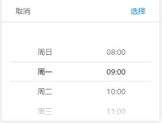
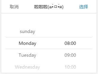
①Demo of use the function :
<div id="day"></div>
<script>
var mySelect = new MobileSelect({
trigger: '#day',
wheels: [
{data:['周日','周一','周二','周三','周四','周五','周六']},
{data:['08:00','09:00','10:00','11:00','12:00','13:00','14:00']}
],
initValue: "周一 09:00",
colWidth: [1, 2]
});
mySelect.setTitle('啦啦啦(๑•̀ㅁ•́ฅ)');
mySelect.updateWheel(0,['sunday','Monday','Tuesday','Wednesday','Thursday','Friday','Saturday']);
mySelect.locatePosition(1,0);
mySelect.destroy();
</script>
Base example → Function after operation
②ajax asynchronous fill data
<div id="trigger6"></div>
<script type="text/javascript">
var mobileSelect6 = new MobileSelect({
trigger: '#trigger6',
title: 'ajax fill data - non-cascade',
wheels: [
{data:[
{id:'1',value:'choose area'},
]},
{data:[
{id:'1',value:'choose distance'},
]}
],
onChange: function(data, indexArr, msInstance) {
console.log(data);
},
});
$.ajax({
type: "POST",
url: "xxxx",
data: {},
dataType: "json",
success: function(res){
mobileSelect6.updateWheel(0, res.data.area);
mobileSelect6.updateWheel(1, res.data.distance);
}
});
</script>
<div id="trigger7"></div>
<script type="text/javascript">
var mobileSelect7 = new MobileSelect({
trigger: '#trigger7',
title: 'ajax fill data - cascade',
wheels: [
{data:[
{
id:'1',
value:'',
childs:[
{id:'A1',value:''},
]
}
]}
],
onChange: function(data, indexArr, msInstance) {
console.log(data);
},
});
$.ajax({
type: "POST",
url: "xxxx",
data: {},
dataType: "json",
success: function(res){
mobileSelect7.updateWheels(res.data);
}
});
</script>
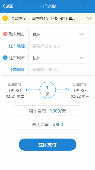
Project demo:
Use the onTransitionEnd (), onChange (), updateWheel (), locatePosition () functions to do the following:
- choose the date of the day, not more than today has been too.
- Select the time to take the car, the car must not exceed the time to take the car (including the date and time).
🥯 Change Logs
2017-04-20[update]
As the input tag in the iphone, the cursor will flashing.
As well as the input tag open in the iphone6P / iphone7P chrome will appear offset phenomenon.
So do not use the input tag, instead by the ordinary div trigger.
The value selected will be written in the div trigger‘s innerHTML.
It is recommended to use the callback (indexArr, data) function to get the selected value.
2017-07-27[bug fixed]
Repair the issues raised by [li362692680]:
Cascade selection can not initially locate the secondary selection box.
At the same time repair the init function of the entry array parameter length is less than the number of wheels can not move the problem.
2017-07-30[bug fixed + update]
Repair the issues raised by [leohgbs]:
- The update does not take into account the problem that the data is json.
- After the update, the cached data is not updated, resulting in a callback data source error.
Change the variable name: jsonData → cascadeJsonData
Change method name: updateWheels() → reRenderWheels()
The updateWheel() method does not change.
Add new API: updateWheels(data) is used to update the entire data source in cascading data format.
2017-08-15[update]
Repair in cascade state, single click failed.
Delete the comment after the brace in the js file(In the php environment there will be js code failure situation).
Fix ios potential bug.
Add API: show()
Add API: getValue()
Add option style options(Modify the connector / button text / button color / background color and so on):
connector
ensureBtnText
ensureBtnColor
cancelBtnText
cancelBtnColor
titleColor
titleBgColor
bgColor
textColor
Supports color formats such as #ff0000 rgba(0,255,255,0.5) orange.
2017-09-07[update]
Add keyMap function
Update README
2017-10-17[update]
Add cancel callback
2017-12-12[update]
Remove cancel callback
Thanks for [ngdly]:
Add onshow callback
Add onhide callback
Add show function
Add hide function
2018-01-28[update]
Thanks for [aaalog]:
Modify the method for listening to click events.
To fix the click event which will triggered twice the transitionEnd funtion:
Remove addListenerLi(), singleClick() internal methods,
Click judgment directly in the touchend event.
2018-01-29[update]
Add maskOpacity option
2019-05-15[update]
Thanks for [Jackliu007888]:
Add option colWidth
2022-08[refactor]
- Using TS refactor and vite build tools, build the type production of the specification (UMD, ESM, IIFE).
- Add the attribute
initValue, autoFocus, scrollSpeed' - Add function
destroy() - Optimize method and attribute names:
callback--> onChange
cancel --> onCancel
transitionEnd --> onTransitionEnd
triggerDisplayData --> triggerDisplayValue - Add CSS style class name prefix to prevent style conflicts
- Docs optimization: Add guidance on how to use it in the framework
📘 License
MIT LICENSE
Copyright (c) 2017-present, LIHONG OU(onlyhom)


