Product
Introducing License Enforcement in Socket
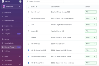
Ensure open-source compliance with Socket’s License Enforcement Beta. Set up your License Policy and secure your software!
native-x-theme
Advanced tools
This modules helps you define the theme for all native-x components.
yarn add native-x-theme
npm install native-x-theme
import { COLOR, THEME, ThemeProvider } from '@native-x/theme'

export const THEMES = {
  [THEME.LIGHT]: {
    [COLOR.PRIMARY]: '#FFFFFF',
    [COLOR.SECONDARY]: '#212121',
    [COLOR.TERTIARY]: '#707070',
    [COLOR.ACCENT]: '#0AD572',
    [COLOR.DIVIDER]: '#BDBDBD',
    [COLOR.DISABLED]: '#F5F5F5',
    [COLOR.INPUT]: '#F5F5F5',
    [COLOR.SUCCESS]: '#63D471',
    [COLOR.ERROR]: '#ED2733',
    [COLOR.WARNING]: '#F9D101',
    [COLOR.TRANSPARENT]: 'transparent',
  },
  [THEME.DARK]: {
    [COLOR.PRIMARY]: '#212121',
    [COLOR.SECONDARY]: '#FFFFFF',
    [COLOR.TERTIARY]: '#F3E8C0',
    [COLOR.ACCENT]: '#71F28F',
    [COLOR.DIVIDER]: '#707070',
    [COLOR.DISABLED]: '#252525',
    [COLOR.INPUT]: '#F5F5F5',
    [COLOR.SUCCESS]: '#63D471',
    [COLOR.ERROR]: '#ED2733',
    [COLOR.WARNING]: '#F9D101',
    [COLOR.TRANSPARENT]: 'transparent',
  },
}

function App() {
  return <ThemeProvider theme={'dark'} themes={themes}>
    {...}
  </ThemeProvider>
}
useTheme()function MyComponent() {
const {
// current theme
currentTheme,
// name of the current theme
themeName,
// all the declared themes by name
themes,
// get a color by name `getColor(name: string, theme?: string)`
getColor,
// get text color by name `getTextColor(name: string, theme?: string)`
getTextColor,
// get background color by name `getBackgroundColor(name: string, theme?: string)`
getBackgroundColor,
// get border color by name `getBorderColor(name: string, side?: BorderSide, theme?: string)
getBorderColor,
} = useTheme()
const accentBackgroundStyle = getBackgroundColor(COLOR.ACCENT)
return <View style={accentBackgroundStyle}>
{...}
</View>
}
useContainerStyle()import { ContainerStyleProps, useContainerStyle } from '@native-x/theme'
interface Props extends ContainerStyleProps {
...
}
function MyComponent({
backgroundColor,
border,
borderBottomColor,
borderColor,
borderLeftColor,
borderRadius,
borderRightColor,
borderTopColor,
opacity,
padding,
}: Props) {
const style = useContainerStyle({
backgroundColor,
border,
borderBottomColor,
borderColor,
borderLeftColor,
borderRadius,
borderRightColor,
borderTopColor,
opacity,
padding,
})
return <View style={style}>
{...}
</View>
}
You can also extend specific style types:
interface Props extends BackgroundColorStyleProps,
  BorderColorStyleProps,
  BorderSizeStyleProps,
  OpacityStyleProps,
  ShadowStyleProps,
  PaddingStyleProps {
  ...
}
useTextStyle()import { TextStyleProps, useTextStyle } from '@native-x/theme'
interface Props extends TextStyleProps {
...
}
function MyComponent({ fontSize, lineHeight, textColor }: Props) {
const style = useTextStyle({ fontSize, lineHeight, textColor })
return <Text style={style}>{...}</Text>
}
Or use individual styles as below
interface Props extends FontSizeStyleProps,
  LineHeightStyleProps,
  TextColorStyleProps {
  ...
}
useShadowStyle()import { ShadowProps, useShadowStyle } from '@native-x/theme'
interface Props extends ShadowProps {}
function MyComponent({ shadow, shadowColor }: Props) {
const style = useShadowStyle({ shadow, shadowColor })
return <Text style={style}>{...}</Text>
}
autoSwitchThemeThemeProvider will automatically switch between dark and light theme depending on system
appearance. By default this value is set to false. Auto theme switching won't work if you don't
have themes by name dark (THEME.DARK) and light (THEME.LIGHT).
autoSwitchStatusBarThemeProvider will automatically switch status bar content to dark-content or light-content
depending on system appearance. By default this value is set to false and works only when both
autoSwitchStatusBar and autoSwitchTheme is set to true.
Here is an example of the release type that will be done based on a commit messages:
| Commit message | Release type |
|---|---|
| fix: [comment] | Patch Release |
| feat: [comment] | Minor Feature Release |
| perf: [comment] | Major Feature Release |
| doc: [comment] | No Release |
| refactor: [comment] | No Release |
| chore: [comment] | No Release |
FAQs
Theme setup for native-x components
The npm package native-x-theme receives a total of 253 weekly downloads. As such, native-x-theme popularity was classified as not popular.
We found that native-x-theme demonstrated a not healthy version release cadence and project activity because the last version was released a year ago. It has 1 open source maintainer collaborating on the project.
Did you know?

Socket for GitHub automatically highlights issues in each pull request and monitors the health of all your open source dependencies. Discover the contents of your packages and block harmful activity before you install or update your dependencies.

Product
Ensure open-source compliance with Socket’s License Enforcement Beta. Set up your License Policy and secure your software!

Product
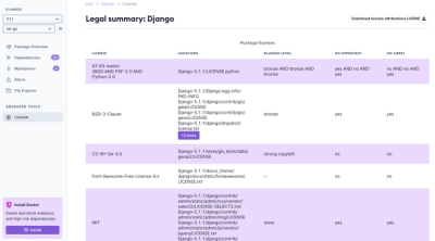
We're launching a new set of license analysis and compliance features for analyzing, managing, and complying with licenses across a range of supported languages and ecosystems.

Product
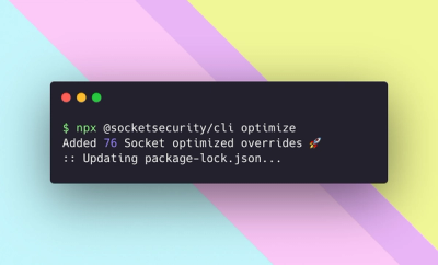
We're excited to introduce Socket Optimize, a powerful CLI command to secure open source dependencies with tested, optimized package overrides.