NgVoting
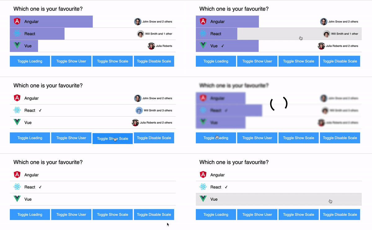
ng-voting is a reusable Angular component that can be used to easily implement a voting platform in your app. It is responsive and completely customizable.
Demo

Table of Contents
Installation
npm i ng-voting
Usage
- Import the
NgVotingComponent in the module of your choice.
...
import { NgVotingComponent } from 'ng-voting'

@NgModule({
  declarations: [
    AppComponent
  ],
  imports: [
    ...,
    NgVotingComponent
  ],
  providers: [],
  bootstrap: [AppComponent]
})
export class AppModule { }
- In
your.component.ts add some data of type Voting. can be import like import { Voting } from ng-voting
- In
your.component.html add the ng-voting tag and pass you data of type Voting to [data] as shown below.
your.component.ts
import { Voting } from 'ng-voting';
@Component({
selector: 'your-root',
templateUrl: './your.component.html'
})
export class YourComponent {
data: Voting = {
question: "Do you like ng-voting?",
options: [
{
label: "Yes",
value: "yes",
votesCount: 1,
imageUrl: "optional-image-url",
users: [
...users,
{
name: "John Snow",
image: "assets/profile1.jpg"
},
]
},
{
label: "No",
value: "no",
votesCount: 0,
imageUrl: "optional-image-url"
}
]
}
optionSelected(value: string) {
}
your.component.html
<ng-voting [data]="data" (selected)="optionSelected($event)"></ng-voting>
Voting
export interface Voting {
  question: string;
  options: Option[];
}

export interface Option {
  label: string;
  value: string;
  votesCount: number;
  imageUrl?: string;
  users?: { name: string; image?: string }[];
  color?: string;
  bgColor?: string;
  selected?: boolean;
}
Customize
- The component can be completely customized, from adding background colors, font sizes to modifying the margins
- Import the
StyleParams like import { StypeParams } from 'ng-voting', and create and object.
- Pass the object to
[styleParams] in your html. (use rem instead of px)
styleParams: StyleParams = {
borderColor: "#d3d3d3",
margin: "1rem",
hoverColor: "#ebebeb",
scaleColor: "#9797dc",
fontSize: "1.5rem",
topicBackgroundColor: "#ffffff",
optionsBackgroundColor: "#ffffff",
topicFontColor: "black",
optionsFontColor: "black",
};
// In your html file, pass that object. <ng-voting [data]="data" [styleParams]="styleParams" (selected)="increaseVoteCount($event)"></ng-voting>
API
[data] | Voting | Voting topic and option and their details | undefined | true |
[isLoading] | boolean | Show loading state | false | false |
[showUsers] | boolean | Show the users count on option | true | false |
[showScale] | boolean | Show the percentage scale of voting | true | false |
[disable] | boolean | Disable voting | false | false |
[selectedOptionValue] | boolean | Shows a checkmark of which option was selected by user | "" | false |
[styleParams] | StyleParams | Customize the Voting component. | borderColor: '#d3d3d3', margin: '1rem', hoverColor: '#ebebeb', scaleColor: '#9797dc', fontSize: '1.5rem', topicBackgroundColor:'#ffffff', optionsBackgroundColor:'#ffffff', topicFontColor: 'black', optionsFontColor: 'black' | false |
(selected) | string | Emits the selected option value | | |
<ng-voting
        [data]="data"
        [styleParams]="styleParams"
        [showScale]="true"
        [showUsers]="true"
        [isLoading]="false"
        [selectedOptionValue]="''"
        [disable]="false"
        (selected)="handleVote($event)"></ng-voting>
Whats next
- A customization app, where you can try out the component and generate the code for it.
- More reusable components.
Author


