Product
Socket Now Protects the Chrome Extension Ecosystem
Socket is launching experimental protection for Chrome extensions, scanning for malware and risky permissions to prevent silent supply chain attacks.
ngp-image-picker
Advanced tools
Angular library for the selection, edition and compression of images in png, jpeg and webp formats.
Angular library for the selection, edition and compression of images in png, jpeg and webp formats This library was generated with Angular CLI version 15, and support the latest version of angular. Previous versions of this library relied entirely on angular material components. Today it is made with html and css without any extra components. Recently new functionality has been added. More image editing capabilities, initial compression indexing is now available for the first time an more
In many projects it is of interest to upload images for a backend, and sometimes we have to consult other programs for the compression of images and the change of format to improve the performance of the page. With NgpImagePicker this is possible in real time with for each image that you want to upload.
npm i ngp-image-picker --save
You must import the module NgpImagePicker where you will use it and use the component
***
import { NgpImagePickerModule } from 'ngp-image-picker';
@NgModule({
  ***
  imports: [
    NgpImagePickerModule,
  ],
****
})
In your component:
<ngp-image-picker [_config]="imagePickerConf" ($imageChanged)="onImageChange($event)"></ngp-image-picker>
In .ts file
export class ExampleComponent {
  imagePickerConf: ImagePickerConf = {
    borderRadius: '4px',
    language: 'en',
    width: '320px',
    height: '240px',
  };
}
export class ExampleComponent {
  config1: ImagePickerConf = {
    borderRadius: '16px',
    language: 'en',
  };
  config2: ImagePickerConf = {
    borderRadius: '50%',
    language: 'es',
    width: '200px',
    height: '200px',
  };
  config3: ImagePickerConf = {
    borderRadius: '4px',
    language: 'en',
  };
  initialImage = 'https:example-server.com/public/main.png';
}
<h2>Basic ussage</h2>
<ngp-image-picker [_config]="config1"></ngp-image-picker>
<br />
<h2>Custom comfig</h2>
<ngp-image-picker [_config]="config2"></ngp-image-picker>
<br />
<h2>Initial Image</h2>
<ngp-image-picker [_imageSrc]="initialImage" ($imageChanged)="onImageChanged($event)" [_config]="config3"> </ngp-image-picker>

The NgpImagePicker component has a setting to change the width, length, the aspectRatio, and objectFit properti of the loaded image. In addition to the language ( en | es | fr | de ). It also has an initial compression ratio option that by default is null.
It is important to note that the quality factor for image compression is only for formats such as: jpeg and webp.
The interface looks like this:
export interface ImagePickerConf {
  width?: string;
  height?: string;
  borderRadius?: string;
  aspectRatio?: number | null;
  objectFit?: 'cover' | 'contain' | 'fill' | 'revert' | 'scale-down';
  compressInitial?: number; // Range from [1-100]
  language?: string;
  hideDeleteBtn?: boolean;
  hideDownloadBtn?: boolean;
  hideEditBtn?: boolean;
  hideAddBtn?: boolean;
}
| name | type | description | default |
|---|---|---|---|
| width | string | Set the specific width of the div that contain the image uploaded | null |
| height | string | Set the specific height of the div that contain the image uploaded | null |
| borderRadius | string | Set the property for the holder of the image and the image | null |
| aspectRatio | string | This apply a specifict aspect ratio to the div, use this with only setting a width and you can archive the ratio that you want it | null |
| objectFit | string | Default is 'cover', but if 'contain' is used the content will be scaled to maintain its aspect ratio while fitting inside the element's content box. | 'cover' |
| compressInitial | number | Quality factor applied to images with format: "webp, jpeg" | null |
| language | string | set the translations object | 'en' |
| hideDeleteBtn | boolean | hide the botton | false |
| hideDownloadBtn | boolean | hide the botton | false |
| hideEditBtn | boolean | hide the botton | false |
| hideAddBtn | boolean | hide the botton | false |
A basic configuration object with compression applied would be:
export class ExampleComponent {
  config1: ImagePickerConf = {
    language: 'en',
    compressInitial: 90
  };
The above example means that once an image is loaded from the file system, a compression quality is applied to it with a value of 0.9, and the resulting image will be reformatted as a jpeg.
Once you have selected an image, 4 buttons are enabled below the image:
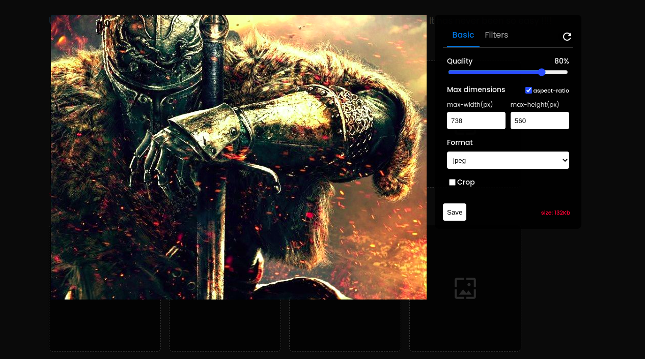
In the edit panel, you can change the quality ratio to compress the file size (in kb). Also changing width and height in px keeping aspect ratio or not, is selectable. You can change the image format as you wish, the options are 'png', 'webp','jpeg'. The 'Png' format is not affected by changing the quality ratio. Another capability is that you can crop the image by simply dragging and dropping the cropping component. And by clicking on the crop button.
I just added a new tab for applying filters. Now you can not only crop, compress and reformat your image, but you have new features like:
🔥🔥🔥🔥🔥 You can have in your website a component like the instagram or linkedin for editing your images. 🔥🔥🔥🔥🔥


FAQs
Angular library for the selection, edition and compression of images in png, jpeg and webp formats.
The npm package ngp-image-picker receives a total of 142 weekly downloads. As such, ngp-image-picker popularity was classified as not popular.
We found that ngp-image-picker demonstrated a not healthy version release cadence and project activity because the last version was released a year ago. It has 1 open source maintainer collaborating on the project.
Did you know?

Socket for GitHub automatically highlights issues in each pull request and monitors the health of all your open source dependencies. Discover the contents of your packages and block harmful activity before you install or update your dependencies.

Product
Socket is launching experimental protection for Chrome extensions, scanning for malware and risky permissions to prevent silent supply chain attacks.

Product
Add secure dependency scanning to Claude Desktop with Socket MCP, a one-click extension that keeps your coding conversations safe from malicious packages.

Product
Socket now supports Scala and Kotlin, bringing AI-powered threat detection to JVM projects with easy manifest generation and fast, accurate scans.