Product
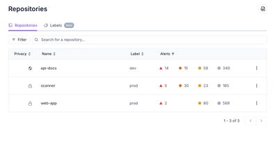
Redesigned Repositories Page: A Faster Way to Prioritize Security Risk
Our redesigned Repositories page adds alert severity, filtering, and tabs for faster triage and clearer insights across all your projects.
DEMO: https://ngx-color.vercel.app
13 Different Pickers - Sketch, Photoshop, Chrome, Twitter and many more
Make Your Own - Use the building block components to make your own
This is a port of react-color by casesandberg
Latest version available for each version of Angular
| ngx-color | Angular |
|---|---|
| 4.1.1 | 8.x |
| 5.1.4 | 9.x |
| 6.2.0 | 10.x 11.x |
| 7.3.3 | 12.x 13.x |
| 8.0.3 | 14.x 15.x |
| current | >= 16.x |
npm install ngx-color --save
import { ColorSketchModule } from 'ngx-color/sketch';

@NgModule({
  imports: [
    ColorSketchModule, // added to imports
  ],
})
class YourModule {}
<color-sketch [color]="state" (onChangeComplete)="changeComplete($event)"></color-sketch>
import { ColorAlphaModule } from 'ngx-color/alpha'; // <color-alpha-picker></color-alpha-picker>
import { ColorBlockModule } from 'ngx-color/block'; // <color-block></color-block>
import { ColorChromeModule } from 'ngx-color/chrome'; // <color-chrome></color-chrome>
import { ColorCircleModule } from 'ngx-color/circle'; // <color-circle></color-circle>
import { ColorCompactModule } from 'ngx-color/compact'; // <color-compact></color-compact>
import { ColorGithubModule } from 'ngx-color/github'; // <color-github></color-github>
import { ColorHueModule } from 'ngx-color/hue'; // <color-hue-picker></color-hue-picker>
import { ColorMaterialModule } from 'ngx-color/material'; // <color-material></color-material>
import { ColorPhotoshopModule } from 'ngx-color/photoshop'; // <color-photoshop></color-photoshop>
import { ColorSketchModule } from 'ngx-color/sketch'; // <color-sketch></color-sketch>
import { ColorSliderModule } from 'ngx-color/slider'; // <color-slider></color-slider>
import { ColorSwatchesModule } from 'ngx-color/swatches'; // <color-swatches></color-swatches>
import { ColorTwitterModule } from 'ngx-color/twitter'; // <color-twitter></color-twitter>
import { ColorShadeModule } from 'ngx-color/shade'; // <color-shade-picker></color-shade-picker>
Color controls what color is active on the color picker. You can use this to initialize the color picker with a particular color, or to keep it in sync with the state of a parent component.
Color accepts either a string of a hex color '#333' or a object of rgb or hsl
values { r: 51, g: 51, b: 51 } or { h: 0, s: 0, l: .10 }. Both rgb and hsl
will also take a a: 1 value for alpha. You can also use transparent.
<color-sketch color="#fff" (onChangeComplete)="handleChangeComplete($event)"></color-sketch>
In this case, the color picker will initialize with the color #fff. When the
color is changed, handleChangeComplete will fire and set the new color to
state.
Pass a function to call every time the color is changed. Use this to store the color in the state of a parent component or to make other transformations.
Keep in mind this is called on drag events that can happen quite frequently. If
you just need to get the color once use onChangeComplete.
import { Component } from '@angular/core';
import { ColorEvent } from 'ngx-color';

@Component({
  selector: 'selector-name',
  template: ` <color-sketch (onChange)="handleChange($event)"></color-sketch> `,
})
export class NameComponent {
  constructor() {}

  handleChange($event: ColorEvent) {
    console.log($event.color);
    // color = {
    //   hex: '#333',
    //   rgb: {
    //     r: 51,
    //     g: 51,
    //     b: 51,
    //     a: 1,
    //   },
    //   hsl: {
    //     h: 0,
    //     s: 0,
    //     l: .20,
    //     a: 1,
    //   },
    // }
  }
}
Pass a function to call once a color change is complete.
Some pickers have specific APIs that are unique to themselves:
316px16pxhorizontal or vertical. Default horizontal170px['#D9E3F0', '#F47373', '#697689', '#37D67A', '#2CCCE4', '#555555', '#dce775', '#ff8a65', '#ba68c8']hide or top. Default toponMouseOver on the
<Swatch>s within this component. Gives the args (color, event)false252px["#f44336", "#e91e63", "#9c27b0", "#673ab7", "#3f51b5", "#2196f3", "#03a9f4", "#00bcd4", "#009688", "#4caf50", "#8bc34a", "#cddc39", "#ffeb3b", "#ffc107", "#ff9800", "#ff5722", "#795548", "#607d8b"]2814onMouseOver on the
<Swatch>s within this component. Gives the args (color, event)['#4D4D4D', '#999999', '#FFFFFF', '#F44E3B', '#FE9200', '#FCDC00', '#DBDF00', '#A4DD00', '#68CCCA', '#73D8FF', '#AEA1FF', '#FDA1FF', '#333333', '#808080', '#cccccc', '#D33115', '#E27300', '#FCC400', '#B0BC00', '#68BC00', '#16A5A5', '#009CE0', '#7B64FF', '#FA28FF', '#000000', '#666666', '#B3B3B3', '#9F0500', '#C45100', '#FB9E00', '#808900', '#194D33', '#0C797D', '#0062B1', '#653294', '#AB149E']onMouseOver on the
<Swatch>s within this component. Gives the args (color, event)212px['#B80000', '#DB3E00', '#FCCB00', '#008B02', '#006B76', '#1273DE', '#004DCF', '#5300EB', '#EB9694', '#FAD0C3', '#FEF3BD', '#C1E1C5', '#BEDADC', '#C4DEF6', '#BED3F3', '#D4C4FB']hide, top-left or top-right. Default
top-leftonMouseOver on the
<Swatch>s within this component. Gives the args (color, event)316px16pxhorizontal or vertical. Default horizontalNone
Color Pickerfalse['#D0021B', '#F5A623', '#F8E71C', '#8B572A', '#7ED321', '#417505', '#BD10E0', '#9013FE', '#4A90E2', '#50E3C2', '#B8E986', '#000000', '#4A4A4A', '#9B9B9B', '#FFFFFF']
presetColors may also be described as an array of objects with
colorandtitleproperties:[{ color: '#f00', title: 'red' }]or a combination of both
200onMouseOver on the <Swatch>s
within this component. Gives the args (color, event)320240onMouseOver on the
<Swatch>s within this component. Gives the args (color, event)276px['#FF6900', '#FCB900', '#7BDCB5', '#00D084', '#8ED1FC', '#0693E3', '#ABB8C3', '#EB144C', '#F78DA7', '#9900EF']hide, top-left or top-right. Default
top-leftonMouseOver on the
<Swatch>s within this component. Gives the args (color, event)316px16pxFAQs
A Collection of Color Pickers from Sketch, Photoshop, Chrome & more
We found that ngx-color demonstrated a healthy version release cadence and project activity because the last version was released less than a year ago. It has 0 open source maintainers collaborating on the project.
Did you know?

Socket for GitHub automatically highlights issues in each pull request and monitors the health of all your open source dependencies. Discover the contents of your packages and block harmful activity before you install or update your dependencies.

Product
Our redesigned Repositories page adds alert severity, filtering, and tabs for faster triage and clearer insights across all your projects.

Security News
Slopsquatting is a new supply chain threat where AI-assisted code generators recommend hallucinated packages that attackers register and weaponize.

Security News
Multiple deserialization flaws in PyTorch Lightning could allow remote code execution when loading untrusted model files, affecting versions up to 2.4.0.