What is notistack?
notistack is a highly customizable notification library for React. It allows you to display snackbars (toasts) with ease and provides a variety of options for customization, including positioning, duration, and styling.
What are notistack's main functionalities?
Basic Snackbar
This code demonstrates how to display a basic snackbar using notistack. The `SnackbarProvider` component wraps the application, and the `useSnackbar` hook is used to trigger the snackbar.
import React from 'react';
import { SnackbarProvider, useSnackbar } from 'notistack';
function App() {
const { enqueueSnackbar } = useSnackbar();
const handleClick = () => {
enqueueSnackbar('This is a basic snackbar');
};
return (
<div>
<button onClick={handleClick}>Show Snackbar</button>
</div>
);
}
export default function IntegrationNotistack() {
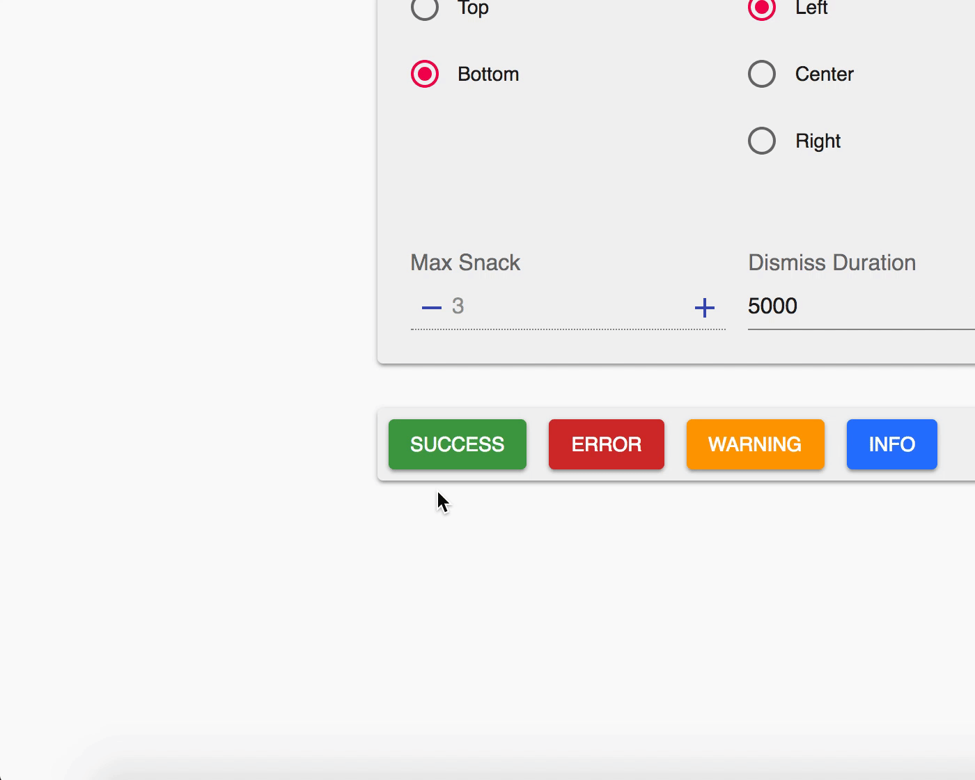
return (
<SnackbarProvider maxSnack={3}>
<App />
</SnackbarProvider>
);
}
Custom Snackbar Variants
This code demonstrates how to display snackbars with different variants (success, error, warning, info) using notistack. The `enqueueSnackbar` function is called with a variant option to customize the type of snackbar.
import React from 'react';
import { SnackbarProvider, useSnackbar } from 'notistack';

function App() {
  const { enqueueSnackbar } = useSnackbar();

  const handleClickVariant = (variant) => () => {
    enqueueSnackbar('This is a ' + variant + ' snackbar', { variant });
  };

  return (
    <div>
      <button onClick={handleClickVariant('success')}>Show Success Snackbar</button>
      <button onClick={handleClickVariant('error')}>Show Error Snackbar</button>
      <button onClick={handleClickVariant('warning')}>Show Warning Snackbar</button>
      <button onClick={handleClickVariant('info')}>Show Info Snackbar</button>
    </div>
  );
}

export default function IntegrationNotistack() {
  return (
    <SnackbarProvider maxSnack={3}>
      <App />
    </SnackbarProvider>
  );
}
Custom Snackbar Styling
This code demonstrates how to apply custom styling to a snackbar using notistack. The `makeStyles` function from Material-UI is used to create custom styles, which are then applied to the snackbar via the `enqueueSnackbar` function.
import React from 'react';
import { SnackbarProvider, useSnackbar } from 'notistack';
import { makeStyles } from '@material-ui/core/styles';

const useStyles = makeStyles((theme) => ({
  customSnackbar: {
    backgroundColor: theme.palette.primary.main,
    color: theme.palette.primary.contrastText,
  },
}));

function App() {
  const classes = useStyles();
  const { enqueueSnackbar } = useSnackbar();

  const handleClick = () => {
    enqueueSnackbar('This is a custom styled snackbar', {
      classes: {
        root: classes.customSnackbar,
      },
    });
  };

  return (
    <div>
      <button onClick={handleClick}>Show Custom Styled Snackbar</button>
    </div>
  );
}

export default function IntegrationNotistack() {
  return (
    <SnackbarProvider maxSnack={3}>
      <App />
    </SnackbarProvider>
  );
}
Other packages similar to notistack
react-toastify
react-toastify is another popular library for displaying toast notifications in React applications. It offers a simple API and a variety of customization options. Compared to notistack, react-toastify is more focused on ease of use and quick setup, while notistack provides more advanced customization and control over the snackbars.
material-ui
Material-UI is a comprehensive library of React components that implement Google's Material Design. It includes a Snackbar component that can be used for notifications. While Material-UI's Snackbar is powerful and integrates well with other Material-UI components, notistack offers a more specialized and flexible solution for managing snackbars, including stacking and dismissing multiple notifications.
react-notifications-component
react-notifications-component is a library for creating customizable notifications in React. It supports various types of notifications and provides a range of customization options. Compared to notistack, react-notifications-component offers a broader range of notification types but may not provide the same level of integration and ease of use for snackbars specifically.
Notistack is a notification library which makes it extremely easy to display notifications on your web apps. It is highly customizable and enables you to stack snackbars/toasts on top of one another.
Visit documentation website for demos.


Table of Contents
Getting Started
Use your preferred package manager:
npm install notistack
yarn add notistack
How to use
1: Wrap your app inside a SnackbarProvider component: (see docs for a full list of available props)
Note: If you're using material-ui ThemeProvider, make sure SnackbarProvider is a child of it.
import { SnackbarProvider } from 'notistack';

<SnackbarProvider maxSnack={3}>
    <App />
</SnackbarProvider>
2: Export any component that needs to send notification using withSnackbar. By doing this, you'll have access to methods enqueueSnackbar and closeSnackbar, where the former can be used to send snackbars.
import { withSnackbar } from 'notistack';
class MyComponent extends Component {
handleNetworkRequest = () => {
fetchSomeData()
.then(() => this.props.enqueueSnackbar('Successfully fetched the data.'))
.catch(() => this.props.enqueueSnackbar('Failed fetching data.'));
};
render(){
};
};
export default withSnackbar(MyComponent);
2 (alternative): You can use useSnackbar hook in your functional components as well.
import { useSnackbar } from 'notistack';

const MyButton = () => {
    const { enqueueSnackbar, closeSnackbar } = useSnackbar();

    const handleClick = () => {
        enqueueSnackbar('I love hooks');
    };

    return (
        <Button onClick={handleClick}>Show snackbar</Button>
    );
}
Online demo
Visit documentation website to see all the demos.
Or play with a minimal working example: codesandbox
Redux and Mobx support:
notistack is compatible with state management libraries such as Redux and Mobx. See notistack documentation for more info.
Contribution
Open an issue and your problem will be solved.
Author - Contact
Hossein Dehnokhalaji


notistack@1.0.0
August 22, 2020
- Drop
SnackbarContent component and ContentProps props #297
Breaking Changes
className prop is now used to customise styles applied to the content of snackbar (e.g. backgroundColor).- If you were using
className to apply styles to Snackbar component, you should now do so using classes.root.
<SnackbarProvider
-  className={classes.snackbar}
+  classes={{
+    root: classes.snackbar
+  }}
>
ContentProps prop is not supported anymore. Here are alternative ways to pass the same data to snackbar component. For any other
scenario, you should pass you own custom content.
<SnackbarProvider
-  ContentProps={{
-    action: () => <button>dismiss</button>,
-    'aria-describedby': 'some-value',
-  }}
+  action={() => <button>dismiss</button>}
+  ariaAttributes={{
+    'aria-describedby': 'some-value'
+  }}
>
- If you have customised
MuiSnackbarContent through Material-UI theme object, these changes won't automatically
reflect within notistack. You can however, use className prop to apply your customisations.
const theme = createMuiTheme({
  overrides: {
    // no effect within notistack
    MuiSnackbarContent: {
      root: {
        fontSize: '1rem',
      },
    },
  },
});
<br />