OpenGlass UI
The open-source Liquid Glass UI system for React and the web.



Live demo and docs →
Free download ·
Watch the build ·
moelueker.com
Most "liquid glass" on the web is a blur with a border. The few that go further
are one-off effects that fall apart the moment real text, a focus ring, or a
screen reader shows up.
OpenGlass UI is built the other way around: forty accessible components that
happen to be made of glass, not a glass effect with components bolted on. The
material serves the component system, never the reverse.
npm install open-glass-ui react react-dom
import "open-glass-ui/styles.css";
import { Button, Glass, GlassSystemProvider } from "open-glass-ui";

export function App() {
  return (
    <GlassSystemProvider renderer="auto" theme={{ appearance: "system" }}>
      <Glass material="frosted">
        <Button variant="primary">Create project</Button>
      </Glass>
    </GlassSystemProvider>
  );
}
That is the whole setup. One package, one stylesheet, one provider.
The liquid design
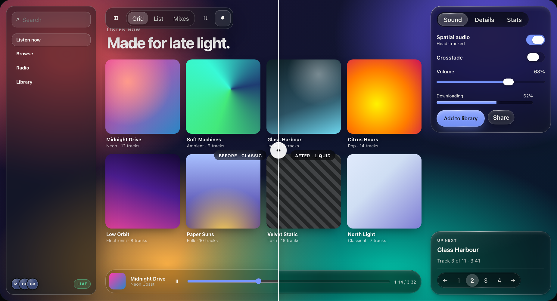
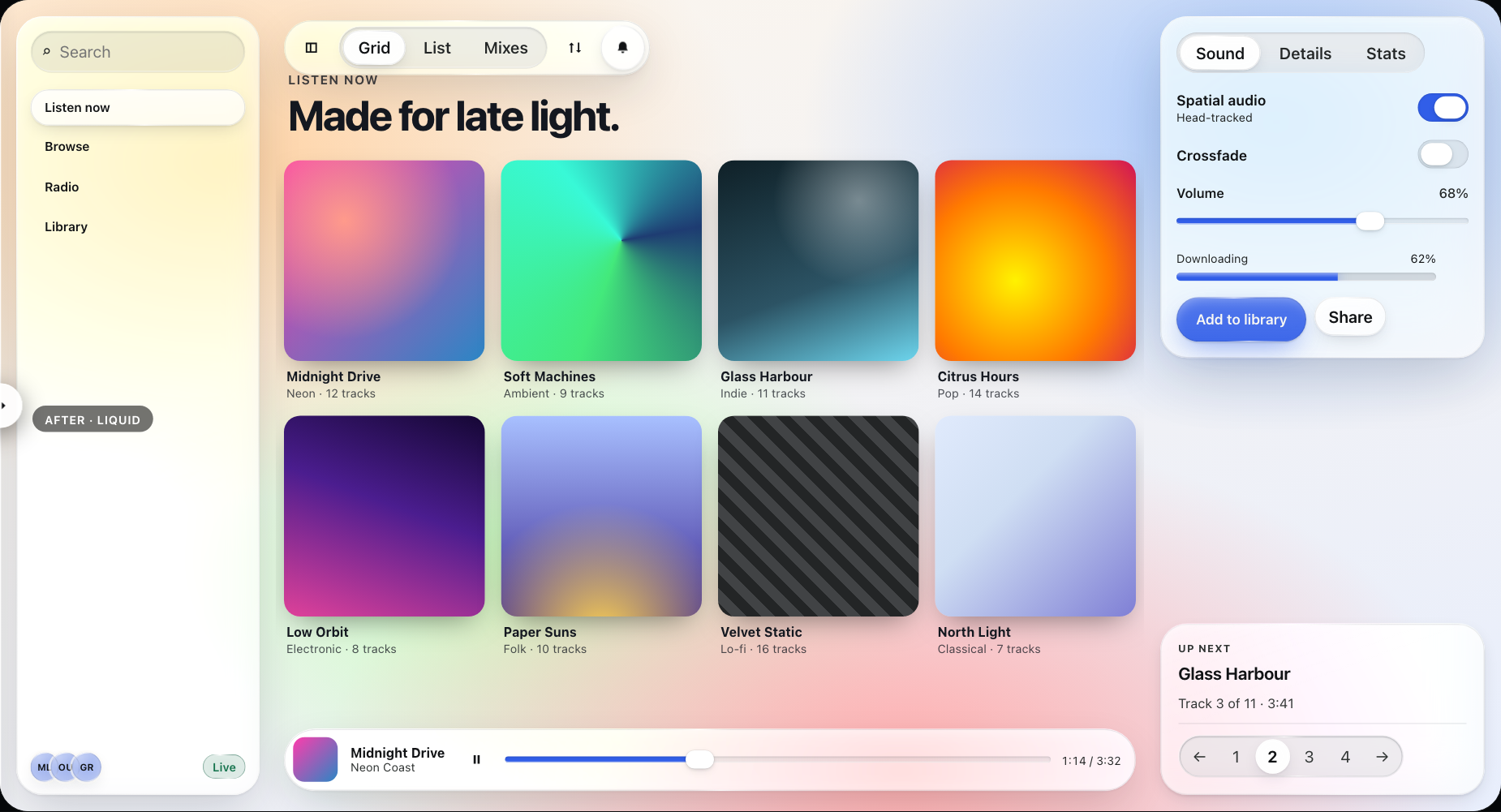
Version 0.4 is a visual rebuild. Glass is clearer and brighter, with one clean
lit edge instead of a border. Controls are pill-shaped, a glass thumb springs
between segments and tabs, and switch and slider thumbs swell into lenses while
you hold them. Dark glass dims what sits behind it and light glass lifts it, so
text stays at WCAG AA contrast over bright, dark, and busy backgrounds.
Make it yours
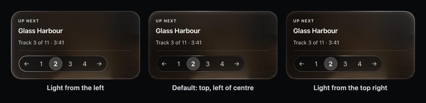
Every surface reads a handful of dials: frost, tint and density, saturation,
brightness, edge highlight, edge lensing, depth, and where the light comes
from. Pick a preset or set any dial, for the whole site, one section, or one
element.
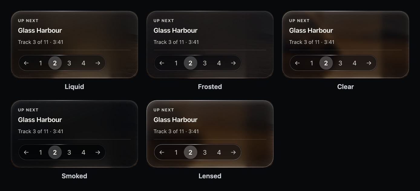
<GlassSystemProvider theme={{ theme: { glass: "frosted" } }}>
<GlassThemeProvider theme={{ glass: { lightAngle: 300 } }}> // one section
<Glass look={{ blur: 0.4, rim: 1.4, lensing: 2 }}> // one surface
Upgrading from 0.3
Nothing changes until you upgrade: a ^0.3.0 range never resolves to 0.4.
When you do upgrade and want the old look, it is one prop:
<GlassSystemProvider design="classic">
  <App />
</GlassSystemProvider>
Scopes nest, so you can move one section at a time. Every class name, prop,
token, and export from 0.3 still works. See docs/MIGRATION.md,
or run pnpm dev and open /compare to see both designs live.
Why you might pick this
| Zero runtime dependencies | The published package depends on nothing. React and React DOM are peers, so your app owns its versions. |
| One import, not forty | Importing a single component costs 28% of the full barrel. The other thirty-nine are shaken out. |
| CSS-first, no surprises | renderer="auto" resolves to plain CSS and never silently escalates. SVG refraction and WebGL are opt-in. |
| Accessible by construction | Reduced motion, reduced transparency, and forced colors are designed states, not afterthoughts. |
| SSR and RSC safe | A server-safe open-glass-ui/core entry never imports React. Verified against Next.js 16. |
| Tested where it matters | 137 unit tests and 179 browser checks across Chromium, Firefox, and WebKit. |
The forty components
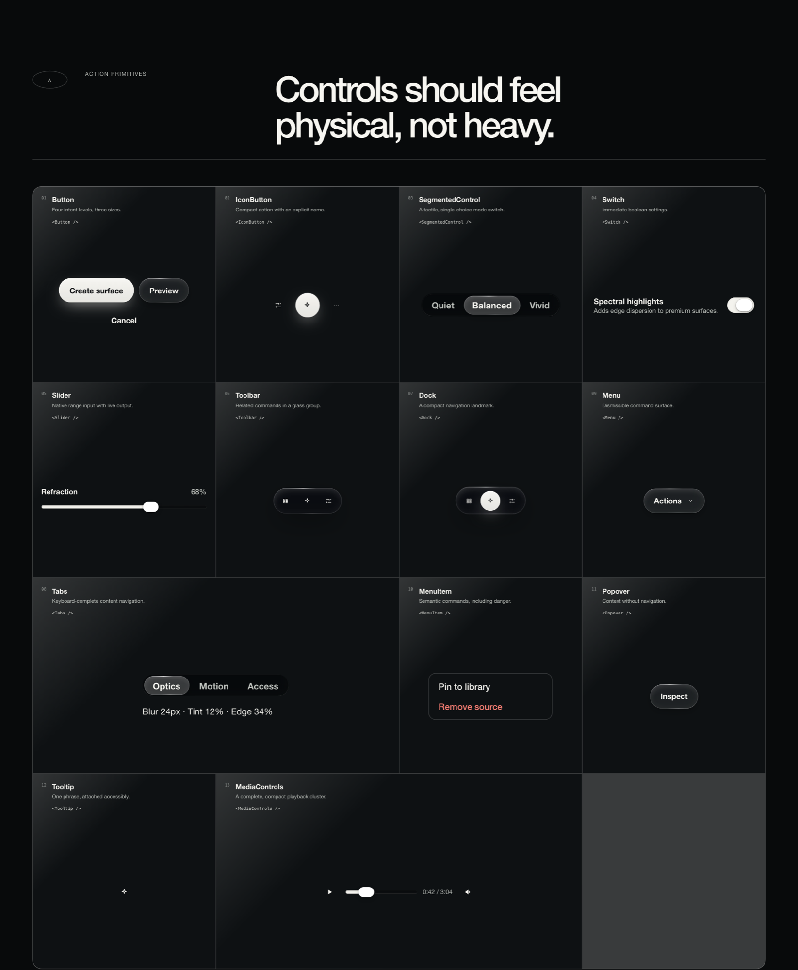
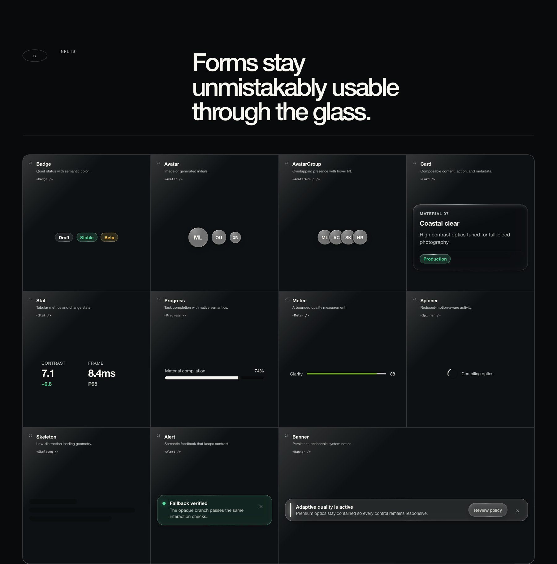
Every specimen below is live in the component catalog.
They are ordinary DOM: they take focus, respond to the keyboard, and announce
themselves properly.
Actions and controls
Button IconButton SegmentedControl Switch Slider Toolbar Dock
Tabs Menu MenuItem Popover Tooltip MediaControls
Data display and status
Badge Avatar AvatarGroup Card Stat Progress Meter Spinner
Skeleton Alert Banner
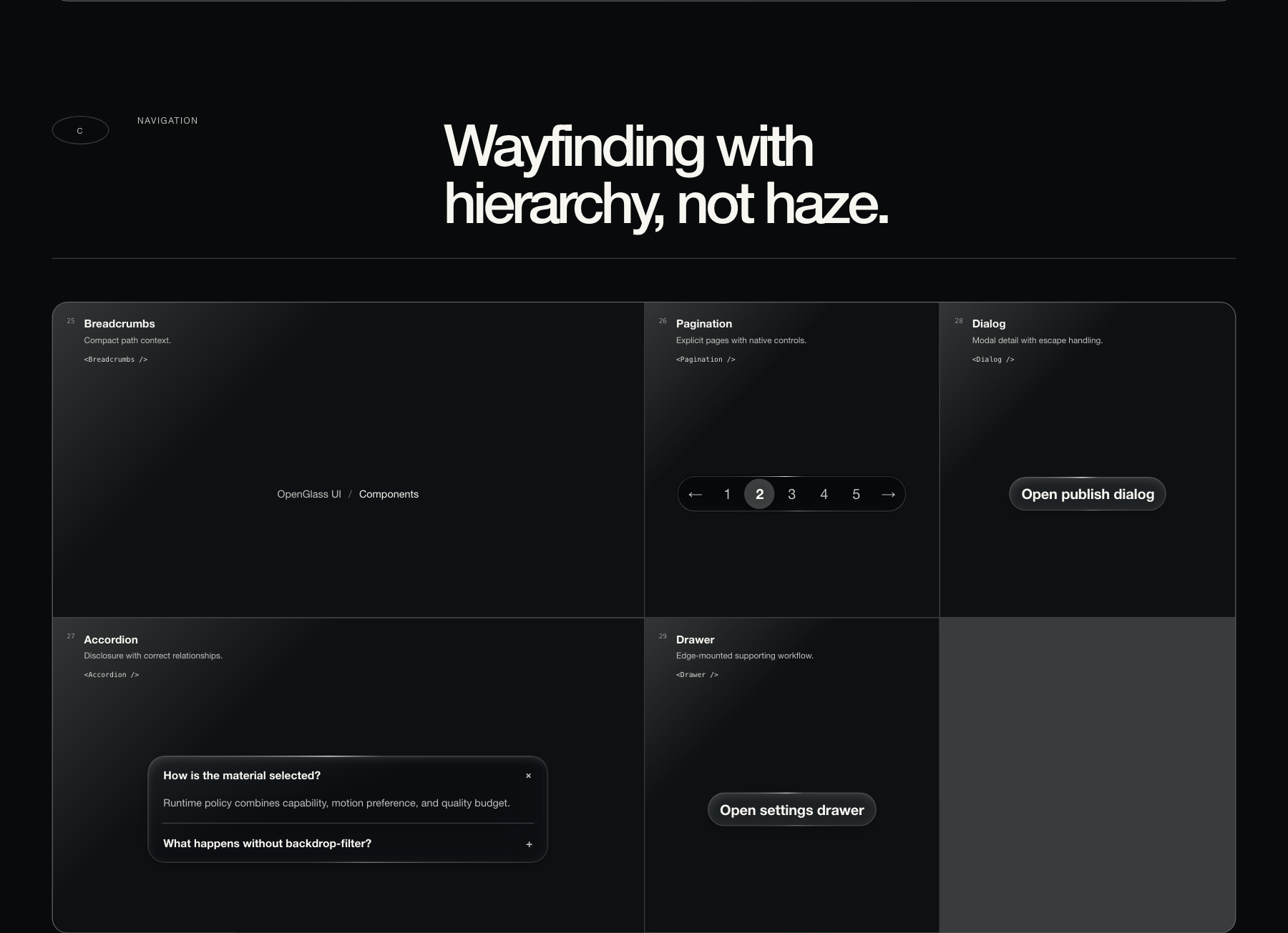
Navigation and overlays
Breadcrumbs Pagination Accordion Dialog Drawer
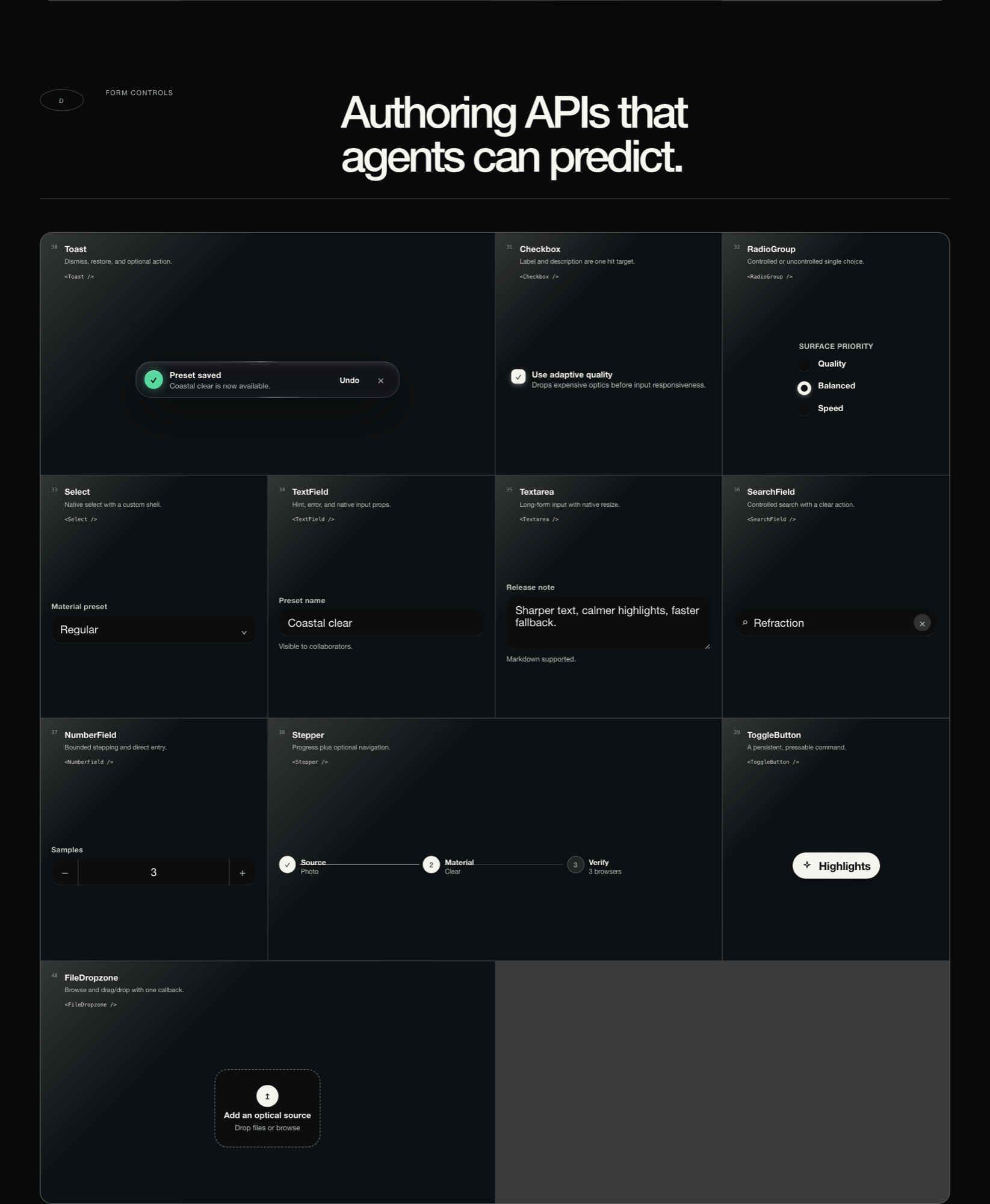
Forms and input
TextField Textarea NumberField SearchField Select Checkbox
RadioGroup Stepper ToggleButton FileDropzone Toast
Full props for each: docs/COMPONENTS.md.
Three materials, one contract
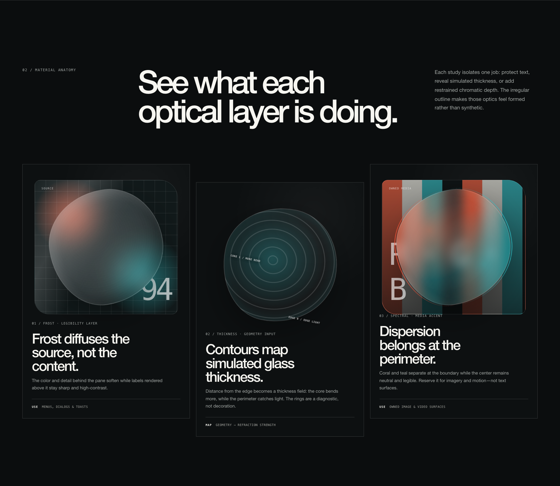
Glass is a hierarchy tool, not decoration. Each material has a job:
clear | 1.50 | 4% | Hero surfaces and lenses over imagery |
regular | 1.46 | 24% | The default. Cards, panels, most surfaces |
frosted | 1.40 | 66% | Menus, dialogs and toasts over busy content |
<Glass material="frosted">…</Glass>
Theming
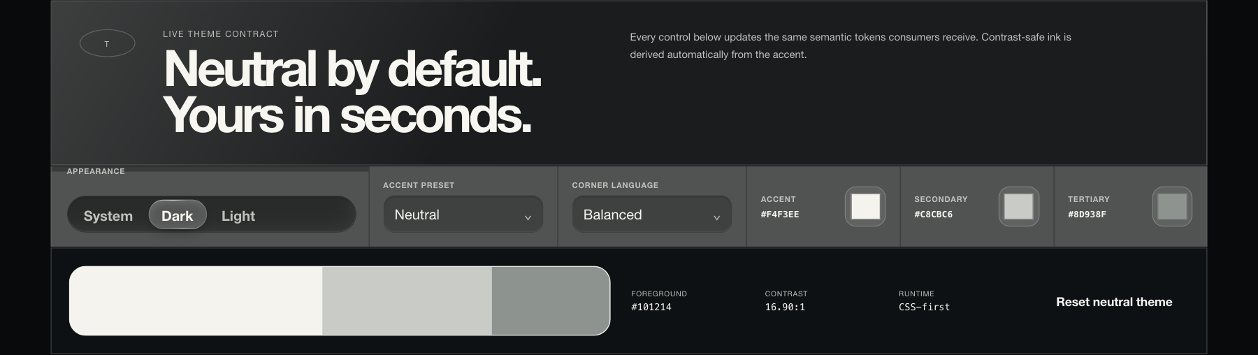
Neutral light and dark are the defaults and need no configuration. Accent,
secondary, and tertiary colors are yours. Foreground ink is derived
automatically so contrast stays safe, whatever accent you pick.
<GlassSystemProvider
  theme={{
    appearance: "system",
    theme: { preset: "cobalt", contrast: "high", radius: "balanced" },
  }}
>
  <App />
</GlassSystemProvider>
Six presets ship in the box, or pass any hex. Every token is a --ogui-* custom
property you can override. See docs/THEMING.md.
Accessibility is not a checkbox here
A survey of notable web glass libraries found zero implementing
prefers-reduced-transparency or prefers-contrast. This one treats them as
designed states that still look intentional:
- Reduced motion stops pointer tracking, morphing, and background video.
- Reduced transparency swaps to opaque surfaces with equivalent hierarchy.
- Forced colors hands rendering to the system palette instead of fighting it.
- Text never gets flattened into a canvas. Selection, focus, and screen
reader semantics survive because the DOM survives.
Details in docs/ACCESSIBILITY.md.
What this does not claim
The project says physics-inspired, not physically accurate. Browsers cannot
generally sample arbitrary page pixels, so CSS implies refraction rather
than performing it. WebGL has the highest optical ceiling but only over media
you own. SVG displacement is real but browser-sensitive.
Those limits are the reason the architecture looks the way it does. Full list:
docs/LIMITATIONS.md.
OpenGlass UI is independent and is not affiliated with, endorsed by, or
sponsored by Apple Inc.
Documentation
Machine-readable references for coding agents: llms.txt and
llms-full.txt.
The research behind it
Five materially different rendering approaches were built and compared under the
same interaction and difficult-background suite, then scored with visual appeal
weighted at 50%:
| 1 | Adaptive Hybrid | 9.36 | The architecture |
| 2 | Native CSS | 9.25 | The default material |
| 3 | Spectral WebGL | 8.66 | Opt-in, owned media only |
| 4 | Organic SVG | 8.60 | Expressive recipe |
| 5 | Geometric SDF | 8.59 | Deterministic adapter |
The shader had the highest ceiling but only works on media you own. CSS won on
everything else, so CSS became the default and the rest became opt-in.
Write-ups: docs/RESEARCH.md,
docs/EXPERIMENT-REPORT.md,
docs/COMPONENT-ATLAS.md. Every experiment is still
browsable locally under /research, /library, and /experiments/*.
Contributing
Issues and pull requests are welcome. Start with the
contributing guide.
License
MIT.