Old School Grid
Trustworthy postcss grid system we learnt to love, with wrapping columns and padding gutters.
Visit official website for live demo and documentation
What's that?
postcss-oldschool-grid is a postcss plugin that provide an easy to use and intuitive grid system based on padding gutters and wrapping columns.
No calc(), no right margins with :last-child and :nth-child(), simply nested containers with padding gutters.
Under the hood it behave like Bootstrap grid system, so all you have to do is to put content inside a column, put the column inside a row and eventually put the row inside a wrapper. Easy! :)
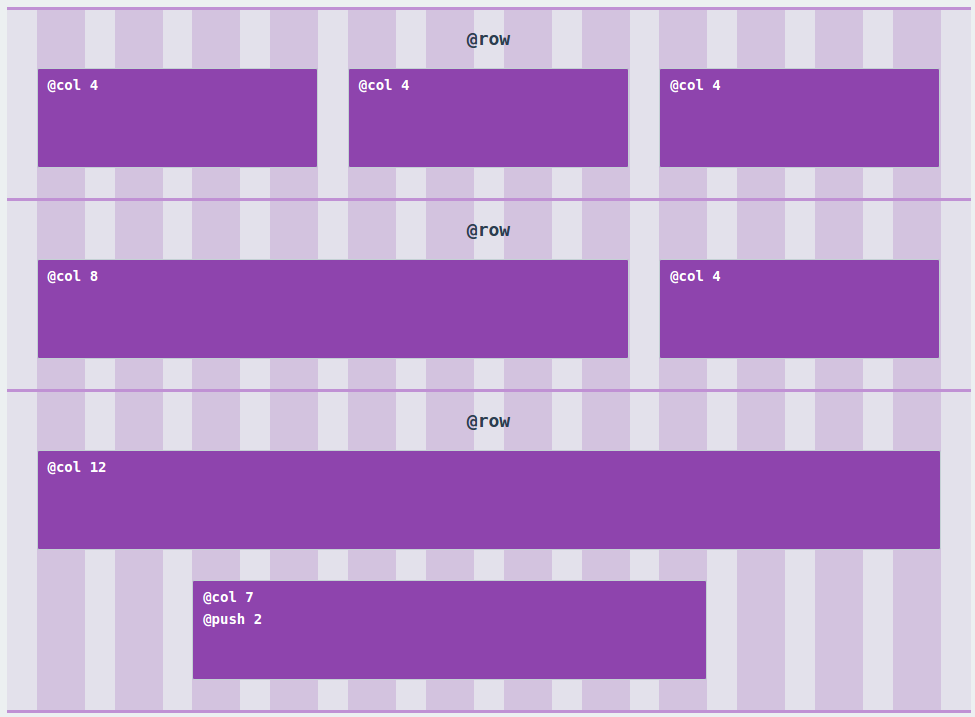
Example
Install
First of all you have to install and configure postcss in order to use this plugin: if you don't know what f***ing I'm talking about, take a look to the guide on the postcss github page.
Next step is to use npm to instll postcss-oldschool-grid:
$ npm install postcss-oldschool-grid`
And add it to your postcss processors:
var osg = require('postcss-oldschool-grid');
...
postcss([ osg({config}) ])
...
Options
There are two ways to configure postcss-oldschool-grid:
- Pass an object as parameter when you call the processor
var config = {
    wrapperWidth: '40px';
    gutterWidth: '20px',
    totalColumns: 16
}
...
postcss([ osg(config) ]);
- Set options in the CSS, inside the special at-rule @grid (you can use either camelCase or param-case)
@grid {
    wrapper-width: 40px;
    gutter-width: 20px;
    total-columns: 16
}
totalColumns
Accepted Values: string, number Default Value: 12
Set the total number of columns used to calculate the grid.
wrapperWidth
Accepted Values: string, number Default Value: "1024px"
Set the width of @wrapper element
wrapperPadding
Accepted Values: string, number, true|false Default Value: Inherit form GutterWidth
Set the padding of @wrapper element, so its external gutter. If setted to true it will inherit gutterWidth; if false it will be removed.
gutterWidth
Accepted Values: string, number Default Value: "30px"
The gutter width used in the grid.
verticalSpace
Accepted Values: string, number, true|false Default Value: Not set
Set the vertical space between columns and rows.
debugMode
Accepted Values: true|false Default Value: false
Activate debug mode for all rows: a background rappresenting the grid will be applied (like the exemple in this page).
Functions
@wrapper [width]
[width]: Width of the wrapper
Create a wrapper, fluid and centered in the page.
It also add border-box property to the element and all the children.
.wrapper {
    @wrapper 960px;
}
compiles:
.wrapper{
    width: 100%;
    margin-left: auto;
    margin-right: auto;
    max-width: 960px;
    padding-left: 30px;
    padding-right: 30px;
    box-sizing: border-box;
}
.wrapper *, .wrapper *:after, .wrapper *:before {
    box-sizing: border-box;
}
@row
Create a row: better to use inside the wrapper, because it applies a negative margin to compensate wrapper and columns padding.
It also adds a clearfix.
.row {
@row;
}
compiles:
.row{
    width: 100%;
    padding-left: 15px;
    padding-right: 15px;
    margin-left: -30px;
    margin-right: -30px;
    zoom: 1;
}
.row:after {
    content: "";
    display: table;
    clear: both;
}
.row:before {
    content: "";
    display: table;
}
@col [number]
[number]: The number of cols to span this element.
Span the element for [number] cols.
.col {
    @col 960px;
}
compiles
.col{
    position: relative;
    float: left;
    width: 33.33333333333333%;
    padding-left: 15px;
    padding-right: 15px;
}
@pull [number] or @push [number]
[number]: The number of cols to pull or push this element
Pull or push the element for [number] cols. Uses relative position and right or left properties.
.push {
    @push 2;
}
compiles:
.push {
    left: 16.666666666666664%;
}
@clearfix
Utility to add a clearfix to an element.
@borderbox or @border-box
Utility to set an element and his children in box-sizing: border-box;.
If used outside any selector, il will apply border-box globally.
@borderbox;
compiles:
*, *:after, *:before {
    box-sizing: border-box;
}
@debug-grid
Utility to debug the grid with background guides.
Apply it only to a row element to prevent unexpected behaviours.
Contacts


