Security News
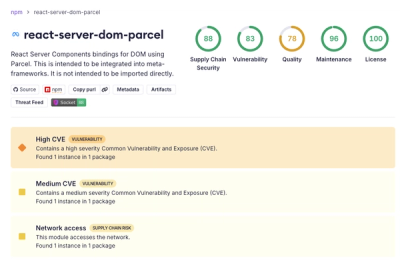
New React Server Components Vulnerabilities: DoS and Source Code Exposure
New DoS and source code exposure bugs in React Server Components and Next.js: what’s affected and how to update safely.
postcss-sort-media-queries
Advanced tools
PostCSS plugin for sorting and combining CSS media queries with mobile first / **desktop first methodologies
🌏 English ▫ O'zbek
PostCSS plugin for sorting and combining CSS media queries with mobile first / desktop first methodologies.
From 5.0.0 plugin support Media Feature Types: “range”
And here is the online demo
before
@media screen and (max-width: 640px) {
.head { color: #cfcfcf }
}
@media screen and (max-width: 768px) {
.footer { color: #cfcfcf }
}
@media screen and (max-width: 640px) {
.main { color: #cfcfcf }
}
@media screen and (min-width: 1280px) {
.mobile-first { color: #cfcfcf }
}
@media screen and (width > 640px) {
.mobile-first { color: #cfcfcf }
}
@media screen and (max-width: 640px) {
.footer { color: #cfcfcf }
}
after
@media screen and (width > 640px) {
  .mobile-first { color: #cfcfcf }
}
@media screen and (min-width: 1280px) {
  .mobile-first { color: #cfcfcf }
}
@media screen and (max-width: 768px) {
  .footer { color: #cfcfcf }
}
@media screen and (max-width: 640px) {
  /* combined */
  .head { color: #cfcfcf }
  .main { color: #cfcfcf }
  .footer { color: #cfcfcf }
}
before
@media screen and (width < 640px) {
  .header { color: #cdcdcd }
}
@media screen and (min-width: 760px) {
  .desktop-first { color: #cdcdcd }
}
@media screen and (width < 640px) {
  .main { color: #cdcdcd }
}
@media screen and (min-width: 1280px) {
  .desktop-first { color: #cdcdcd }
}
@media screen and (max-width: 760px) {
  .footer { color: #cdcdcd }
}
@media screen and (max-width: 640px) {
  .footer { color: #cdcdcd }
}
after
@media screen and (max-width: 760px) {
  .footer { color: #cdcdcd }
}
@media screen and (width < 640px) {
  /* combined */
  .header { color: #cdcdcd }
  .main { color: #cdcdcd }
  .footer { color: #cdcdcd }
}
@media screen and (min-width: 760px) {
  .desktop-first { color: #cdcdcd }
}
@media screen and (min-width: 1280px) {
  .desktop-first { color: #cdcdcd }
}
First thing's, install the module:
npm install postcss postcss-sort-media-queries --save-dev
Check you project for existed PostCSS config: postcss.config.js
in the project root, "postcss" section in package.json
or postcss in bundle config.
If you already use PostCSS, add the plugin to plugins list:
module.exports = {
  plugins: [
+   require('postcss-sort-media-queries')({
+     sort: 'mobile-first', // default value
+   }),
    require('autoprefixer')
  ]
}
or with custom sort function
module.exports = {
  plugins: [
+   require('postcss-sort-media-queries')({
+     sort: function(a, b) {
+        // custom sorting function
+     }
+   }),
    require('autoprefixer')
  ]
}
If you do not use PostCSS, add it according to official docs and set this plugin in settings.
Sorting works based on dutchenkoOleg/sort-css-media-queries function.
This option support string or function values.
{string} 'mobile-first' - (default) mobile first sorting{string} 'desktop-first' - desktop first sorting{function} your own sorting function'mobile-first'postcss([
sortMediaQueries({
sort: 'mobile-first' // default
})
]).process(css);
'desktop-first'postcss([
sortMediaQueries({
sort: 'desktop-first'
})
]).process(css);
postcss([
  sortMediaQueries({
    function(a, b) {
      return a.localeCompare(b);
    }
  })
]).process(css);
In this example, all your media queries will sort by A-Z order.
This sorting function is directly passed to Array#sort() method of an array of all your media queries.
By this configuration you can control sorting behaviour.
postcss([
  sortMediaQueries({
    configuration: {
      unitlessMqAlwaysFirst: true, // or false
    }
  })
]).process(css);
Or alternatively create a sort-css-mq.config.json file in the root of your project. Or add property sortCssMQ: {} in your package.json.
Sort only top level media queries to prevent eject nested media queries from parent node
postcss([
  sortMediaQueries({
    onlyTopLevel: true,
  })
]).process(css);
See Releases history
postcss-momentum-scrolling - plugin for adding momentum style scrolling behavior (-webkit-overflow-scrolling:touch) for elements with overflow (scroll, auto) on iOScss-mqpacker is a PostCSS plugin that packs same CSS media query rules into one media query rule. Unlike postcss-sort-media-queries, which focuses on sorting, css-mqpacker focuses on merging media queries to reduce redundancy.
postcss-combine-media-query is a PostCSS plugin that combines matching media queries into one. It is similar to css-mqpacker but with a focus on combining rather than sorting.
postcss-merge-rules is a PostCSS plugin that merges adjacent rules by selectors and properties. While it doesn't specifically target media queries, it can help in reducing the overall size of the CSS by merging rules, which can indirectly affect media queries.
FAQs
PostCSS plugin for sorting and combining CSS media queries with mobile first / **desktop first methodologies
The npm package postcss-sort-media-queries receives a total of 349,223 weekly downloads. As such, postcss-sort-media-queries popularity was classified as popular.
We found that postcss-sort-media-queries demonstrated a not healthy version release cadence and project activity because the last version was released a year ago. It has 1 open source maintainer collaborating on the project.
Did you know?

Socket for GitHub automatically highlights issues in each pull request and monitors the health of all your open source dependencies. Discover the contents of your packages and block harmful activity before you install or update your dependencies.

Security News
New DoS and source code exposure bugs in React Server Components and Next.js: what’s affected and how to update safely.

Security News
Socket CEO Feross Aboukhadijeh joins Software Engineering Daily to discuss modern software supply chain attacks and rising AI-driven security risks.

Security News
GitHub has revoked npm classic tokens for publishing; maintainers must migrate, but OpenJS warns OIDC trusted publishing still has risky gaps for critical projects.