Product
Socket Now Protects the Chrome Extension Ecosystem
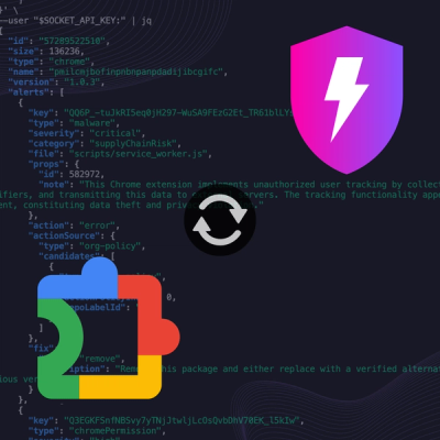
Socket is launching experimental protection for Chrome extensions, scanning for malware and risky permissions to prevent silent supply chain attacks.
primer-buttons
Advanced tools
Buttons are used for actions, like in forms, while textual hyperlinks are used for destinations, or moving from one page to another.
This repository is a module of the full primer repository.
This repository is distributed with npm. After installing npm, you can install primer-buttons with this command.
$ npm install --save primer-buttons
The source files included are written in Sass (scss) You can simply point your sass include-path at your node_modules directory and import it like this.
@import "primer-buttons/index.scss";
You can also import specific portions of the module by importing those partials from the /lib/ folder. Make sure you import any requirements along with the modules.
For a compiled css version of this module, a npm script is included that will output a css version to build/build.css The built css file is also included in the npm package.
$ npm run build
Buttons are used for actions, like in forms, while textual hyperlinks are used for destinations, or moving from one page to another.
{:toc}
Use the standard—yet classy—.btn for form actions and primary page actions. These are used extensively around the site.
When using a <button> element, always specify a type. When using a <a> element, always add role="button" for accessibility.
<button class="btn" type="button">Button button</button>
<a class="btn" href="#url" role="button">Link button</a>
You can find them in two sizes: the default .btn and the smaller .btn-sm.
<button class="btn" type="button">Button</button>
<button class="btn btn-sm" type="button">Small button</button>
Primary buttons are green and are used to indicate the primary action on a page. When you need your buttons to stand out, use .btn.btn-primary. You can use it with both button sizes—just add .btn-primary.
<button class="btn btn-primary" type="button">Primary button</button>
<button class="btn btn-sm btn-primary" type="button">Small primary button</button>
Danger buttons are red. They help reiterate that the intended action is important or potentially dangerous (e.g., deleting a repo or transferring ownership). Similar to the primary buttons, just add .btn-danger.
<button class="btn btn-danger" type="button">Danger button</button>
<button class="btn btn-sm btn-danger" type="button">Small danger button</button>
Outline buttons downplay an action as they appear like boxy links. Just add .btn-outline and go.
<button class="btn btn-outline" type="button">Outline button</button>
<button class="btn btn-sm btn-outline" type="button">Outline button</button>
Use .btn-large to increase the padding and border radius of a button. This is useful for prominent calls to action in hero sections.
Type scale utilities can be used to alter the font-size if needed. Padding is applied in em's so that it scales proportionally with the font-size.
<p>
  <a class="btn btn-large btn-purple" href="#url" role="button">Large link button</a>
  <button class="btn btn-large" type="button">Large button button</button>
</p>
Use .btn-large with a type scale utility to transform the text to a bigger size.
<p class="f3">
  <a class="btn btn-large btn-purple" href="#url" role="button">Large link button</a>
  <button class="btn btn-large btn-outline-blue" type="button">Large button button</button>
</p>
Disable <button> elements with the boolean disabled attribute and <a> elements with the .disabled class.
<button class="btn" type="button" disabled>Disabled button</button>
<a class="btn disabled" href="#url" role="button">Disabled button</a>
Similar styles are applied to primary, danger, and outline buttons:
<button class="btn btn-primary" type="button" disabled>Disabled button</button>
<a class="btn btn-primary disabled" href="#url" role="button">Disabled button</a>
<button class="btn btn-danger" type="button" disabled>Disabled button</button>
<a class="btn btn-danger disabled" href="#url" role="button">Disabled button</a>
<button class="btn btn-outline" type="button" disabled>Disabled button</button>
<a class="btn btn-outline disabled" href="#url" role="button">Disabled button</a>
Make any button full-width by adding .btn-block. It adds width: 100%;, changes the display from inline-block to block, and centers the button text.
<p><button class="btn btn-block" type="button">Block button</button></p>
<p><button class="btn btn-sm btn-block" type="button">Small block button</button></p>
Create a button that looks like a link with .btn-link. Rather than using an <a> to trigger JS, this style on a <button> should be used for better accessibility.
The .btn-link class is not designed to be used with .btn; the overlapping styles are not compatible.
<p><button class="btn-link" type="button">Link button</button></p>
You can easily append a count to a small button. Add the .with-count class to the .btn-sm and then add the .social-count after the button.
Be sure to clear the float added by the additional class.
<div class="clearfix">
  <a class="btn btn-sm btn-with-count" href="#url" role="button">
    <%= octicon "eye" %>
    Watch
  </a>
  <a class="social-count" href="#url">6</a>
</div>
You can also use the counter component within buttons:
<button class="btn" type="button">
  Button
  <span class="Counter">12</span>
</button>

<button class="btn btn-primary" type="button">
  Button
  <span class="Counter">12</span>
</button>

<button class="btn btn-danger" type="button">
  Button
  <span class="Counter">12</span>
</button>

<button class="btn btn-outline" type="button">
  Button
  <span class="Counter">12</span>
</button>
Have a hankering for a series of buttons that are attached to one another? Wrap them in a .BtnGroup and the buttons will be rounded and spaced automatically.
<div class="BtnGroup mr-2">
  <button class="btn BtnGroup-item" type="button">Button</button>
  <button class="btn BtnGroup-item" type="button">Button</button>
  <button class="btn BtnGroup-item" type="button">Button</button>
</div>

<div class="BtnGroup mr-2">
  <button class="btn BtnGroup-item btn-outline" type="button">Button</button>
  <button class="btn BtnGroup-item btn-outline" type="button">Button</button>
  <button class="btn BtnGroup-item btn-outline" type="button">Button</button>
</div>

<div class="BtnGroup">
  <button class="btn BtnGroup-item btn-sm" type="button">Button</button>
  <button class="btn BtnGroup-item btn-sm" type="button">Button</button>
  <button class="btn BtnGroup-item btn-sm" type="button">Button</button>
</div>
Add .BtnGroup-parent to parent elements, like <form>s or <details>s, within .BtnGroups for proper spacing and rounded corners.
<div class="BtnGroup">
  <button class="btn BtnGroup-item" type="button">Button</button>
  <form class="BtnGroup-parent">
    <button class="btn BtnGroup-item" type="button">Button in a form</button>
  </form>
  <button class="btn BtnGroup-item" type="button">Button</button>
  <button class="btn BtnGroup-item" type="button">Button</button>
</div>
Use .hidden-text-expander to indicate and toggle hidden text.
<span class="hidden-text-expander">
<button type="button" class="ellipsis-expander" aria-expanded="false">…</button>
</span>
You can also make the expander appear inline by adding .inline.
You can add .btn and .btn-* classes to any
<summary>
element so that it gains the appearance of a button, and
selected/active styles when the parent
<details>
element is open.
<details>
  <summary class="btn btn-block btn-primary">Toggle the content</summary>
  <p class="mt-2">
    This content will be toggled.
  </p>
</details>
FAQs
Did you know?

Socket for GitHub automatically highlights issues in each pull request and monitors the health of all your open source dependencies. Discover the contents of your packages and block harmful activity before you install or update your dependencies.

Product
Socket is launching experimental protection for Chrome extensions, scanning for malware and risky permissions to prevent silent supply chain attacks.

Product
Add secure dependency scanning to Claude Desktop with Socket MCP, a one-click extension that keeps your coding conversations safe from malicious packages.

Product
Socket now supports Scala and Kotlin, bringing AI-powered threat detection to JVM projects with easy manifest generation and fast, accurate scans.