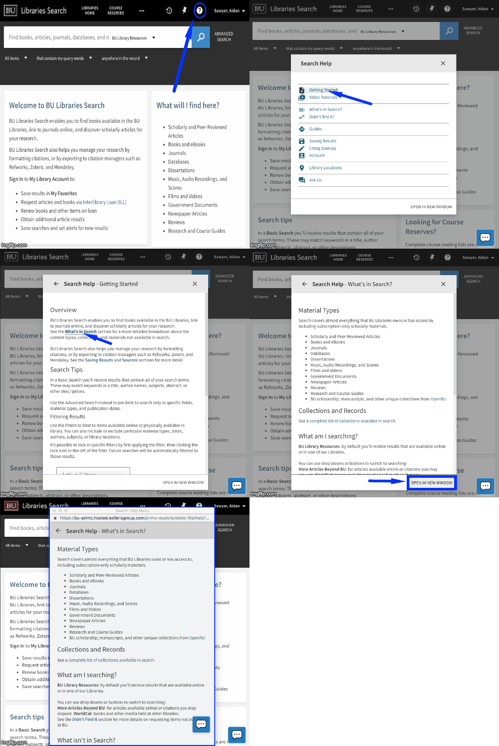
Add link to customizable 'help-menu' popup to prm-search-bookmark-filter-after (top nav bar)
Description

- clicking on the '(?)' icon in the top right of any page brings up a new help-menu dialog
- here, users see a list of entries (from
list_of_elements) which they can scroll through and select - once selected, the user sees the specified
template for that entry displayed - links can be made between entries very simply using anchor tags
#{entry.id} - if desired, users can open the help menu in a new window to enable multi-tasking
note: as of 1.3.0, you can open the help menu from any page (or module) by triggering an openHelpMenuEvent event!
window.dispatchEvent(new CustomEvent('openHelpMenuEvent'))
If you want to specify a particular page, simply add the entry id as the event detail like so:
window.dispatchEvent(new CustomEvent('openHelpMenuEvent', {detail:'getting-started'}))
Usage
Adding the Package to your view in primo-explore
run the following command from within your view's main directory to add it as a dependency.
$ npm install --save-dev primo-explore-help-menu
this should add the following line to your package.json file...
"primo-explore-help-menu": "^1.X.X"
and add the contents of this repository (at that npm version) into a node_modules/primo-explore-help-menu
directory for your current view. the presence of this package should mean that the package was successfully
installed and added to your project.
Installing/Importing it
from here you'll have to edit your main.js (or config.module.js) file to import the package, and add
both 'helpMenuContentDisplay' and 'helpMenuTopbar', to the dependencies inside of your
'viewCustom' module:
import 'primo-explore-help-menu';
angular.module('viewCustom', ['angularLoad', 'helpMenuContentDisplay', 'helpMenuTopbar'])
(see ./src/.main.js for a working example).
Additional Steps
To get the same styling, you'll have to copy or import the help-menu.css file to the css/custom.css for your view.
to automate this, add the following script to your package.json:
"postinstall": "cp node_modules/primo-explore-help-menu/dist/help-menu.css ./css/help-menu.css"
If you're using a version from 1.1.0 onward, you'll have to make sure there's a html/help_en_US.html included as well
$ touch html/help_en_US.html
Adding Your Own Content
To add your own content, specify a list_of_elements variable within a constant object called 'helpMenuConfig' and
attach it to your primo angular module (app) like so:
import {my_custom_list_of_elements} from 'my_long_list_of_json_objects';
app.constant('helpMenuConfig', { "list_of_elements": my_custom_list_of_elements });
Make sure that each object in the list of elements matches the following structure:
{
  "id":"my-custom-help-entry",
  "title":"My Custom Help Entry",
  "icon":{"group":"action", "code":"description"},
  "description":"brief description of the entry's purpose (optional)",
  "template":"<h3>A valid Heading</h3><p>relevant information below that heading</p>"
}
...include intentionally empty objects in the list ({}) to form the dividers.
note: the iconset being used is from material.io and is included within primo
As of 1.6.0, you can also specify a list_of_updates variable with the same structure to highlight a number of
items above the other entries. At BU, we use this feature to highlight recent changes to the platform or big
pieces of library news.
import {my_custom_list_of_updates} from 'my_long_list_of_json_objects';
app.constant('helpMenuConfig', { "list_of_updates": my_custom_list_of_updates });
Additional Customization
the following table describes describes some additional configuration options that are currently afforded to
you by the package. an example implementation of this section can be found within this repo at src/.main.js:
| name | default | description |
|---|
logToConsole | true | controls whether or not messages about what's going on in the component are console.log()-ed (visible in inspector) |
publishEvents | false | controls whether the logEventToAnalytics is actually triggered, ensurng only real traffic is tracked |
logEventToAnalytics | see example | here's an opportunity to hook in whatever event tracking you have, (we use google analytics) |
helpMenuTitle | Search Help | page and popup title displayed at the top of the menu (useful for translations) |
helpMenuWidth | 500 (px) | the width of the dialog box and associated popup |
enableNotificationIndicator | false | visually highlight the top-bar icon for new users until they open and dismiss it |
notificationIndicatorExpiration | 2 weeks | set the amount of time it takes before the notification dismissal resets |
updatesLabel | Search Updates | Heading text for shortlist of updates above help entries |
entriesLabel | Help Entries | Heading text for main help entries (only appears when there's a list of updates) |
Events Logged
All events are logged under the category help-menu.
| action | label | description |
|---|
open-dialog | page user was on when clicked | user clicks on the icon in the top right to initially open help-menu |
select-item | item.id of currently open entry or webpage | user selects an item in the main help-menu or follows link to another entry |
open-window | item.id of currently open entry or webpage | user presses 'open in new window' button |
note: At BU Libraries, we use Google Analytics to track and log events. Given this, all events emitted follow the 'category > action > label' convention.
Contributing
You're more than welcome to fork this repository, make some changes, and contribute it back by
creating a pull request.
If you have any issues with this package or ideas for how to make it better, don't hesitate to let us know by
submitting a new issue.
In both of these cases, it would help us if you make sure to add on the appropriate
labels (including especially help-menu) so that we
can keep track of what your pull request or issue relates to.
If you get stuck, send us a message on our gitter, and we'll try to help you out.


