Product
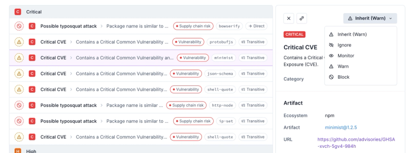
Introducing Enhanced Alert Actions and Triage Functionality
Socket now supports four distinct alert actions instead of the previous two, and alert triaging allows users to override the actions taken for all individual alerts.
quasar
Advanced tools
Package description
Quasar is a powerful Vue.js framework that allows developers to create responsive websites, mobile apps, and Electron apps using a single codebase. It provides a wide range of components, utilities, and tools to streamline the development process.
Responsive Layouts
Quasar provides a powerful layout system that allows you to create responsive and adaptive layouts with ease. The example demonstrates a basic layout with a header and a page container.
<template>
<q-layout view="hHh lpR fFf">
<q-header elevated>
<q-toolbar>
<q-toolbar-title>
My App
</q-toolbar-title>
</q-toolbar>
</q-header>
<q-page-container>
<q-page>
<div class="q-pa-md">
<q-card>
<q-card-section>
Welcome to Quasar!
</q-card-section>
</q-card>
</div>
</q-page>
</q-page-container>
</q-layout>
</template>
<script>
export default {
name: 'MyLayout'
}
</script>Form Components
Quasar offers a wide range of form components that are easy to use and integrate. The example shows a simple form with input fields for name and email, and a submit button.
<template>
  <q-form @submit="onSubmit">
    <q-input filled v-model="formData.name" label="Name" />
    <q-input filled v-model="formData.email" label="Email" type="email" />
    <q-btn type="submit" label="Submit" color="primary" />
  </q-form>
</template>
<script>
export default {
  data() {
    return {
      formData: {
        name: '',
        email: ''
      }
    }
  },
  methods: {
    onSubmit() {
      console.log(this.formData);
    }
  }
}
</script>
Dialogs and Notifications
Quasar provides built-in support for dialogs and notifications, making it easy to create interactive and user-friendly interfaces. The example demonstrates how to show a dialog with a title, message, and OK/Cancel buttons.
<template>
  <q-page>
    <q-btn @click="showDialog" label="Show Dialog" color="primary" />
  </q-page>
</template>
<script>
export default {
  methods: {
    showDialog() {
      this.$q.dialog({
        title: 'Dialog Title',
        message: 'This is a dialog message.',
        ok: 'OK',
        cancel: 'Cancel'
      }).onOk(() => {
        console.log('OK clicked');
      }).onCancel(() => {
        console.log('Cancel clicked');
      });
    }
  }
}
</script>Vuetify is a popular Vue.js framework that provides a wide range of UI components and tools for building responsive and visually appealing applications. Compared to Quasar, Vuetify focuses more on Material Design principles and offers a rich set of components that adhere to these guidelines.
Bootstrap-Vue is a Vue.js integration for Bootstrap, providing a comprehensive set of Bootstrap components and grid system for building responsive web applications. While Quasar offers more advanced features and tools for building mobile and Electron apps, Bootstrap-Vue is a great choice for developers who prefer the Bootstrap framework.
Element UI is a Vue.js 2.0-based component library for developers, designers, and product managers. It provides a set of high-quality components and a customizable theme. Compared to Quasar, Element UI is more focused on desktop applications and offers a simpler, more straightforward API.
Readme
Core functionality for engage and spacebear.
FAQs
Build high-performance VueJS user interfaces (SPA, PWA, SSR, Mobile and Desktop) in record time
The npm package quasar receives a total of 96,241 weekly downloads. As such, quasar popularity was classified as popular.
We found that quasar demonstrated a healthy version release cadence and project activity because the last version was released less than a year ago. It has 2 open source maintainers collaborating on the project.
Did you know?

Socket for GitHub automatically highlights issues in each pull request and monitors the health of all your open source dependencies. Discover the contents of your packages and block harmful activity before you install or update your dependencies.

Product
Socket now supports four distinct alert actions instead of the previous two, and alert triaging allows users to override the actions taken for all individual alerts.

Security News
Polyfill.io has been serving malware for months via its CDN, after the project's open source maintainer sold the service to a company based in China.

Security News
OpenSSF is warning open source maintainers to stay vigilant against reputation farming on GitHub, where users artificially inflate their status by manipulating interactions on closed issues and PRs.