
Research
Security News
The Growing Risk of Malicious Browser Extensions
Socket researchers uncover how browser extensions in trusted stores are used to hijack sessions, redirect traffic, and manipulate user behavior.
By Kush Pandya - Jun 13, 2025
rc-cascader
Advanced tools
The rc-cascader package is a React component for creating cascading drop-down menus. It allows users to select options from a hierarchical structure, which is useful for selecting nested categories or locations.
Basic Cascading Menu
This code sample demonstrates how to create a basic cascading menu with the rc-cascader package. The 'options' array defines the hierarchical structure of the menu, and the 'onChange' function logs the selected value.
import React from 'react';
import Cascader from 'rc-cascader';

const options = [
  {
    value: 'zhejiang',
    label: 'Zhejiang',
    children: [
      {
        value: 'hangzhou',
        label: 'Hangzhou',
        children: [
          {
            value: 'xihu',
            label: 'West Lake',
          },
        ],
      },
    ],
  },
  {
    value: 'jiangsu',
    label: 'Jiangsu',
    children: [
      {
        value: 'nanjing',
        label: 'Nanjing',
        children: [
          {
            value: 'zhonghuamen',
            label: 'Zhong Hua Men',
          },
        ],
      },
    ],
  },
];

function onChange(value) {
  console.log(value);
}

const App = () => (
  <Cascader options={options} onChange={onChange} />
);

export default App;
Custom Trigger
This code sample shows how to use a custom trigger, such as a button, to open the cascading menu. The children of the Cascader component determine the trigger element.
import React from 'react';
import Cascader from 'rc-cascader';

const options = [/* ... */];

const App = () => (
  <Cascader options={options}>
    <button>Click me to select</button>
  </Cascader>
);

export default App;
Search and Filter
This code sample illustrates how to enable a search and filter functionality within the cascading menu by setting the 'showSearch' prop to true. This allows users to quickly find options by typing.
import React from 'react';
import Cascader from 'rc-cascader';

const options = [/* ... */];

const App = () => (
  <Cascader options={options} showSearch />
);

export default App;React-select is a flexible and customizable select input component for React. It supports single and multi-select options, as well as asynchronous loading of options. Compared to rc-cascader, react-select offers more customization and is not specifically designed for cascading options.
Ant Design (antd) is a comprehensive UI design language and React UI library that includes a cascading menu component similar to rc-cascader. The Cascader component in antd is more integrated with the overall design system and may offer additional features and a more polished look.
React Cascader Component.


 IE / Edge |  Firefox |  Chrome |  Safari |  Electron |
|---|---|---|---|---|
| IE11, Edge | last 2 versions | last 2 versions | last 2 versions | last 2 versions |
https://cascader-react-component.vercel.app
$ npm install rc-cascader --save
import React from 'react';
import Cascader from 'rc-cascader';
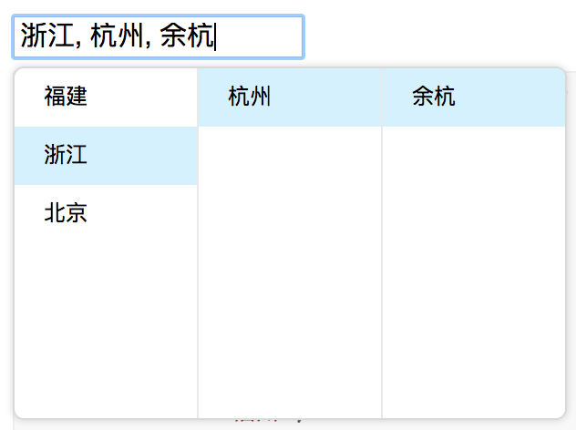
const options = [{
'label': '福建',
'value': 'fj',
'children': [{
'label': '福州',
'value': 'fuzhou',
'children': [{
'label': '马尾',
'value': 'mawei',
}],
}, {
'label': '泉州',
'value': 'quanzhou',
}],
}, {
'label': '浙江',
'value': 'zj',
'children': [{
'label': '杭州',
'value': 'hangzhou',
'children': [{
'label': '余杭',
'value': 'yuhang',
}],
}],
}, {
'label': '北京',
'value': 'bj',
'children': [{
'label': '朝阳区',
'value': 'chaoyang',
}, {
'label': '海淀区',
'value': 'haidian',
}],
}];
React.render(
<Cascader options={options}>
...
</Cascader>
, container);
| name | type | default | description |
|---|---|---|---|
| autoClearSearchValue | boolean | true | Whether the current search will be cleared on selecting an item. Only applies when checkable |
| options | Object | The data options of cascade | |
| value | Array | selected value | |
| defaultValue | Array | initial selected value | |
| onChange | Function(value, selectedOptions) | callback when finishing cascader select | |
| changeOnSelect | Boolean | false | change value on each selection |
| loadData | Function(selectedOptions) | callback when click any option, use for loading more options | |
| expandTrigger | String | 'click' | expand current item when click or hover |
| open | Boolean | visibility of popup overlay | |
| onDropdownVisibleChange | Function(visible) | callback when popup overlay's visibility changed | |
| transitionName | String | transition className like "slide-up" | |
| prefixCls | String | rc-cascader | prefix className of popup overlay |
| dropdownClassName | String | additional className of popup overlay | |
| popupPlacement | String | bottomLeft | use preset popup align config from builtinPlacements:bottomRight topRight bottomLeft topLeft |
| getPopupContainer | function(trigger:Node):Node | () => document.body | container which popup select menu rendered into |
| dropdownMenuColumnStyle | Object | style object for each cascader pop menu | |
| fieldNames | Object | { label: 'label', value: 'value', children: 'children' } | custom field name for label and value and children |
| expandIcon | ReactNode | > | specific the default expand icon |
| loadingIcon | ReactNode | > | specific the default loading icon |
| hidePopupOnSelect | Boolean | >true | hide popup on select |
| name | type | default | description |
|---|---|---|---|
| label | String | option text to display | |
| value | String | option value as react key | |
| disabled | Boolean | disabled option | |
| children | Array | children options |
$ npm install
$ npm start
$ npm test
$ npm run coverage
rc-cascader is released under the MIT license.
FAQs
cascade select ui component for react
The npm package rc-cascader receives a total of 1,088,405 weekly downloads. As such, rc-cascader popularity was classified as popular.
We found that rc-cascader demonstrated a healthy version release cadence and project activity because the last version was released less than a year ago. It has 5 open source maintainers collaborating on the project.
Did you know?

Socket for GitHub automatically highlights issues in each pull request and monitors the health of all your open source dependencies. Discover the contents of your packages and block harmful activity before you install or update your dependencies.
Research
Security News
Socket researchers uncover how browser extensions in trusted stores are used to hijack sessions, redirect traffic, and manipulate user behavior.

Research
Security News
An in-depth analysis of credential stealers, crypto drainers, cryptojackers, and clipboard hijackers abusing open source package registries to compromise Web3 development environments.

Security News
pnpm 10.12.1 introduces a global virtual store for faster installs and new options for managing dependencies with version catalogs.