What is rc-progress?
The rc-progress npm package provides React components for displaying progress information. It supports both line and circle (or pie) progress bars, allowing for customizable colors, sizes, and other properties to visually represent progress in a React application.
What are rc-progress's main functionalities?
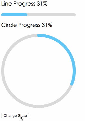
Line Progress
This feature allows you to create a linear progress bar. You can customize the percentage of completion, the stroke width, and the color of the progress bar.
import { Line } from 'rc-progress';
<Line percent="70" strokeWidth="4" strokeColor="#D3D3D3" />
Circle Progress
This feature enables the creation of a circular progress bar. Similar to the line progress, you can customize the completion percentage, stroke width, and color.
import { Circle } from 'rc-progress';

<Circle percent="30" strokeWidth="4" strokeColor="#00FF00" />
Other packages similar to rc-progress
react-circular-progressbar
This package provides a circular progress bar component for React. It is similar to the Circle component of rc-progress but focuses solely on circular progress bars. It offers a different set of customization options and styles.
progressbar.js
progressbar.js is a vanilla JavaScript library for creating both line and circle progress bars. It is not React-specific like rc-progress but can be integrated into React projects. It offers a wide range of customization options and animations.
nprogress
nprogress is a lightweight JavaScript library for creating slim progress bars, typically used at the top of the page to indicate loading progress. Unlike rc-progress, it is not React-specific and does not offer circular progress bars, focusing instead on a minimalistic approach.


