
Security News
Crates.io Users Targeted by Phishing Emails
The Rust Security Response WG is warning of phishing emails from rustfoundation.dev targeting crates.io users.
By Sarah Gooding - Sep 12, 2025
rc-tooltip
Advanced tools
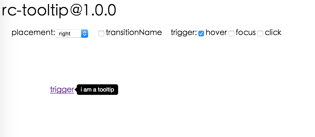
The rc-tooltip package is a React component for creating simple and customizable tooltips. It allows developers to easily add tooltip functionality to their React applications, providing users with additional context or information when they hover over or focus on an element. The package supports various customization options, including the tooltip's appearance, positioning, and animation.
Basic Tooltip
This code sample demonstrates how to create a basic tooltip that appears on top of an element when it is hovered over. The tooltip's content is specified as 'Tooltip text'.
import React from 'react';
import Tooltip from 'rc-tooltip';
import 'rc-tooltip/assets/bootstrap.css';
const BasicTooltip = () => (
<Tooltip placement="top" trigger={['hover']} overlay={<span>Tooltip text</span>}>
<a href="#">Hover me</a>
</Tooltip>
);Customized Tooltip
This example shows how to create a tooltip that appears to the right of an element when clicked. The tooltip displays custom content, including a custom style and an arrow pointing to the target element.
import React from 'react';
import Tooltip from 'rc-tooltip';
import 'rc-tooltip/assets/bootstrap_white.css';

const CustomTooltip = () => (
  <Tooltip
    placement="right"
    trigger={['click']}
    overlay={<div style={{ height: 50, width: 100, backgroundColor: '#89CFF0' }}>Custom Content</div>}
    arrowContent={<div className="rc-tooltip-arrow-inner"></div>}
  >
    <a href="#">Click me</a>
  </Tooltip>
);
Dynamic Tooltip
This code snippet illustrates how to create a tooltip with dynamic visibility, controlled by the component's state. The tooltip appears when the mouse enters the target element and disappears when it leaves.
import React, { useState } from 'react';
import Tooltip from 'rc-tooltip';

const DynamicTooltip = () => {
  const [visible, setVisible] = useState(false);
  return (
    <Tooltip
      visible={visible}
      onVisibleChange={(vis) => setVisible(vis)}
      overlay={<span>Dynamic Content</span>}
    >
      <a href="#" onMouseEnter={() => setVisible(true)} onMouseLeave={() => setVisible(false)}>Hover or Leave</a>
    </Tooltip>
  );
};react-tooltip is another popular tooltip library for React applications. It offers a wide range of customization options similar to rc-tooltip, but with a different API and additional features such as global tooltip management and more extensive styling capabilities.
tippy.js is a highly customizable tooltip and popover library that can be used with React through a wrapper component. It provides more extensive animation and theming options compared to rc-tooltip, making it suitable for more complex tooltip requirements.
React Tooltip


 IE / Edge |  Firefox |  Chrome |  Safari |  Opera |
|---|---|---|---|---|
| IE 8 + ✔ | Firefox 31.0+ ✔ | Chrome 31.0+ ✔ | Safari 7.0+ ✔ | Opera 30.0+ ✔ |

var Tooltip = require('rc-tooltip');
var React = require('react');
var ReactDOM = require('react-dom');

// By default, the tooltip has no style.
// Consider importing the stylesheet it comes with:
// 'rc-tooltip/assets/bootstrap_white.css'

ReactDOM.render(
  <Tooltip placement="left" trigger={['click']} overlay={<span>tooltip</span>}>
    <a href="#">hover</a>
  </Tooltip>,
  container,
);
npm start and then go to
http://localhost:8000/demo
Online demo: https://react-component.github.io/tooltip/demo
| name | type | default | description |
|---|---|---|---|
| trigger | string | string[] | 'hover' | which actions cause tooltip shown. enum of 'hover','click','focus' |
| visible | boolean | false | whether tooltip is visible |
| defaultVisible | boolean | false | whether tooltip is visible by default |
| placement | string | 'right' | tooltip placement. enum of 'top','left','right','bottom', 'topLeft', 'topRight', 'bottomLeft', 'bottomRight', 'leftTop', 'leftBottom', 'rightTop', 'rightBottom' |
| motion | object | Config popup motion. Please ref demo for example | |
| onVisibleChange | (visible: boolean) => void; | Callback when visible change | |
| afterVisibleChange | (visible: boolean) => void; | Callback after visible change | |
| overlay | ReactNode | () => ReactNode | tooltip overlay content | |
| overlayStyle | object | deprecated, Please use styles={{ root: {} }} | |
| overlayClassName | string | deprecated, Please use classNames={{ root: {} }} | |
| prefixCls | string | 'rc-tooltip' | prefix class name of tooltip |
| mouseEnterDelay | number | 0 | delay time (in second) before tooltip shows when mouse enter |
| mouseLeaveDelay | number | 0.1 | delay time (in second) before tooltip hides when mouse leave |
| getTooltipContainer | (triggerNode: HTMLElement) => HTMLElement | () => document.body | get container of tooltip, default to body |
| destroyTooltipOnHide | boolean | false | destroy tooltip when it is hidden |
| align | object | align config of tooltip. Please ref demo for usage example | |
| showArrow | boolean | object | false | whether to show arrow of tooltip |
| zIndex | number | config popup tooltip zIndex | |
| classNames | classNames?: { root?: string; body?: string;}; | Semantic DOM class | |
| styles | styles?: {root?: React.CSSProperties;body?: React.CSSProperties;}; | Semantic DOM styles |
Tooltip requires a child node that accepts an onMouseEnter, onMouseLeave, onFocus, onClick event. This means the child node must be a built-in component like div or span, or a custom component that passes its props to its built-in component child.
For accessibility purpose you can use the id prop to link your tooltip with another element. For example attaching it to an input element:
<Tooltip
    ...
    id={this.props.name}>
    <input type="text"
           ...
           aria-describedby={this.props.name}/>
</Tooltip>
If you do it like this, a screenreader would read the content of your tooltip if you focus the input element.
NOTE: role="tooltip" is also added to expose the purpose of the tooltip element to a screenreader.
npm install
npm start
npm test
npm run chrome-test
npm run coverage
rc-tooltip is released under the MIT license.
FAQs
React Tooltip
The npm package rc-tooltip receives a total of 1,950,126 weekly downloads. As such, rc-tooltip popularity was classified as popular.
We found that rc-tooltip demonstrated a healthy version release cadence and project activity because the last version was released less than a year ago. It has 8 open source maintainers collaborating on the project.
Did you know?

Socket for GitHub automatically highlights issues in each pull request and monitors the health of all your open source dependencies. Discover the contents of your packages and block harmful activity before you install or update your dependencies.
Security News
The Rust Security Response WG is warning of phishing emails from rustfoundation.dev targeting crates.io users.

Product
Socket now lets you customize pull request alert headers, helping security teams share clear guidance right in PRs to speed reviews and reduce back-and-forth.

Product
Socket's Rust support is moving to Beta: all users can scan Cargo projects and generate SBOMs, including Cargo.toml-only crates, with Rust-aware supply chain checks.