
Introduction
React component to render catalog view for products, services, image gallery or any other E-commerce applications.
Installation:
npm install react-catalog-view
Features:
-
JSON data array:
Accepts formatted JSON data array and renders them as cards in a catalog view.
-
Fully Customizable:
Classes can be overridden easily to customize catalog view.
-
Responsive FlexBox:
Based on CSS flexbox. Default view is responsive for all screens.
-
Card Sizes:
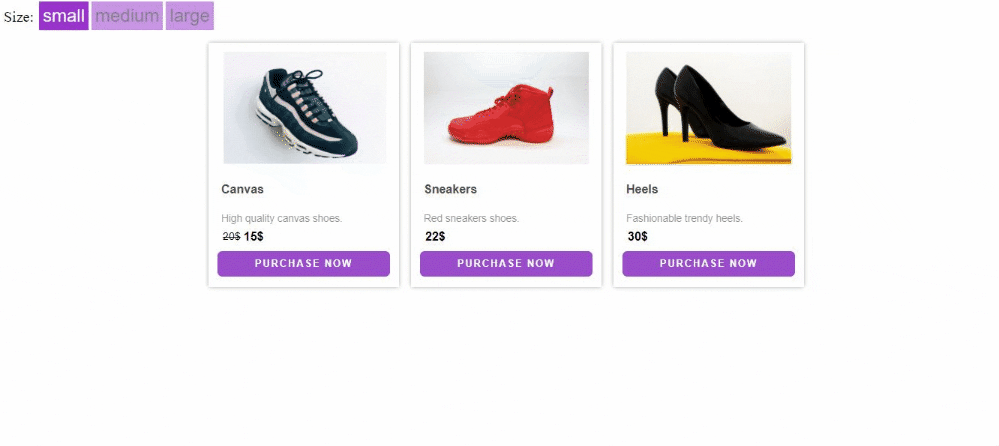
Cards are available in small, medium and large size.
-
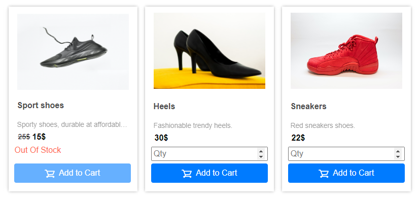
Custom Action Buttons:
Two action buttons with custom css, button text & custom callbacks on click event.
-
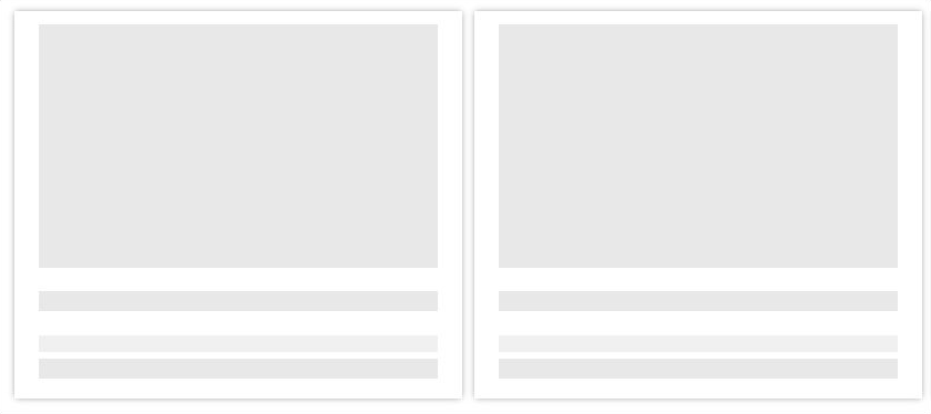
Skeleton Loading:
Show custom number of skeleton content cards while loading.
-
Lightweight:
No additional dependencies or CSS Framework required.
Preview:
Responsive on small screens

Skeleton loading
With Custom Card Controls
With Custom CSS

E-Commerce Example

Example:
    import React from 'react';
    import Catalog from "react-catalog-view";

    function ProductData(props){
      let products =
       [
         {
            id: 1,
            title: "Canvas",
            description: "High quality canvas shoes.",
            price: "20",
            discounted: "15",
            currency: "$",
            image: "http://domain.com/images/1.jpg",
         },
         {
            id: 2,
            title: "Sport shoes",
            description: "Sporty shoes, durable at affordable ranges.",
            price: "25",
            currency: "$",
            discounted: "15",
            image: "http://domain.com/images/5.jpg",
         },
         {
            id: 3,
            title: "Heels",
            description: "Fashionable trendy heels.",
            currency: "$",
            price: "30",
            image: "http://domain.com/images/6.jpg",
         }
      ];

      const CONTENT_KEYS =
      {
         imgKey: "image",
         cardTitleKey: "title",
         cardDescriptionKey: "description",
         priceKey: "price",
         discountedPriceKey: "discounted",
         priceCurrencyKey: "currency",
         discountCurrencyKey: "currency"
      };

      return(
        <Catalog
           data = {products}
           // Array of JSON Objects (required)
           contentKeys={CONTENT_KEYS}
           // JSON Object defining the keys that will be
           // used from the data array, keys should match. (required)
           skeleton={0}
           // Any non zero number will override default cards
           // and will show that many skeleton cards.
           cardSize="sm"
           // Card sizes, sm, md and lg for small, medium  and large
           btnOneText="View"
           // Enter text for action button one
           // or pass empty string to hide.
           btnTwoText="Purchase Now"
           // Enter text for action button two
           // or pass empty string to hide.
           btnOneHandler={(args, event, objectData)=>{
            // 'objectData' returns object data from 'data' prop
            // any arguments passed will be before 'event'
            // and 'objectData'
           }}
           btnTwoHandler={(args, event, row)=>{
            // 'objectData' returns object data from 'data' prop
            // any arguments passed will be before 'event'
            // and 'objectData'
           }}
           imageClickHandler={(args, event, row)=>{
            // 'objectData' returns object data from 'data' prop
            // any arguments passed will be before 'event'
            // and 'objectData'
           }}
           cardControls={ dataObj => {
               return(
                  <div>
                     <input className='my-custom-input' placeholder='custom-input' />
                     <button className='my-custom-button' type='submit'> OK </button>
                  </div>
               )
            }
            // Pass a function which returns JSX to be rendered inside card
            // This function will have 'dataObj' containing JSON of
            // the item each card represents
        />
      )
  }
Props:
| Prop | Type | Description |
|---|
| data | Array | Array of JSON objects to be rendered (required) |
| contentKeys | JSON | JSON object which matches the keys in 'data' array (required) {
imgKey: "image",
cardTitleKey: "title",
cardDescriptionKey: "description",
priceKey: "price",
discountedPriceKey: "discounted",
priceCurrencyKey: "currency",
discountCurrencyKey: "currency"
} |
| cardSize | String | Card sizes, sm, md and lg for small, medium and large |
| skeleton | Number | Any non zero number will generate that many skeleton cards, skeleton cards over rides default view |
| btnOneText | String | Enter text for action button one or pass empty string to hide |
| btnTwoText | String | Enter text for action button two or pass empty string to hide |
| btnOneHandler | Callback | Callback function for onClick |
| btnTwoHandler | Callback | Callback function for onClick |
| imageClickHandler | Callback | Callback function for image click |
| cardControls | Function | Render custom component passed as a function |
CSS Classes:
Default CSS classes for easy css customization.
| ClassName | Description |
|---|
| rcv-container-custom | For parent container |
rcv-object-sm-custom
@media(max-width: 575px) | For container of small cards |
rcv-object-md-custom
@media(max-width: 575px) | For container of medium cards |
rcv-object-lg-custom
@media(max-width: 575px) | For container of large cards |
| rcv-catalog-card-custom | For customizing card |
| rcv-product-image-container-custom | For product image container |
| rcv-product-image-container-custom>img | For product image |
| rcv-product-text-custom | For product text |
| rcv-product-name-custom | For product name |
| rcv-product-description-custom | For product description |
| rcv-original-price-custom | For original price text |
| rcv-discount-price-custom | For discount price text |
| rcv-btn-one-custom | For button one |
| rcv-btn-two-custom | For button two |
Support:
For support contact: adnanali17official@gmail.com, daniyal_09.2005@hotmail.com


