react-chat-elements
Reactjs chat elements
Components
- ChatItem
- MessageBox
- SystemMessage
- MessageList
- ChatList
- Input
- Button
- Popup
- SideBar
- Navbar
- Dropdown
ChatItem Component
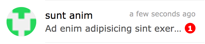
import { ChatItem } from 'react-chat-elements'
<ChatItem
avatar={'https://facebook.github.io/react/img/logo.svg'}
alt={'Reactjs'}
title={'Facebook'}
subtitle={'What are you doing?'}
date={new Date()}
unread={0} />
ChatItem props
| prop | default | type | description |
|---|
| avatar | none | string | ChatItem avatar photo url |
| alt | none | string | ChatItem avatar photo alt text |
| title | none | string | ChatItem title |
| subtitle | none | string | ChatItem subtitle |
| date | none | date | ChatItem date |
| unread | 0 | int | ChatItem unread count |
| onClick | none | function | ChatItem on click |
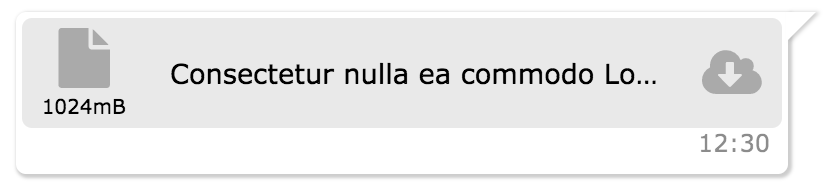
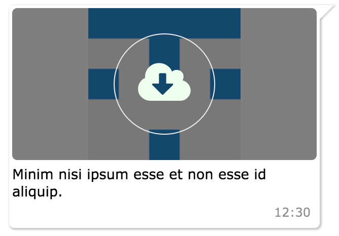
MessageBox Component
import { MessageBox } from 'react-chat-elements'

<MessageBox
    position={'left'}
    type={'photo'}
    text={'react.svg'}
    data={{
        uri: 'https://facebook.github.io/react/img/logo.svg',
        status: {
            click: false,
            loading: 0,
        }
    }}/>
MessageBox props
| prop | default | type | description |
|---|
| id | i (index) | string | message box id |
| position | left | string | message box position |
| type | text | string | message type (text, photo, file) |
| text | none | string | message text |
| data | {} | object | message data |
| date | new Date() | Date | message date |
SystemMessage Component
import { SystemMessage } from 'react-chat-elements'

<SystemMessage
    text={'End of conversation'}/>
SystemMessage props
| prop | default | type | description |
|---|
| text | none | string | message text |
MessageList Component
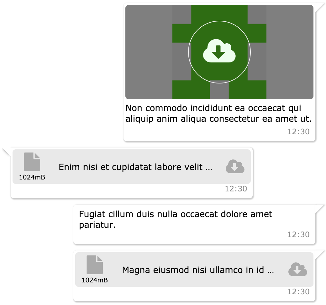
import { MessageList } from 'react-chat-elements'

<MessageList
    className='message-list'
    lockable={true}
    toBottomHeight={'100%'}
    dataSource={[
        {
            position: 'right',
            type: 'text',
            text: 'Lorem ipsum dolor sit amet, consectetur adipisicing elit',
            date: new Date(),
        },
        .
        .
        .
    ]} />
MessageList props
| prop | default | type | description |
|---|
| className | none | string | optional message list className |
| dataSource | [] | array | message list array |
| lockable | false | boolean | It locks to scroll position when the dataSource has been changed |
| toBottomHeight | 300 | int or string(only '100%') | If the toBottomHeight property's value higher than bottom value of the scrollbar when the data source has been changed Scrollbar goes to bottom at the end of the page. If the toBottomHeight property's value has been set '100%', scrollbar goes to bottom at the end of the page when the data source has been changed. |
| onClick | none | function | message list item on click (message(object) is returned) |
ChatList Component
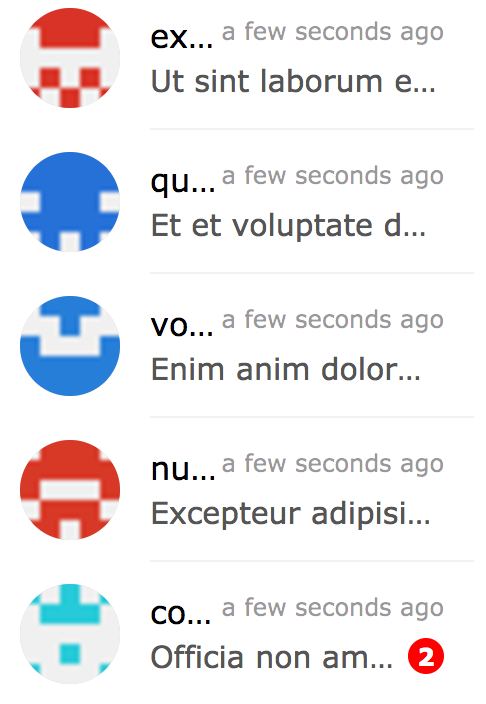
import { ChatList } from 'react-chat-elements'

<ChatList
    className='chat-list'
    dataSource={[
        {
            avatar: 'https://facebook.github.io/react/img/logo.svg',
            alt: 'Reactjs',
            title: 'Facebook',
            subtitle: 'What are you doing?',
            date: new Date(),
            unread: 0,
        },
        .
        .
        .
    ]} />
ChatList props
| prop | default | type | description |
|---|
| className | none | string | optional chat list className |
| dataSource | [] | array | chat list array |
| onClick | none | function | chat list item on click (chat(object) is returned) |
Input Component
import { Input } from 'react-chat-elements'
<Input
placeholder="Type here..."
multiline={true}
buttons={
<Button
color='white'
backgroundColor='black'
text='Send'/>
}/>
<Input
ref='input'
placeholder="Type here..."/>
this.refs.input.clear();
Input props
| prop | default | type | description |
|---|
| className | none | string | optional input className |
| placeholder | none | string | input placeholder text |
| defaultValue | none | string | input default value |
| onChange | none | function | input onChange function |
| multiline | false | bool | input is textarea |
| autoHeight | true | bool | input auto height |
| minHeight | 25 | int | input min height |
| maxHeight | 200 | int | input max height |
| inputStyle | none | object | inputStyle object |
| leftButtons | none | object(component) | left buttons component |
| rightButtons | none | object(component) | right buttons component |
| inputRef | none | function | input or textarea ref |
Button Component
import { Button } from 'react-chat-elements'

<Button
    text={'click me!'} />
Button props
| prop | default | type | description |
|---|
| type | none | string | button type (outlined, transparent) |
| disabled | none | string | button is disabled? |
| text | none | string | button text |
| buttonRef | none | function | button ref |
import { Popup } from 'react-chat-elements'

<Popup
    show={this.state.show}
    header='Lorem ipsum dolor sit amet.'
    headerButtons={[{
        type: 'transparent',
        color:'black',
        text: 'close',
        onClick: () => {
            this.setState({show: false})
        }
    }]}
    text='Lorem ipsum dolor sit amet, consectetur adipisicing elit. Voluptatem animi veniam voluptas eius!'
    footerButtons={[{
        color:'white',
        backgroundColor:'#ff5e3e',
        text:"Vazgeç",
    },{
        color:'white',
        backgroundColor:'lightgreen',
        text:"Tamam",
    }]}/>
| prop | default | type | description |
|---|
| show | false | bool | popup visible |
| header | none | string | popup title (header) message |
| headerButtons | none | array | popup title (header) buttons |
| text | none | string | popup content (center) message |
| color | #333 | string (color) | popup content message color |
| footerButtons | none | array | popup footer buttons |
| renderHeader | none | function (component) | render header function |
| renderContent | none | function (component) | render content function |
| renderFooter | none | function (component) | render footer function |
import { SideBar } from 'react-chat-elements'

<SideBar
    top={
        <div>'TOP' area</div>
    }
    center={
        <div>'CENTER' area</div>
    }
    bottom={
        <div>'BOTTOM' area</div>
    }/>
| prop | default | type | description |
|---|
| type | dark | string | popup visible |
| top | false | function (component) | popup top component |
| center | none | function (component) | popup center component |
| bottom | none | function (component) | popup bottom component |
Navbar Component
import { Navbar } from 'react-chat-elements'

<Navbar
    top={
        <div>'TOP' area</div>
    }
    center={
        <div>'CENTER' area</div>
    }
    bottom={
        <div>'BOTTOM' area</div>
    }/>
Navbar props
| prop | default | type | description |
|---|
| type | dark | string | popup visible |
| top | false | function (component) | popup top component |
| center | none | function (component) | popup center component |
| bottom | none | function (component) | popup bottom component |
Dropdown Component
import { Dropdown } from 'react-chat-elements'

<Dropdown
	buttonProps={{
		text: 'Dropdown',
	}}
    items={[
        'merhaba',
        'lorem',
        'ipsum',
        'dolor',
        'sit',
        'amet',
    ]}/>
Dropdown props
| prop | default | type | description |
|---|
| animationType | none | string | fade or default |
| animationPosition | nortwest | string | animation start position (nortwest, norteast, southwest, southeast) |
| items | none | array | dropdown items array |
| onSelect | none | function | item on select |
| buttonProps | none | object | button properties |