Product
Introducing Rust Support in Socket
Socket now supports Rust and Cargo, offering package search for all users and experimental SBOM generation for enterprise projects.
react-context-tabs
Advanced tools
A flexible and unopinionated tab interface for React. Tabs and panes to be provided in any order or nesting. Inactive panels can be either unmounted or just hidden from view. Includes an optional minimal base stylesheet, but leaves aesthetics up to you.
TabsTabListTabTabPanelPersistentTabPanelnpm install react-context-tabs --save
Straight forward tabs!
import React from 'react'
import { Tab, TabList, Tabs, TabPanel } from 'react-context-tabs'

export default function TabExample() {
  return (
    <Tabs defaultTabId='home'>
      <TabList>
        <Tab tabId='home'>React context tabs</Tab>
        <Tab tabId='about'>What is it?</Tab>
        <Tab tabId='issues'>I have a problem</Tab>
      </TabList>
      <TabPanel tabId='home'>
        <p>
          Flexible tabs for React
        </p>
      </TabPanel>
      <TabPanel tabId='about'>
        <p>
          A fine React library
        </p>
      </TabPanel>
      <TabPanel tabId='issues'>
        <p>
          Problem? Try our
          <a href="https://github.com/usabilityhub/react-context-tabs/issues">issues</a> page.
        </p>
      </TabPanel>
    </Tabs>
  )
}
Tabs can be either "controlled" or "uncontrolled". Controlled tabs require a selectedTabId property.
import React, { Component } from 'react'
import { Tab, TabList, Tabs, TabPanel } from 'react-context-tabs'

function getHash() {
  return window.location.hash.slice(1)
}

class HashControlledTabs extends Component {

  constructor(props) {
    super(props)
    this.state = { selectedTabId: getHash() }
    this.handleHashChange = this.handleHashChange.bind(this)
    this.handleTabChange = this.handleTabChange.bind(this)
  }

  componentDidMount() {
    window.onhashchange = this.handleHashChange
  }

  componentWillUnmount() {
    window.onhashchange = null
  }

  handleHashChange(event) {
    this.setState({ selectedTabId: getHash() })
  }

  handleTabChange(nextTab, prevTab) {
    window.location.hash = nextTab
  }

  render() {
    const { selectedTabId } = this.state

    return (
      <Tabs
        selectedTabId={selectedTabId}
        onTabChange={this.handleTabChange}
      >
        <TabList>
          <Tab tabId='happy'>Happy</Tab>
          <Tab tabId='sad'>Sad</Tab>
        </TabList>
        <TabPanel tabId='happy'>
          <span style={{ fontSize: '100px', transform: 'rotate(0.25turn)' }}>
            :)
          </span>
        </TabPanel>
        <TabPanel tabId='sad'>
          <span style={{ fontSize: '100px', transform: 'rotate(0.25turn)' }}>
            :(
          </span>
        </TabPanel>
      </Tabs>
    )
  }
}
Thanks to React's context feature, children can be re-ordered or nested as you please.
import React from 'react'
import { Tab, TabList, Tabs, TabPanel } from 'react-context-tabs'

function CharacterInformation({ warrior, wizard }) {
  return (
    <Tabs defaultTabId='warrior'>

      <section className='characterInfo'>
        <TabPanel tabId='warrior'>
          <CharacterStats stats={warrior.stats} />
        </TabPanel>
        <TabPanel tabId='wizard'>

          {/* Tabception */}
          <Tabs defaultTabId='stats'>
            <TabList>
              <Tab tabId='stats'>Stats</Tab>
              <Tab tabId='spells'>Spells</Tab>
            </TabList>
            <TabPanel tabId='stats'>
              <CharacterStats stats={wizard.stats} />
            </TabPanel>
            <TabPanel tabId='spells'>
              <CharacterSpells spells={wizard.spells} />
            </TabPanel>
          </Tabs>

        </TabPanel>
      </section>

      {/* Children can be any old component */}
      <marquee>Select your character!</marquee>

      {/* Tabs come after panels */}
      <section className='characterSelection'>
        <TabList>
          <Tab tabId='warrior'>
            Warrior
          </Tab>
          <Tab tabId='wizard'>
            Wizard
          </Tab>
        </TabList>
      </section>
    </Tabs>
  )
}
A base style sheet is included in the build at /lib/styles/base.css. This just sets appropriate cursor and removes default list styles (for the TabList). You'll still need to write your own CSS to make the tabs look how you want.
Each component has a default class name that is the same as its component name. eg:
<div class="Tabs">
  <ul class="TabList">
    <li class="Tab isSelected">First</li>
    <li class="Tab">Second</li>
  </ul>
  <section className="TabPanel">
    First content
  </section>
<!--
  <section className="TabPanel">
    Second content
  </section>
-->
</div>
Note that PersistentTabPanel and TabPanel both have the same class: TabPanel.
TabsParent container to which child components are passed. Tabs can be either "controlled" or "uncontrolled". Supply either defaultTabId for uncontrolled or selectedTabId for controlled.
import { Tabs } from 'react-context-tabs'
import Tabs from 'react-context-tabs/Tabs'
// controlled
<Tabs
  selectedTabId={this.state.selectedTabId}
  onTabChange={(nextTabId, prevTabId) =>
    this.setState({ selectedTadId: nextTabId })
  }
>
  {/* ... */}
</Tabs>

// uncontrolled
<Tabs defaultTabId={initialTabId}>
  {/* ... */}
</Tabs>
defaultTabId: any - The tabId of the initially selected tab when uncontrolled.selectedTabId: any - The tabId of the currently selected tab when controlled.onTabChange: (nextTabId, prevTabId) => - Called when the tab changes. Optional for uncontrolled tabs.TabListA wrapper component for Tabs. This is just a ul.
import { TabList } from 'react-context-tabs'
import TabList from 'react-context-tabs/TabList'
<TabList>
  <Tab tabId='inbox'>Inbox</Tab>
  <Tab tabId='outbox'>Outbox</Tab>
  <Tab tabId='sent'>Sent</Tab>
</TabList>
TabAn individual tab. Has CSS class Tab, and isSelected or isDisabled.
import { Tab } from 'react-context-tabs'
import Tab from 'react-context-tabs/Tab'
<Tab tabId='home'>
  <Icon icon='house' />
  Home
</Tab>
tabId: any - The ID of the TabPanel to show when clicked.disabled: bool - Disallow clicking on this tab.tabindex: number - Allow this tab to be selected with tab. See MDN tabindex reference.TabPanelContainer for each tab's content. TabPanels are removed from the DOM when inactive.
TabPanel can be used as children of a ReactCSSTransitionGroup.
import { TabPanel } from 'react-context-tabs'
import TabPanel from 'react-context-tabs/TabPanel'
<TabPanel tabId='avatar'>
  <img src={`/images/avatars/${user.id}.jpeg`} />
  <span>{ user.name }</span>
</TabPanel>
tabId: any - The ID of the Tab that will reveal this panel.PersistentTabPanelAn alternative to TabPanel. PersistentTabPanel is not removed from the DOM when inactive. Instead it is set to display: none. Children will not be rendered until the tab is first revealed.
These panels are useful for tabs that are computationally expensive to render, or need to persist internal state while deselected.
import { PersistentTabPanel } from 'react-context-tabs'
import PersistentTabPanel from 'react-context-tabs/PersistentTabPanel'
tabId: any - The ID of the Tab that will reveal this panel.Questions, bug reports and pull requests welcome. See GitHub issues.
MIT
FAQs
Flexible tabs for React
The npm package react-context-tabs receives a total of 264 weekly downloads. As such, react-context-tabs popularity was classified as not popular.
We found that react-context-tabs demonstrated a not healthy version release cadence and project activity because the last version was released a year ago. It has 1 open source maintainer collaborating on the project.
Did you know?

Socket for GitHub automatically highlights issues in each pull request and monitors the health of all your open source dependencies. Discover the contents of your packages and block harmful activity before you install or update your dependencies.

Product
Socket now supports Rust and Cargo, offering package search for all users and experimental SBOM generation for enterprise projects.

Product
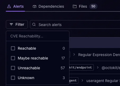
Socket’s precomputed reachability slashes false positives by flagging up to 80% of vulnerabilities as irrelevant, with no setup and instant results.

Product
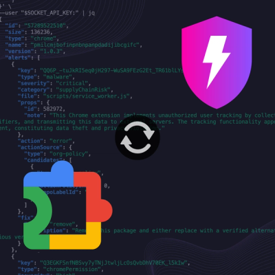
Socket is launching experimental protection for Chrome extensions, scanning for malware and risky permissions to prevent silent supply chain attacks.