A fully customizable custom react rating component
Customizable react star ratings. It allows use of different precisions and supports custom icon like heart icon
npm install --save react-custom-rating-component
Or
yarn add -D react-custom-rating-component
Motivation
I wanted a star rating component that was highly customizable and could do half stars, and I wanted it to be declarative. I couldn't find one that I liked, so I made one.
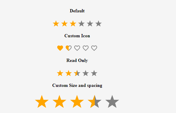
Demo
Demo Example Image
Usage
import Rating from 'react-custom-rating-component'

const App = () => {
  return (
    <div
      style={{
        display: 'flex',
        justifyContent: 'center',
        alignItems: 'center',
        margin: '40px 20px',
      }}
    >
      <Rating
        defaultValue={2.5}
        size='30px'
        spacing='10px'
        activeColor='red'
        onChange={(newRating) => console.log('newRating', newRating)}
        onHover={(hoveredRating) => console.log('hoveredRating', hoveredRating)}
      />
    </div>
  )
}
All Props
| Prop | Type | Default | Description |
|---|
defaultValue | string | 0 | Required. This is the value of the rating displayed by default. Supply this if your rating is also a readOnly |
precision | number | 1 | The value to increment rating when hovered or clicked |
count | number | 5 | The number of Icons to display |
shape | star or heart | star | This is the shape displayed as icon |
onChange | function | - | This is the function that is called when the rating value changes |
onHover | function | - | This is the function that is called when the rating Icon is hovered |
className | string | '' | classes passed to the parent component |
readOnly | boolean | false | This sets the component to be non editable |
size | string | 24px | This defines the size of the Icons used |
spacing | string | 5px | This defines the fap between the Icons used |
activeColor | string | orange | This is the color of the icon in the active state |
defaultColor | string | gray | This is the color of the icon in the inactive state |
titleArray | string[] | ['Poor', 'Good', 'Very Good', 'Best', 'Excellent'] | These are displayed as titles when icons are hovered |
showTitle | boolean | false | This defines whether to display the titles or not |
Browser Support
This library is supported by all the major browsers. It uses SVG and CSS3 to render the icons and hence the browser support is the same as that of SVG and CSS3.
Try Example And Contribute
Clone the repo and run yarn install and then yarn run start to run the example.
Run yarn run test to run the tests and ensure that everything is working as expected before submitting a PR.
If you want to contribute: Make changes in the src folder. And then run yarn run build. And of course test by running yarn run test. Then submit a PR.


