Socket
Socket
Sign inDemoInstall

react-dialog-builder

Package Overview
Dependencies
6
Maintainers
1
Versions
10
Alerts
File Explorer

Advanced tools

Install Socket

Detect and block malicious and high-risk dependencies

Install

    react-dialog-builder

This library provides an easy and convenient programmatic approach to render anything as a dialog


Version published
Maintainers
1
Install size
2.97 MB
Created

Readme

Source

This library allows programmatic creation of dialogs instead of using states which is often time a little inconvenient and results in quite a bit of boilerplate, its minimal, yet powerful API lets you render anything as a dialog, in additional to that, the CSS required for each created dialog is simple with no deeply nested selectors allowing you to easily style your dialogs anyway you want to fit your needs.

Why do you want to programmatically create dialogs? The short answer is simplicity, the long answer is because dialogs are on-demand components, you don't want them to appear inside your DOM tree until you need them which results in less bloated HTML, in additional to that, you don't have to create and maintain a new state to manage the dialog's life cycle (showing and closing the dialog)


Installation

npm i -S react-dialog-builder

Setting up

import { DialogBuilder } from 'react-dialog-builder';

// This is necessary because this library relies on a few CSS rules
import 'react-dialog-builder/light.css';
// or import 'react-dialog-builder/dark.css';

Available APIs

class DialogBuilder {
    /**
     * The entry point to the `DialogBuilder` APIs
     *
     * @param content The component's JSX to render
     * @returns A new dialog builder instance
     */
    static newDialog(content: ReactNode): DialogBuilder;

    /**
     * Adds another class name for this dialog, newly added class names are
     * concatenated instead of replacing previous ones.
     *
     * @param value The new class name to add
     * @returns This dialog builder instance
     */
    addClassName(value: string): DialogBuilder;

    /**
     * Sets whether this dialog can be closed by clicking on the backdrop, `false` by default
     *
     * @returns This dialog builder instance
     */
    dismissible(): DialogBuilder;

    /**
     * Sets whether the backdrop should be transparent, `false` by default
     *
     * @returns This dialog builder instance
     */
    transparentBackdrop(): DialogBuilder;

    /**
     * Opens the currently configured dialog, returns a dialog reference object that includes methods
     * to close this dialog or to set a callback to be invoked after the dialog is closed
     *
     * @returns A {@link DialogRef} object
     */
    open(): DialogRef;
}

/**
 * Represents an object that contains a reference to the opened dialog which allows
 * closing the dialog or setting a callback to be invoked after the dialog is closed
 */
interface DialogRef {
    /**
     * Manually close this dialog
     */
    close(): void;

    /**
     * Sets the callback to be invoked after the dialog is closed.
     */
    runAfterClosed(fn: () => void): void;
}


Using DialogBuilder

DialogBuilder contains a single entry point via the static method called newDialog which returns a new DialogBuilder. It uses the fluent interface pattern to make the APIs more friendly to develop with.

Code example

import { DialogBuilder } from 'react-dialog-builder';

import 'react-dialog-builder/light.css';

function App() {
  const openDialog = () => {
    const dialogRef: DialogRef = DialogBuilder.newDialog(
      <div style={{
        display: 'flex',
        flexFlow: 'column nowrap',
        alignItems: 'flex-end',
        backgroundColor: '#fff',
        padding: '5px 20px 15px',
        borderRadius: 4,
        fontFamily: 'Helvetica Neue'
      }}>
        <p>Creating dialogs can never be easier</p>
        <button
          type='button'
          style={{
            marginTop: 10
          }}
          onClick={() => {
              // Use the returned `DialogRef` object to close the dialog manually
              dialogRef.close();
          }}>
          Close
        </button>
      </div>
    )
        // Calling this method will make clicking on the backdrop close this dialog
      .dismissible()

      // The final step in configuring this dialog which returns a `DialogRef`
      // object allowing you to close this dialog instance or to set a callback to
      // be invoked after the dialog is closed
      .open();

    // The returned `DialogRef` object contains a method to set a callback to be
    // invoked right after the dialog is closed
    dialogRef.runAfterClosed(() => console.info('Dialog was closed'));
  };

  return (
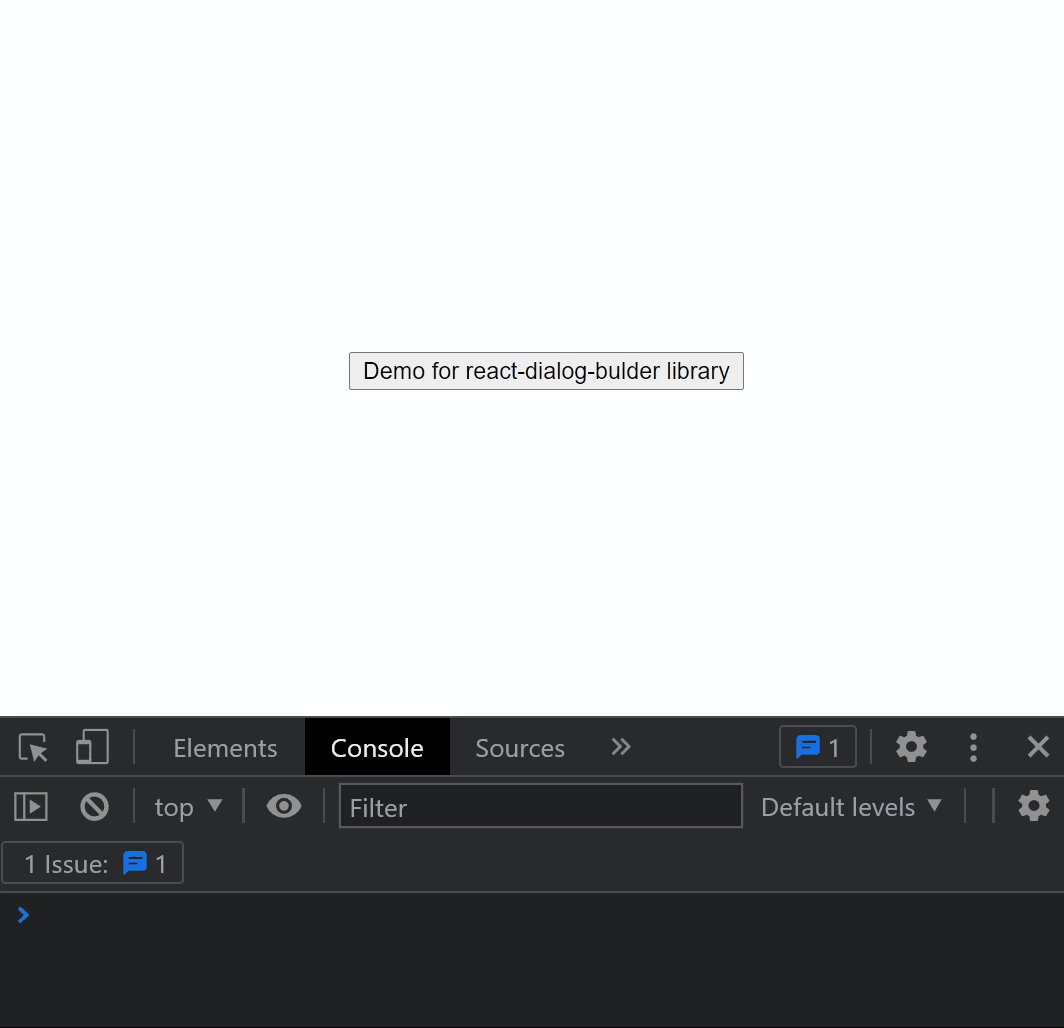
    <button onClick={openDialog}>Demo for react-dialog-builder library</button>
  );
}

Result

Example 1


Keywords

FAQs

Last updated on 06 Feb 2022

Did you know?

Socket for GitHub automatically highlights issues in each pull request and monitors the health of all your open source dependencies. Discover the contents of your packages and block harmful activity before you install or update your dependencies.

Install

Related posts

SocketSocket SOC 2 Logo

Product

  • Package Alerts
  • Integrations
  • Docs
  • Pricing
  • FAQ
  • Roadmap

Stay in touch

Get open source security insights delivered straight into your inbox.


  • Terms
  • Privacy
  • Security

Made with ⚡️ by Socket Inc