Product
New Socket Web Extension, Take Socket with You
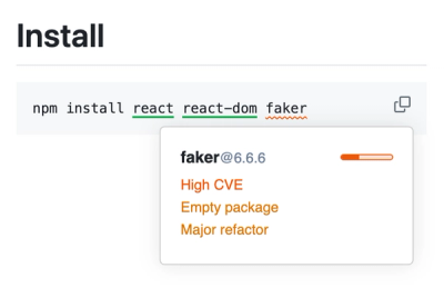
Can you spot malicious malicious packages on the web at a glance? Socket can. Check out our updated Web Extension!
By Vincent Grastic - Aug 14, 2024
react-flex-rating
Advanced tools
Readme

A (semi)full-featured React rating component.
className propertyCheck out the demo here! https://ravenhurst.github.io/react-flex-rating/
yarn add react-flex-rating
In your sass-enabled React app include this component's .scss:
@import "~react-flex-rating/lib/styles/index.scss";
(haven't figured out how to spit out compiled css using nwb-components yet)
Add the component into your app somewhere:
import Rating from 'react-flex-rating'
// Inside React component render():
<Rating {...{
className: `html-entities-rating`,
value: rating,
allowHalfs,
maxValue,
disabled,
iconCount: starCount,
activeIcon: <span>★</span>, // https://www.toptal.com/designers/htmlarrows/symbols/black-star/
inactiveIcon: <span>☆</span>, // https://www.toptal.com/designers/htmlarrows/symbols/white-star/
onSelect: rating => this.setState({ rating })
}} />
value (Number): Current value of the component. Used to drive the rendering of "active" icons. This is passed into the firrst argument of the onSelect callback method.allowHalfs (Boolean): Allows for toggling between whole and half-icon selections.maxValue (Number): Maximum value that full icon selection will indicate.disabled (Boolean): Disables interaction w/ the component and sets appropriate classes for styling.iconCount (Number): Number of icons to render.activeIcon (ReactElement): Element to render in "active" state.inactiveIcon (ReactElement): Element to render in "inactive" state.onSelect (Function): Function that is called whenever a new rating value is selected.FAQs
react-flex-rating Flexable React Component for ratings
We found that react-flex-rating demonstrated a not healthy version release cadence and project activity because the last version was released a year ago. It has 1 open source maintainer collaborating on the project.
Did you know?

Socket for GitHub automatically highlights issues in each pull request and monitors the health of all your open source dependencies. Discover the contents of your packages and block harmful activity before you install or update your dependencies.
Product
Can you spot malicious malicious packages on the web at a glance? Socket can. Check out our updated Web Extension!
Product
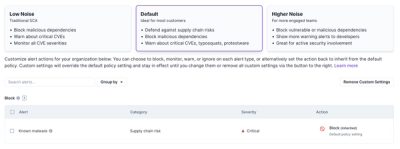
Socket introduces three new customizable default security policies for users to choose from: Low Noise (traditional SCA), Default, and Higher Noise.

Security News
MITRE has just minted its 400th CNA, as the NVD struggles to tame its backlog of CVEs awaiting analysis, which has increased by 30% since June.