
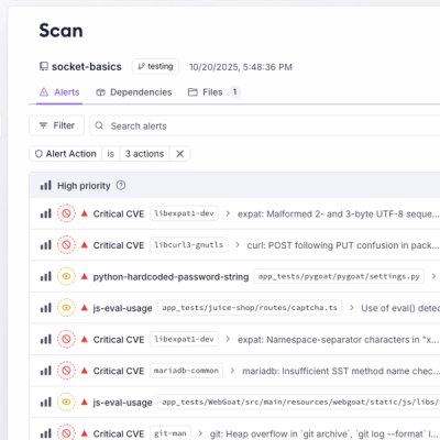
Research
Malicious NuGet Packages Typosquat Nethereum to Exfiltrate Wallet Keys
The Socket Threat Research Team uncovered malicious NuGet packages typosquatting the popular Nethereum project to steal wallet keys.
By Kirill Boychenko - Oct 22, 2025
react-floater
Advanced tools

You can view and edit the code for each Floater here
Install.
npm install --save react-floater
Import it into your component:
import Floater from 'react-floater';

<Floater content="This is the Floater content">
    <span>click me</span>
</Floater>
And voíla!
You can use your own components to render the Floater with the prop component.
Check WithStyledComponents.js in the demo for an example.
If you use your own components as children it will receive an innerRef prop that you must set in your HTMLElement:
Stateless components don't accept refs...
const Button = ({ innerRef, ...rest }) => (
  <button ref={innerRef} {...rest} />
);

...
<Floater content="This is the Floater content">
    <Button>click me</Button>
</Floater>
This works transparently with styled-components (and possible other modules):
const Wrapper = styled.div`
  margin: 0 auto;
  max-width: 500px;
  line-height: 1.5;
`;

<Floater content="This is the Floater content">
    <Wrapper>click me</Wrapper>
</Floater>
autoOpen {bool} ▶︎ false
Open the Floater automatically.
callback {func}
It will be called when the Floater change state with 2 parameters:
open or closechildren {node}
An element to trigger the Floater.
component {element|function}
A React component or function to as a custom UI for the Floater.
The prop closeFloater will be available in your component.
content {node}
The Floater content. It can be anything that can be rendered.
This is the only required props, unless you pass a component.
debug {bool} ▶︎ false
Log some basic actions.
You can also set a global variable ReactFloaterDebug = true;
disableAnimation {bool} ▶︎ false
Animate the Floater on scroll/resize.
disableFlip {bool} ▶︎ false
Disable changes in the Floater position on scroll/resize.
disableHoverToClick {bool} ▶︎ false
Don't convert hover event to click on mobile.
event {string} ▶︎ click
The event that will trigger the Floater. It can be hover | click.
These won't work in controlled mode.
eventDelay {number} ▶︎ 0.4
The amount of time (in seconds) that the floater should wait after a mouseLeave event before hiding.
Only valid for event type hover.
footer {node}
It can be anything that can be rendered.
getPopper {function} Get the pooper.js instance. It receives with 2 parameters:
floater or wrapperhideArrow {bool} ▶︎ false
Don't show the arrow. Useful for centered or modal layout.
id {string|number}
In case that you need to identify the portal.
offset {number} ▶︎ 15
The distance between the Floater and its target in pixels.
open {bool} ▶︎ false
The switch between normal and controlled modes.
Setting this prop will disabled the normal behavior.
options {object}
Customize popper.js modifiers.
Don't use it unless you know what you're doing
placement {string} ▶︎ bottom
The placement of the Floater. It will update the position if there's no space available.
It can be:
showCloseButton {bool} ▶︎ false
It will show a ⨉ button to close the Floater.
This will be true when you change wrapperOptions position.
styles {object} ▶︎ defaultStyles
Customize the default UI.
target {object|string}
The target used to calculate the Floater position. If it's not set, it will use the children as the target.
title {node}
It can be anything that can be rendered.
wrapperOptions {object}
Position the wrapper relative to the target.
You need to set a target for this to work.
{
    offset: number, // The distance between the wrapper and the target. It can be negative.
    placement: string, // the same options as above, except center
    position: bool, // Set to true to position the wrapper
}
You can customize everything with the styles prop.
Only set the properties you want to change and the default styles will be merged.
Check it styles.js for the syntax.
Default
The wrapper will trigger the events and use itself as the Floater's target.
<Floater content="This is the Floater content">
    <span>click me</span>
</Floater>
Proxy
The wrapper will trigger the events but the Floater will use the target prop to position itself.
<div className="App">
    <img src="some-path" />

    <Floater
      content="This is the Floater content"
      target=".App img"
    >
        <span>click me</span>
    </Floater>
</div>
Beacon
The same as the proxy mode but the wrapper will be positioned relative to the target.
<div className="App">
    <img src="https://upload.wikimedia.org/wikipedia/commons/2/2d/Google-favicon-2015.png" width="100" className="my-super-image" />

    <Floater
        content="This is the Floater content"
        target=".my-super-image"
        wrapperOptions={{
            offset: -22,
            placement: 'top',
            position: true,
        }}
    >
    <span style={{ color: '#f04', fontSize: 34 }}>◉</span>
    </Floater>
</div>
Controlled
When you set a boolean to the open prop it will enter the controlled mode and it will not respond to events.
In this mode you don't even need to have children
<div className="App">
    <img src="some-path" />
    <Floater
        content="This is the Floater content"
        open={true}
        target=".App img"
    />
</div>
react-tooltip is a popular library for creating tooltips in React applications. It offers a wide range of customization options and supports various positioning strategies. Compared to react-floater, react-tooltip is more focused on tooltips and may not offer the same level of flexibility for creating popovers and guided tours.
react-popper is a library that provides a powerful positioning engine for creating tooltips, popovers, and dropdowns in React applications. It is built on top of the Popper.js library and offers advanced positioning capabilities. While react-popper is more powerful in terms of positioning, it may require more configuration compared to react-floater.
react-joyride is a library for creating guided tours in React applications. It provides a comprehensive API for defining tour steps and customizing their appearance. Compared to react-floater, react-joyride is more specialized for creating guided tours and offers more features for managing tour state and behavior.
FAQs
Floaters everywhere!
The npm package react-floater receives a total of 419,407 weekly downloads. As such, react-floater popularity was classified as popular.
We found that react-floater demonstrated a not healthy version release cadence and project activity because the last version was released a year ago. It has 1 open source maintainer collaborating on the project.
Did you know?

Socket for GitHub automatically highlights issues in each pull request and monitors the health of all your open source dependencies. Discover the contents of your packages and block harmful activity before you install or update your dependencies.
Research
The Socket Threat Research Team uncovered malicious NuGet packages typosquatting the popular Nethereum project to steal wallet keys.
Product
A single platform for static analysis, secrets detection, container scanning, and CVE checks—built on trusted open source tools, ready to run out of the box.
Product
Socket is launching experimental protection for the Hugging Face ecosystem, scanning for malware and malicious payload injections inside model files to prevent silent AI supply chain attacks.