
Security News
Introducing the Socket Python SDK
The initial version of the Socket Python SDK is now on PyPI, enabling developers to more easily interact with the Socket REST API in Python projects.
By Douglas Coburn - Sep 13, 2024
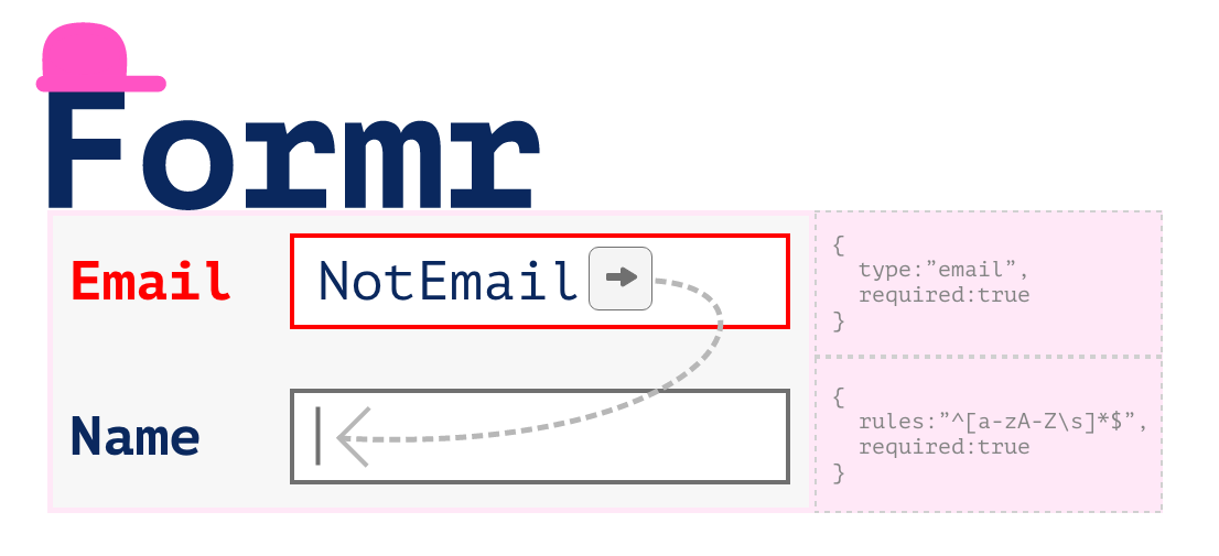
react-formr
Advanced tools


Centralised Form Solution for managing values, validations & input focusing in react native app.
inputBinder function - A function includes almost everything TextInputs required to handle a form.onFinishFocus on submit on last input.onChange props.Detailed blog post Easy React Native Form management with react-formr
Yarn
yarn add react-formr
NPM
npm i --save react-formr
import Formr to use with Formr wrapping component OR import {useFormr} to use Formr Hook.
import Formr, { useFormr } from 'react-formr';
useFormr Hook.export const App = () => {
const {
onChangeHandler,
onBlurHandler,
onSubmitEditingHandler,
onSubmitHandler,
inputBinder,
refsHandler,
values,
touched,
valid
} = useFormr({
formFields: { email: '', phone: '' },
validation: {
email: { required: true, type: 'email' },
phone: { type: 'phone' }
}
});
return (
<View>
{/* Passing Descrete props to TextInput (Not using inputBinder) */}
<TextInput
style={{
borderBottomColor: 'black',
borderWidth: 1,
width: '100%'
}}
onChangeText={(e) => onChangeHandler('email', e)}
onBlur={() => onBlurHandler('email')}
value={values.email}
ref={(ref) => refsHandler('password', ref)}
/>
{touched.email && !valid.email && <Text>Not valid</Text>}
{/* Using inputBinder, No need to take any other function than inputBinder from formr to work with input*/}
<TextInput
style={{
borderBottomColor: 'black',
borderWidth: 1,
width: '100%'
}}
{...inputBinder('phone')}
/>
{touched.phone && !valid.phone && <Text>Not valid</Text>}
<Button
onPress={() => onSubmitHandler(console.log)}
title="Submit"
color="#841584"
/>
</View>
);
};
Very minimal version of using formr
export const App = () =>{
  const {inputBinder} = useFormr({formFields:{name:"",email:""}});
  return(<View>
  <TextInput {...inputBinder('name')} />
  <TextInput {...inputBinder('email')} />
  </View>);
}
Formr wrapping component.export const App = () => {
return (
<View>
<Formr
formFields={{ email: '', phone: '' }}
validation={{
email: { required: true, type: 'email' },
phone: { type: 'phone' }
}}
>
{({
onChangeHandler,
onBlurHandler,
onSubmitEditingHandler,
onSubmitHandler,
inputBinder,
refsHandler,
values,
touched,
valid
}) => {
<>
<TextInput
style={{
borderBottomColor: 'black',
borderWidth: 1,
width: '100%'
}}
onChangeText={(e) => onChangeHandler('email', e)}
onBlur={() => onBlurHandler('email')}
value={values.email}
ref={(ref) => refsHandler('password', ref)}
/>
{touched.email && !valid.email && (
<Text>Not valid</Text>
)}
{/* Using input binder, No need to take any other function than inputBinder from formr to work with input*/}
<TextInput
style={{
borderBottomColor: 'black',
borderWidth: 1,
width: '100%'
}}
{...inputBinder('phone')}
/>
{touched.phone && !valid.phone && (
<Text>Not valid</Text>
)}
<Button
onPress={() => onSubmitHandler(console.log)}
title="Submit"
color="#841584"
/>
</>;
}}
</Formr>
</View>
);
};
| Name | Type | Default | Description | Example |
|---|---|---|---|---|
formFields | StringObject (Object) | {} | Form fields values | {email:""} |
validation | FormrValidation (Object) | {} | Form fields for validation | {email:{required:true,type:"email"}} |
onChange | Function | (values:StringObject)=>void | Function for observing fields changes | |
onFinishFocus | Function | (values:StringObject)=>void | Function to trigger on all input focus finished on hitting return key on last input. |
To control form fields, The Formr component will provide a function that include
| Name | Type | Usage | Descripion | Example |
|---|---|---|---|---|
inputBinder | Function | inputBinder( key:string ) | Which includes almost everything of TextInput: value, onChangeText, onBlur, ref, onSubmitEditing also valid & touched if you are making custom input component with these props | <TextInput {...inputBinder('email')} /> |
onChangeHandler | Function | onChangeHandler( key:string, value:string ) | To set value of the field, call this function with arguments: key - which input field to update. value to that field | <TextInput onChangeText={ (text)=> onHandleChange("email":text) } /> |
onBlurHandler | Function | onBlurHandler( key:string ) | To set which field is blurred, call this function with key on blurrEvent | <TextInput onBlur={ ()=> onBlurHandler("email") } /> |
refsHandler | Function | refsHandler( key:string, ref:any ) | To set which field is blurred, call this function with key on blurrEvent | <TextInput ref={ (ref)=> refsHandler("email",ref) } /> |
onSubmitEditingHandler | Function | onSubmitEditingHandler( key:string ) | To set which field is blurred, call this function with key on blurrEvent | <TextInput onSubmitEditing={ ()=> onSubmitEditingHandler("email") } /> |
onSubmitHandler | Function | onSubmitHandler( callback:(values)=>{} ) | This handle submit button & validation flow. This is used to submit form. | <Button title="Submit" onPress={ ()=> onSubmitHandler( (values)=> submitFormToApi(values) ) } /> |
values | { [key:string]:string, ... } | values={ values[key] } | Objct of field values, can be used for value input for the TextInput | <TextInput value={values.email} /> |
valid | { [key:string]:boolean, ... } | Its is This object contains validation results,true:valid and false:validation fail. | {!valid.email && <Text> This fields is invalid </Text>} | |
touched | { [key:string]:boolean, ... } | Its is used to show error message on validation fail. | {touched.email && !valid.email && <Text> This fields is invalid </Text>} |
FAQs
Form managing component for React & React Native
The npm package react-formr receives a total of 13 weekly downloads. As such, react-formr popularity was classified as not popular.
We found that react-formr demonstrated a healthy version release cadence and project activity because the last version was released less than a year ago. It has 1 open source maintainer collaborating on the project.
Did you know?

Socket for GitHub automatically highlights issues in each pull request and monitors the health of all your open source dependencies. Discover the contents of your packages and block harmful activity before you install or update your dependencies.
Security News
The initial version of the Socket Python SDK is now on PyPI, enabling developers to more easily interact with the Socket REST API in Python projects.

Security News
Floating dependency ranges in npm can introduce instability and security risks into your project by allowing unverified or incompatible versions to be installed automatically, leading to unpredictable behavior and potential conflicts.

Security News
A new Rust RFC proposes "Trusted Publishing" for Crates.io, introducing short-lived access tokens via OIDC to improve security and reduce risks associated with long-lived API tokens.