React Glass UI
A customizable React component library for creating elegant glassmorphism interfaces. It provides flexible, interactive UI elements, such as cards, buttons, and inputs, with effects including blur, saturation, distortion, light glow, and hover.
Live Demo / Playground
View Live Demo
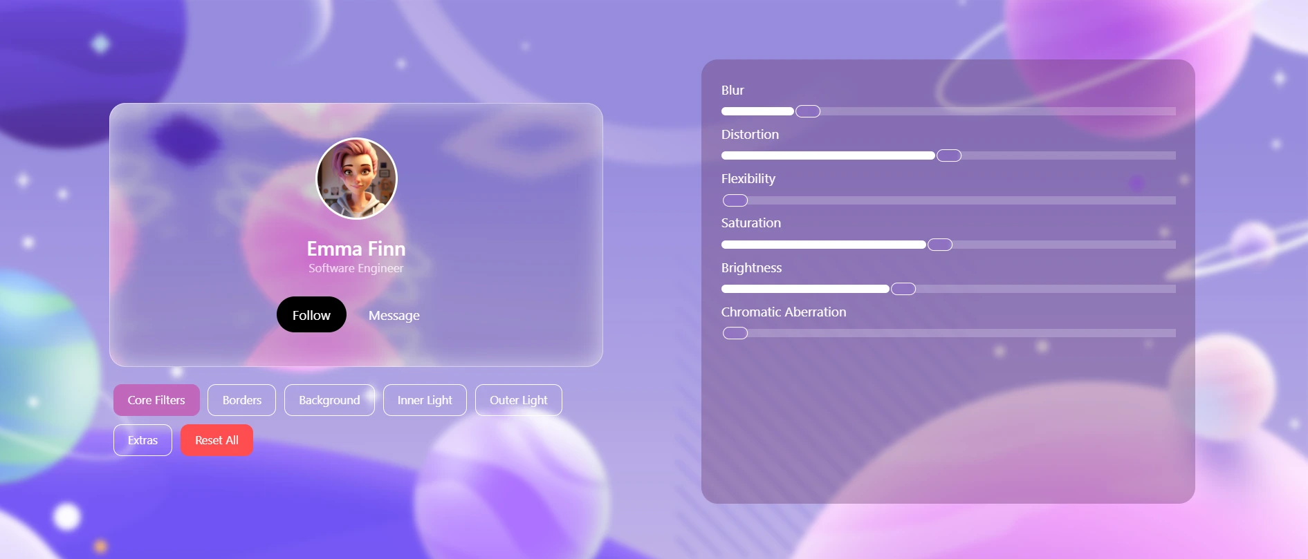
Try out the components in an interactive playground.
Browser Support
This library offers limited support across all modern browsers, but is optimized for Chrome for the best visual quality and performance.
Features
- GlassCard with distortion, glow, and hover flexibility
- GlassButton with customizable light and motion effects
- GlassInput with built-in label and glass styling
- TypeScript support
- Easily integrates into any layout or theme
Installation
npm install react-glass-ui
Usage
<GlassCard />
import { GlassCard } from "react-glass-ui";

<GlassCard>Hello World</GlassCard>
<GlassButton />
import { GlassButton } from "react-glass-ui";

<GlassButton>Click Me</GlassButton>
<GlassInput />
import { GlassInput } from "react-glass-ui";

<GlassInput label="Email:" placeholder="you@example.com" />
Shared Props (CommonGlassProps)
All glass components accept these props:
id | string | Unique identifier (useful for accessibility or testing). |
key | any | React key (usually used in lists). |
name | string | Input or component name (used in forms). |
width | number | Component width in pixels. |
height | number | Component height in pixels. |
className | string | Extra CSS classes for the root element. |
contentClassName | string | Extra CSS classes for the inner content container. |
contentCenter | boolean | Center content horizontally. |
itemsCenter | boolean | Center content vertically. |
blur | number | Background blur radius (e.g., 4 → blur(4px)). |
distortion | number | Distortion intensity (0–100, requires SVG filter). |
chromaticAberration | number | Color fringing intensity (requires SVG filter). |
brightness | number | Brightness multiplier (e.g., 100 = normal, 80 = dim). |
saturation | number | Content saturation level (e.g., 100 = normal, 120 = vivid). |
borderRadius | number | Corner radius in pixels. |
borderSize | number | Border thickness in pixels. |
borderColor | string | Border color. |
borderOpacity | number | Border opacity (0 to 1). |
backgroundColor | string | Background color overlay. |
backgroundOpacity | number | Opacity of the background (0 to 1). |
color | string | Text color for children. |
innerLightBlur | number | Inner glow blur radius. |
innerLightSpread | number | Inner glow spread distance (in px). |
innerLightColor | string | Inner glow color. |
innerLightOpacity | number | Inner glow opacity (0 to 1). |
outerLightBlur | number | Outer glow blur radius. |
outerLightSpread | number | Outer glow spread distance (in px). |
outerLightColor | string | Outer glow color. |
outerLightOpacity | number | Outer glow opacity (0 to 1). |
flexibility | number | Enables responsiveness to hover, motion, and distortion. |
onHoverScale | number | Scale multiplier on hover (requires flexibility > 0). |
padding | string | Padding (CSS shorthand, e.g. "12px 16px"). |
zIndex | number | Component stacking order. |
avoidSvgCreation | boolean | Skip SVG filter rendering (use only if you're handling filters manually). |
onClick | () => void | Click handler. |
Component-Specific Props
<GlassCard />
children | React.ReactNode | Content to render inside the card. |
Inherits all CommonGlassProps
<GlassButton />
children | React.ReactNode | Button content (text, icon, etc.). |
Inherits all CommonGlassProps
<GlassInput />
type | string | Input type (text, file, range, etc.). |
value | any | Current input value. |
placeholder | string | Placeholder text. |
label | string | Optional label displayed above the input. |
labelColor | string | Label text color. |
maxLength | number | Max character length (text input only). |
minLength | number | Min character length. |
min | number | Minimum value (for range/number types). |
max | number | Maximum value (for range/number types). |
step | number | Step size (for range/number inputs). |
multiple | boolean | Allows multiple file selection (file input). |
required | boolean | Marks the input as required. |
autofocus | boolean | Autofocus on mount. |
onChange | (e: React.ChangeEvent<HTMLInputElement>) | Input change handler. |
Inherits all CommonGlassProps
Development
npm install
npm run build
License (MIT)
Copyright (c) 2025 Yash Kamnani
Permission is hereby granted, free of charge, to any person obtaining a copy of this software and associated documentation files (the “Software”), to deal in the Software without restriction, including without limitation the rights to use, copy, modify, merge, publish, distribute, sublicense, and/or sell copies of the Software, and to permit persons to whom the Software is furnished to do so, subject to the following conditions:
The above copyright notice and this permission notice shall be included in all copies or substantial portions of the Software.
THE SOFTWARE IS PROVIDED “AS IS”, WITHOUT WARRANTY OF ANY KIND, EXPRESS OR IMPLIED, INCLUDING BUT NOT LIMITED TO THE WARRANTIES OF MERCHANTABILITY, FITNESS FOR A PARTICULAR PURPOSE AND NONINFRINGEMENT. IN NO EVENT SHALL THE AUTHORS OR COPYRIGHT HOLDERS BE LIABLE FOR ANY CLAIM, DAMAGES OR OTHER LIABILITY, WHETHER IN AN ACTION OF CONTRACT, TORT OR OTHERWISE, ARISING FROM, OUT OF OR IN CONNECTION WITH THE SOFTWARE OR THE USE OR OTHER DEALINGS IN THE SOFTWARE.


