Research
/Security News
Intercom’s npm Package Compromised in Ongoing Mini Shai-Hulud Worm Attack
Compromised intercom-client@7.0.4 npm package is tied to the ongoing Mini Shai-Hulud worm attack targeting developer and CI/CD secrets.
react-gradient-animation
Advanced tools
A highly customizable, animated gradient background component for React applications.
A highly customizable, animated gradient background component for React applications.
npm install react-gradient-animation
Or with Yarn:
yarn add react-gradient-animation
To use react-gradient-animation, wrap the GradientBackground component within a container that has a set width and height and a position: relative style.
import React from "react";
import { GradientBackground } from "react-gradient-animation";

function App() {
  return (
    <div style={{ position: "relative", width: "100%", height: "500px" }}>
      <GradientBackground
        count={20}
        size={{ min: 500, max: 700, pulse: 0.3 }}
        speed={{ x: { min: 0.5, max: 2 }, y: { min: 0.5, max: 2 } }}
        colors={{
          background: "#1e1e1e",
          particles: ["#ff007f", "#7f00ff", "#00ffff"],
        }}
        blending="overlay"
        opacity={{ center: 0.5, edge: 0 }}
        skew={-2}
        shapes={["c", "s", "t"]}
        style={{ opacity: 0.8 }}
      />
      {/* Other content */}
    </div>
  );
}

export default App;
| Prop | Type | Default Value | Description |
|---|---|---|---|
| count | number | 12 | The number of particles (shapes) to animate. |
| size | SizeConfig | { min: 1000, max: 1200, pulse: 0.5 } | Configuration for the size of the particles. Includes min, max, and pulse values. |
| speed | SpeedConfig | { x: { min: 0.6, max: 3 }, y: { min: 0.6, max: 3 } } | Configuration for the movement speed of particles along the x and y axes. |
| colors | ColorsConfig | { background: 'transparent', particles: ['#ff681c', '#87ddfe', '#231efe'] } | Colors for the background and particles. |
| blending | GlobalCompositeOperation or 'none' | 'overlay' | The global composite operation to use for blending particles. |
| opacity | OpacityConfig | { center: 0.45, edge: 0 } | Opacity settings for particles. |
| skew | number | -1.5 | The skew angle in degrees for the canvas transformation. |
| shapes | ShapeType[] | ['c'] | An array of shape types for the particles. |
| className | string | '' | Additional CSS classes to apply to the canvas element. |
| translateYcorrection | boolean | true | Adjusts the vertical translation to compensate for the skew transformation. |
| style | CSSProperties | {} | Inline styles to apply to the canvas element. |
interface SizeConfig {
  min: number;
  max: number;
  pulse: number;
}
interface SpeedAxisConfig {
  min: number;
  max: number;
}
interface SpeedConfig {
  x: SpeedAxisConfig;
  y: SpeedAxisConfig;
}
interface ColorsConfig {
  background: string;
  particles: string[];
}
interface OpacityConfig {
  center: number;
  edge: number;
}
type ShapeType = "c" | "s" | "t"; // 'c' for circle, 's' for square, 't' for triangle
import React from "react";
import { GradientBackground } from "react-gradient-animation";

function BasicExample() {
  return (
    <div style={{ position: "relative", height: "400px" }}>
      <GradientBackground />
      {/* Your content here */}
    </div>
  );
}

export default BasicExample;
import React from "react";
import { GradientBackground } from "react-gradient-animation";

function CustomExample() {
  return (
    <div style={{ position: "relative", width: "100%", height: "600px" }}>
      <GradientBackground
        count={15}
        size={{ min: 800, max: 1000, pulse: 0.4 }}
        speed={{ x: { min: 1, max: 2 }, y: { min: 1, max: 2 } }}
        colors={{
          background: "#0d0d0d",
          particles: ["#ff6347", "#1e90ff", "#32cd32"],
        }}
        blending="screen"
        opacity={{ center: 0.6, edge: 0 }}
        skew={-3}
        shapes={["c", "t"]}
        style={{ opacity: 0.9 }}
      />
      {/* Your content here */}
    </div>
  );
}

export default CustomExample;
GradientBackground component should be placed within a container that has:
position: relative style to ensure the canvas overlays correctly.style prop or use the className prop to apply CSS classes.shapes prop. The particles will cycle through the provided shapes.count and larger size ranges may impact performance on lower-end devices. Adjust the speed and pulse values to optimize animation smoothness.Contributions are welcome! Please open an issue or pull request for any bugs, improvements, or feature requests.
git checkout -b feature/YourFeature).git commit -am 'Add some feature').git push origin feature/YourFeature).This project is licensed under the MIT License - see the LICENSE file for details.
GradientBackground React component.react is a peer dependency. Ensure it is installed in your project.Happy coding!
FAQs
A highly customizable, animated gradient background component for React applications.
The npm package react-gradient-animation receives a total of 40 weekly downloads. As such, react-gradient-animation popularity was classified as not popular.
We found that react-gradient-animation demonstrated a healthy version release cadence and project activity because the last version was released less than a year ago. It has 1 open source maintainer collaborating on the project.
Did you know?

Socket for GitHub automatically highlights issues in each pull request and monitors the health of all your open source dependencies. Discover the contents of your packages and block harmful activity before you install or update your dependencies.

Research
/Security News
Compromised intercom-client@7.0.4 npm package is tied to the ongoing Mini Shai-Hulud worm attack targeting developer and CI/CD secrets.

Research
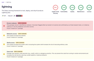
Socket detected a malicious supply chain attack on PyPI package lightning versions 2.6.2 and 2.6.3, which execute credential-stealing malware on import.

Research
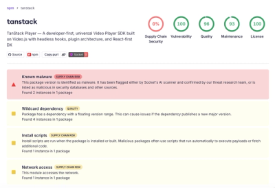
A brand-squatted TanStack npm package used postinstall scripts to steal .env files and exfiltrate developer secrets to an attacker-controlled endpoint.