Company News
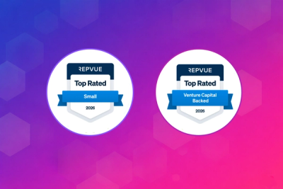
Socket Named Top Sales Organization by RepVue
Socket won two 2026 Reppy Awards from RepVue, ranking in the top 5% of all sales orgs. AE Alexandra Lister shares what it's like to grow a sales career here.
react-grid-system
Advanced tools
A no CSS Bootstrap-like responsive grid system for React.
npm install react-grid-system --save
react-grid-system provides a responsive grid similar to Bootstrap (see: http://getbootstrap.com/css/#grid),
except here, it's React components only, and no CSS is used at all.
Three components are provided for creating responsive grids: Container, Row, and Col.
An example on how to use these:
<Container>
  <Row>
    <Col sm={4}>
      One of three columns
    </Col>
    <Col sm={4}>
      One of three columns
    </Col>
    <Col sm={4}>
      One of three columns
    </Col>
  </Row>
</Container>
Next to the grid, two components are provided for showing or hiding content: Visible and Hidden.
The main difference between these two components and the similar CSS classes provided by Bootstrap is that
these two components do not render the content at all when it should be hidden, instead of just hiding it with CSS.
Some examples on how to use these components:
<p>
  <span>Your current screen class is </span>
  <Visible xs><strong>xs</strong></Visible>
  <Visible sm><strong>sm</strong></Visible>
  <Visible md><strong>md</strong></Visible>
  <Visible lg><strong>lg</strong></Visible>
  <Visible xl><strong>xl</strong></Visible>
  <span>.</span>
</p>
<Visible xs sm>
  <p>Paragraph visible on extra small and small.</p>
</Visible>
<Hidden xs sm>
  <p>Paragraph hidden on extra small and small.</p>
</Hidden>
<Visible md lg>
  <p>Paragraph visible on medium and large.</p>
</Visible>
<Hidden md lg>
  <p>Paragraph hidden on medium and large.</p>
</Hidden>
Next to that, the ScreenClassRender component is provided, for rendering a component differently based on the screen class.
An example on how to use this:
const styleFunction = (screenClass) => {
  if (screenClass === 'xl') return { fontSize: '60px' };
  if (screenClass === 'lg') return { fontSize: '40px' };
  if (screenClass === 'md') return { fontSize: '30px' };
  if (screenClass === 'sm') return { fontSize: '20px' };
  return { fontSize: '10px' };
};

<ScreenClassRender style={styleFunction}><p>Some text which font size depends on the screen class.</p></ScreenClassRender>
Finally, a ClearFix component can be used for resetting a row. This is sometimes needed when not all columns have the same height. For example:
<Row>
  <Col xs={6} sm={3}>
    xs=6 sm=3<br />
    This column has a lot more height, so a clearfix is needed for screenclass xs.
  </Col>
  <Col xs={6} sm={3}>xs=6 sm=3</Col>

  <ClearFix xs />

  <Col xs={6} sm={3}>xs=6 sm=3</Col>
  <Col xs={6} sm={3}>xs=6 sm=3</Col>
</Row>
The following child context types can be provided to the grid components, to alter their responsive behavior:
| Context Type | Default Value | Description |
|---|---|---|
breakpoints | [576, 768, 992, 1200] | The breakpoints (minimum width) of devices in screen class sm, md, lg, and xl. The default values are based on the Bootstrap 4 breakpoints. |
containerWidths | [540, 750, 960, 1140] | The container widths in pixels of devices in screen class sm, md, lg, and xl. The default values are based on the Bootstrap 4 container widths. |
gutterWidth | 30 | The gutter width in pixels. A gutter width of 30 means 15px on each side of a column. The default value is based on the Bootstrap 4 gutter width. |
serverSideScreenClass | xl | The screen class used when the view port cannot be determined using window. This is useful for server-side rendering based on the user agent. See also the example application below. |
phone | false | deprecated When set to true, a server-side screen class of xs will be used. |
tablet | false | deprecated When set to true, a server-side screen class of md will be used. |
An simple example application using all the features of react-grid-system can be found at https://github.com/JSxMachina/react-grid-system/tree/master/example.
More examples and documentation of all components can be found at the GitHub pages: https://JSxMachina.github.io/react-grid-system/
FAQs
A powerful Bootstrap-like responsive grid system for React.
The npm package react-grid-system receives a total of 42,088 weekly downloads. As such, react-grid-system popularity was classified as popular.
We found that react-grid-system demonstrated a not healthy version release cadence and project activity because the last version was released a year ago. It has 2 open source maintainers collaborating on the project.
Did you know?

Socket for GitHub automatically highlights issues in each pull request and monitors the health of all your open source dependencies. Discover the contents of your packages and block harmful activity before you install or update your dependencies.

Company News
Socket won two 2026 Reppy Awards from RepVue, ranking in the top 5% of all sales orgs. AE Alexandra Lister shares what it's like to grow a sales career here.

Security News
NIST will stop enriching most CVEs under a new risk-based model, narrowing the NVD's scope as vulnerability submissions continue to surge.

Company News
/Security News
Socket is an initial recipient of OpenAI's Cybersecurity Grant Program, which commits $10M in API credits to defenders securing open source software.