Product
Announcing Precomputed Reachability Analysis in Socket
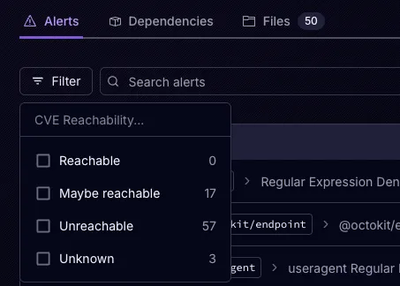
Socket’s precomputed reachability slashes false positives by flagging up to 80% of vulnerabilities as irrelevant, with no setup and instant results.
react-image-grid-gallery
Advanced tools
A simple image gallery with lightbox for displaying a grid of images in React apps
A simple, easy-to-use, and responsive image gallery component with a lightbox for displaying a grid of images in React apps.

Available at: https://codesweetly.com/react-image-grid-gallery
This section shows how to install the React Image Grid Gallery package.
npm install react-image-grid-gallery --save
yarn add react-image-grid-gallery
pnpm add react-image-grid-gallery
import { ImageGallery } from "react-image-grid-gallery";

const imagesArray = [
  {
    id: "uniqueid111",
    alt: "Image1's alt text",
    caption: "Image1's description",
    src: "http://example.com/image1.jpg",
  },
  {
    id: "uniqueid222",
    alt: "Image2's alt text",
    caption: "Image2's description",
    src: "http://example.com/image2.png",
    thumbSrc: "http://example.com/image2_640.png",
  },
  {
    id: "uniqueid333",
    alt: "Image3's alt text",
    caption: "Image3's description",
    src: "http://example.com/image3.webp?w=2400",
    gridSrc: "http://example.com/image3.webp?w=1280",
    thumbSrc: "http://example.com/image3.webp?w=640",
    srcSet:
      "http://example.com/image3.webp?w=2400 2400w, http://example.com/image3.webp?w=1280 1280w, http://example.com/image3.webp?w=640 640w",
    mediaSizes: "(max-width: 640px) 640w, (max-width: 1024px) 1280w, 2400px",
  },
];

function App() {
  return <ImageGallery imagesInfoArray={imagesArray} gapSize={24} />;
}
| Props | Type | Default | Description |
|---|---|---|---|
imagesInfoArray | array | undefined |
(Required) An array of objects containing the following properties:
|
| number or keyword (string) | "auto" | (Optional) The number of columns. | |
| number or keyword (string) | 230 | (Optional) The minimum width of the gallery's columns. | |
| number | 24 | (Optional) The gallery's gap size. | |
fixedCaption | boolean | false |
(Optional) Specify whether to display the image captions permanently ( |
thumbnailBorder | string | "3px solid #fff" | (Optional) The thumbnail's border style. |
lazy | boolean | true | (Optional) Specify whether to lazy load images. |
lazyFromIndex | number | 6 |
(Optional) The image's index to begin the grid's lazy loading. tip: Use a negative number to lazy load all the images. |
customStyles | ImageGalleryStylesType | {} |
(Optional) Custom styles to override the following element's default styles:
|
Remix users should add "react-image-grid-gallery" to their remix.config.js file:
/** @type {import('@remix-run/dev').AppConfig} */
module.exports = {
  ignoredRouteFiles: ["**/.*"],
+ serverDependenciesToBundle: ["react-image-grid-gallery"],
  serverModuleFormat: "cjs",
};
The serverDependenciesToBundle field tells Remix to transpile and include the "react-image-grid-gallery" package in the server bundle.
NextJS users should declare the "use client" directive at the top of their file. It should sit above all other import statements like so:
+ "use client";
import { ImageGallery } from "react-image-grid-gallery";
import { YouTubePlaylist } from "@codesweetly/react-youtube-playlist";
The "use client" directive tells NextJS to consider all modules imported into the page as part of the Client Component module graph.
The ImageGallery package works only as a Client Component because it uses React's State and Lifecycle effects, such as useState() and useEffect().
Did you get a ReferenceError: crypto is not defined error during the build step? If so, this note is for you.
Wrap the ImageGallery component in <BrowserOnly> if you get a ReferenceError: crypto is not defined error during your build step.
import BrowserOnly from "@docusaurus/BrowserOnly";

function YourComponent() {
  return (
    <BrowserOnly fallback={<div>Loading...</div>}>
      {() => {
        const ImageGallery = require("react-image-grid-gallery").ImageGallery;
        return (
          <ImageGallery
            imagesInfoArray={imagesArray}
            columnCount={"auto"}
            columnWidth={230}
            gapSize={24}
          />
        );
      }}
    </BrowserOnly>
  );
}
This process is essential if your imagesArray uses the Web Crypto API. The <BrowserOnly> component tells Docusaurus to render the ImageGallery library only in the browser. It ensures that the Crypto API runs only in CSR (Client-Side Rendering) rather than during build or SSR (Server-Side Rendering).
npm run build
<small>3.1.1 (2025-02-18)</small>
FAQs
A simple image gallery with lightbox for displaying a grid of images in React apps
The npm package react-image-grid-gallery receives a total of 318 weekly downloads. As such, react-image-grid-gallery popularity was classified as not popular.
We found that react-image-grid-gallery demonstrated a healthy version release cadence and project activity because the last version was released less than a year ago. It has 1 open source maintainer collaborating on the project.
Did you know?

Socket for GitHub automatically highlights issues in each pull request and monitors the health of all your open source dependencies. Discover the contents of your packages and block harmful activity before you install or update your dependencies.

Product
Socket’s precomputed reachability slashes false positives by flagging up to 80% of vulnerabilities as irrelevant, with no setup and instant results.

Product
Socket is launching experimental protection for Chrome extensions, scanning for malware and risky permissions to prevent silent supply chain attacks.

Product
Add secure dependency scanning to Claude Desktop with Socket MCP, a one-click extension that keeps your coding conversations safe from malicious packages.