
React Image Timeline
An image-centric timeline component for React.js. View chronological events in a pleasant way.
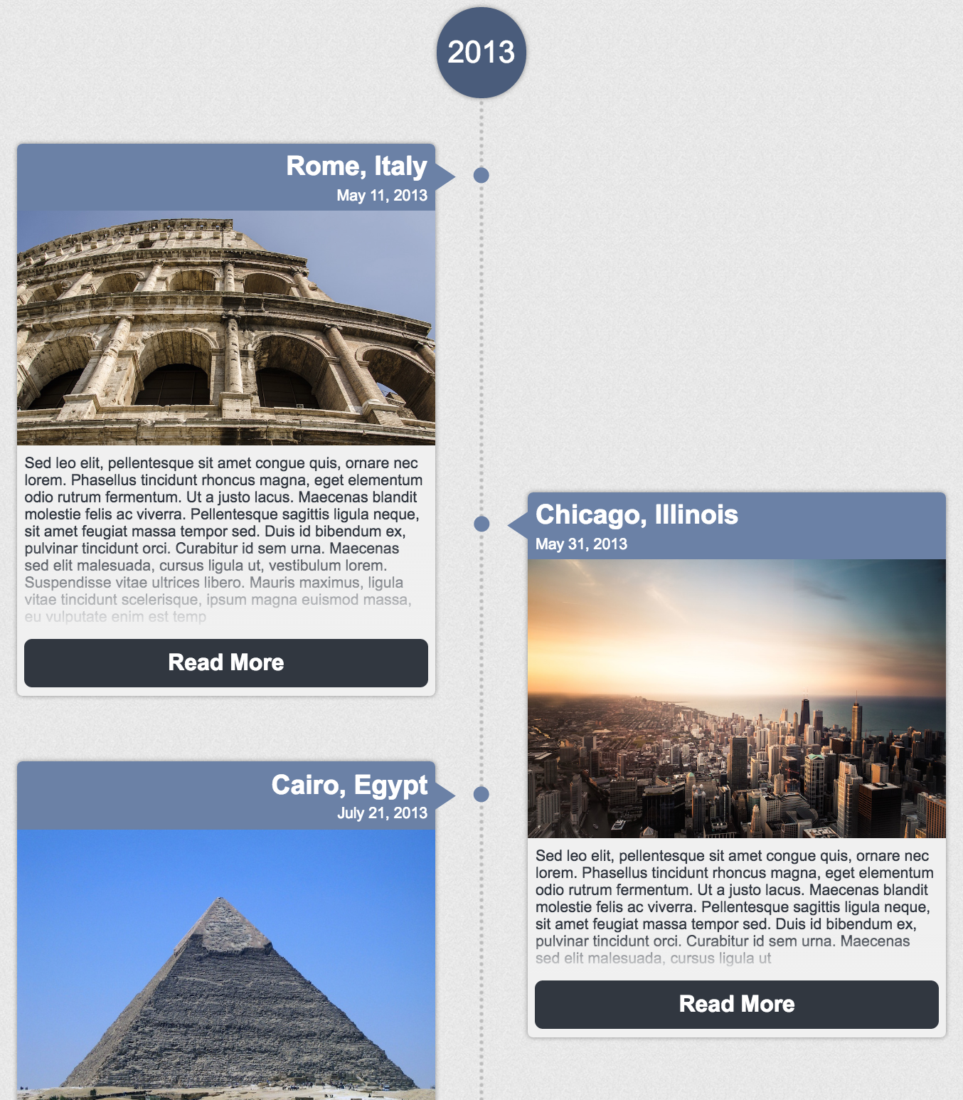
View Sample Timeline
Features:
- Responsive layout
- Graceful handling of non-uniform content
- Customizable (use your own CSS and components)
- Memoized, pure, & typed (Typescript definitions included)
- Only 32kb
- Zero extra dependencies
How to Use
npm install react-image-timeline --save
import React from 'react';
import ReactDOM from 'react-dom';
import Timeline from 'react-image-timeline';
require('react-image-timeline/dist/timeline.css');
ReactDOM.render(<Timeline events={events} />, document.getElementById('root'));
Sample TimelineEvent
{
    date: new Date(2013, 9, 27),
    text: "Sed leo elit, pellentesque sit amet congue quis, ornare nec lorem.",
    title: "Cairo, Egypt",
    buttonText: 'Click Me',
    imageUrl: "http://github.com/aaron9000/react-image-timeline/blob/master/src/assets/cairo.jpg?raw=true",
    onClick: () => {
        console.log('hello');
    }
}
Types
Typescript definitions are available
import {
    TimelineProps,
    TimelineEventProps,
    TimelineEvent,
    TimelineCustomComponents
} from 'react-image-timeline';
TimelineProps
| Key | Type | Required? |
|---|
| events | Array | Yes |
| customComponents | TimelineCustomComponents | |
| reverseOrder | boolean | |
| denseLayout | boolean | |
TimelineCustomComponents
| Key | Type | Required? |
|---|
| topLabel | component | |
| bottomLabel | component | |
| header | component | |
| imageBody | component | |
| textBody | component | |
| footer | component | |
TimelineEventProps
| Key | Type | Required? |
|---|
| event | TimelineEvent | Yes |
TimelineEvent
| Key | Type | Required? |
|---|
| date | date | Yes |
| title | string | Yes |
| imageUrl | string | Yes |
| text | string | Yes |
| onClick | function | |
| buttonText | string | |
| extras | object | |
Customization
Custom Styles
To customize the timeline, add your own CSS to override the default styles.
Event Metadata
To pass extra data into custom components, use extras on TimelineEvent.
Custom Dot Pattern
The dots are defined in CSS using a base64-encoded image. Encode a new image and override the corresponding CSS class.
Custom Components
For more advanced customization, you can pass in custom components to replace the defaults. Custom components will be passed a TimelineEvent model in props.
const CustomHeader = (props) => {

    const {title, extras} = props.event;
    const {customField} = extras;

    return <div className="custom-header">
        <h1>{title}</h1>
        <p>{customField}</p>
    </div>;
};

ReactDOM.render(<Timeline events={events} customComponents={{header: CustomHeader}}/>, document.getElementById('root'));
Run Example Project
*clone repository*
npm install
npm run start
Run Tests
*clone repository*
npm run test


