
Product
Socket for Jira Is Now Available
Socket for Jira lets teams turn alerts into Jira tickets with manual creation, automated ticketing rules, and two-way sync.
By Jeppe Hasseriis - Apr 20, 2026
react-loading-skeleton
Advanced tools
Make beautiful, animated loading skeletons that automatically adapt to your app.
Make beautiful, animated loading skeletons that automatically adapt to your app.
Learn about the changes in version 3, or view the v2 documentation.
Install via one of:
yarn add react-loading-skeleton
npm install react-loading-skeleton
import Skeleton from 'react-loading-skeleton'
import 'react-loading-skeleton/dist/skeleton.css'

<Skeleton /> // Simple, single-line loading skeleton
<Skeleton count={5} /> // Five-line loading skeleton
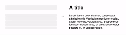
The Skeleton component should be used directly in your components in place of
content that is loading. While other libraries require you to meticulously craft
a skeleton screen that matches the font size, line height, and margins of your
content, the Skeleton component is automatically sized to the correct
dimensions.
For example:
function BlogPost(props) {
  return (
    <div>
      <h1>{props.title || <Skeleton />}</h1>
      {props.body || <Skeleton count={10} />}
    </div>
  );
}
...will produce correctly-sized skeletons for the heading and body without any further configuration.
This ensures the loading state remains up-to-date with any changes to your layout or typography.
Instead, make components with built-in skeleton states.
This approach is beneficial because:
Customize individual skeletons with props, or render a SkeletonTheme to style
all skeletons below it in the React hierarchy:
import Skeleton, { SkeletonTheme } from 'react-loading-skeleton';

return (
  <SkeletonTheme baseColor="#202020" highlightColor="#444">
    <p>
      <Skeleton count={3} />
    </p>
  </SkeletonTheme>
);
Skeleton only| Prop | Description | Default |
|---|---|---|
count?: number |
The number of lines of skeletons to render. If
count is a decimal number like 3.5,
three full skeletons and one half-width skeleton will be
rendered.
| 1 |
wrapper?: React.FunctionComponent | A custom wrapper component that goes around the individual skeleton elements. | |
circle?: boolean |
Makes the skeleton circular by setting border-radius to
50%.
| false |
className?: string |
A custom class name for the individual skeleton elements which is used
alongside the default class, react-loading-skeleton.
| |
containerClassName?: string |
A custom class name for the <span> that wraps the
individual skeleton elements.
| |
containerTestId?: string |
A string that is added to the container element as a
data-testid attribute. Use it with
screen.getByTestId('...') from React Testing Library.
| |
style?: React.CSSProperties |
This is an escape hatch for advanced use cases and is not the preferred
way to style the skeleton. Props (e.g. width,
borderRadius) take priority over this style object.
|
Skeleton and SkeletonTheme| Prop | Description | Default |
|---|---|---|
baseColor?: string | The background color of the skeleton. | #ebebeb |
highlightColor?: string | The highlight color in the skeleton animation. | #f5f5f5 |
width?: string | number | The width of the skeleton. | 100% |
height?: string | number | The height of each skeleton line. | The font size |
borderRadius?: string | number | The border radius of the skeleton. | 0.25rem |
inline?: boolean |
By default, a <br /> is inserted after each skeleton so
that each skeleton gets its own line. When inline is true, no
line breaks are inserted.
| false |
duration?: number | The length of the animation in seconds. | 1.5 |
direction?: 'ltr' | 'rtl' | The direction of the animation, either left-to-right or right-to-left. | 'ltr' |
enableAnimation?: boolean |
Whether the animation should play. The skeleton will be a solid color when
this is false. You could use this prop to stop the animation
if an error occurs.
| true |
customHighlightBackground?: string |
Allows you to override the background-image property of the highlight element, enabling you to fully customize the gradient. See example below.
| undefined |
There are two ways to wrap a skeleton in a container:
function Box({ children }: PropsWithChildren<unknown>) {
  return (
    <div
      style={{
        border: '1px solid #ccc',
        display: 'block',
        lineHeight: 2,
        padding: '1rem',
        marginBottom: '0.5rem',
        width: 100,
      }}
    >
      {children}
    </div>
  );
}

// Method 1: Use the wrapper prop
const wrapped1 = <Skeleton wrapper={Box} count={5} />;

// Method 2: Do it "the normal way"
const wrapped2 = (
  <Box>
    <Skeleton />
  </Box>
);
You may want to make the gradient used in the highlight element narrower or wider. To do this, you can set the customHighlightBackground prop. Here's an example of a narrow highlight:
<Skeleton customHighlightBackground="linear-gradient(90deg, var(--base-color) 40%, var(--highlight-color) 50%, var(--base-color) 60%)" />
If you use this prop, the baseColor and highlightColor props are ignored, but you can still reference their corresponding CSS variables as shown in the above example.

display: flex!In the example below, the width of the skeleton will be 0:
<div style={{ display: 'flex' }}>
  <Skeleton />
</div>
This happens because the skeleton has no intrinsic width. You can fix it by
applying flex: 1 to the skeleton container via the containerClassName prop.
For example, if you are using Tailwind, your code would look like this:
<div style={{ display: 'flex' }}>
  <Skeleton containerClassName="flex-1" />
</div>
In the example below, the height of the <div> will be slightly larger than 30
even though the react-loading-skeleton element is exactly 30px.
<div>
  <Skeleton height={30} />
</div>
This is a consequence of how line-height works in CSS. If you need the <div>
to be exactly 30px tall, set its line-height to 1. See
here
for more details.
Contributions are welcome! See CONTRIBUTING.md to get started.
Our logo is based off an image from Font Awesome. Thanks!
react-content-loader is a package that allows you to create SVG-based loading placeholders. It offers more customization options compared to react-loading-skeleton, including the ability to create complex shapes and animations. However, it may require more effort to set up and customize.
react-placeholder is another package for creating loading placeholders. It provides a variety of built-in placeholder types, such as text, media, and custom shapes. It is similar to react-loading-skeleton in terms of ease of use but offers more predefined placeholder types.
react-spinners is a package that provides a collection of loading spinner components. While it does not offer skeleton loading screens, it is useful for indicating loading states with animated spinners. It can be used in conjunction with react-loading-skeleton for a more comprehensive loading experience.
FAQs
Make beautiful, animated loading skeletons that automatically adapt to your app.
The npm package react-loading-skeleton receives a total of 901,376 weekly downloads. As such, react-loading-skeleton popularity was classified as popular.
We found that react-loading-skeleton demonstrated a not healthy version release cadence and project activity because the last version was released a year ago. It has 1 open source maintainer collaborating on the project.
Did you know?

Socket for GitHub automatically highlights issues in each pull request and monitors the health of all your open source dependencies. Discover the contents of your packages and block harmful activity before you install or update your dependencies.
Product
Socket for Jira lets teams turn alerts into Jira tickets with manual creation, automated ticketing rules, and two-way sync.

Company News
Socket won two 2026 Reppy Awards from RepVue, ranking in the top 5% of all sales orgs. AE Alexandra Lister shares what it's like to grow a sales career here.

Security News
NIST will stop enriching most CVEs under a new risk-based model, narrowing the NVD's scope as vulnerability submissions continue to surge.