Product
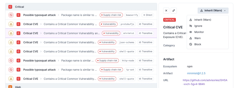
Introducing Enhanced Alert Actions and Triage Functionality
Socket now supports four distinct alert actions instead of the previous two, and alert triaging allows users to override the actions taken for all individual alerts.
react-modal-dialog
Advanced tools
Readme
This project is in progress. Feel free to read the code to use on your own. Documentation is coming; or if you want to contribute to the documentation, that is great as well.
Most of the core code is done, but the website and documentation are still in progress. Will update to version 1.0.0 once this API is stable.
When you have two dialogs, the ESC key will only close the top level one (there is an event manager implemented like a stack)
Dialogs bounce in with a spring animation (not a standard ease-in, ease-out). It is on the roadmap to make this part more extensible.
Dialogs that are too long will scroll in their viewport
The portal which opens the dialog, the background that the dialogs are loaded on, and the dialog itself are separate components. This way, you can hide a dialog and show a spinner on the dark portion, then show a success dialog. And neither the background or the dialog know about the portal.
For now, I recommend you check out the source code of this project, as it is quite simple, to really get an understanding of how this dialog works. I've spent a lot of time trying many paradigms (you can read about all that here), and I've settled on this one for good reasons.
The hardest part about dialogs is their architecture, not the UI or specific implementation. Feel free to swap out your own ModalDialog class into my existing ModalContainer, or disassemble ModalContainer into your own portal and background class.
To get the esc key to only close the top dialog when there are two modal dialogs, I employed the use of an event controller. However, you may find this to be peculiar or you may want to attach your dialogs to your own event controller. If that's true, you may want to branch this project to edit the code in componentDidMount and componentWillUnmount of ModalPortal.
To build the website, navigate to /site and run npm start
...
For your convenience, I have included some stylesheets in the package that you can either load in with something like webpack, or use as a reference for your own style implementation. I have also included the images necessary for the close button.
FAQs
A simple, idiomatic, and declarative way to launch modal dialogs in ReactJS
We found that react-modal-dialog demonstrated a not healthy version release cadence and project activity because the last version was released a year ago. It has 1 open source maintainer collaborating on the project.
Did you know?

Socket for GitHub automatically highlights issues in each pull request and monitors the health of all your open source dependencies. Discover the contents of your packages and block harmful activity before you install or update your dependencies.

Product
Socket now supports four distinct alert actions instead of the previous two, and alert triaging allows users to override the actions taken for all individual alerts.

Security News
Polyfill.io has been serving malware for months via its CDN, after the project's open source maintainer sold the service to a company based in China.

Security News
OpenSSF is warning open source maintainers to stay vigilant against reputation farming on GitHub, where users artificially inflate their status by manipulating interactions on closed issues and PRs.