
Security News
Deno 2.6 + Socket: Supply Chain Defense In Your CLI
Deno 2.6 introduces deno audit with a new --socket flag that plugs directly into Socket to bring supply chain security checks into the Deno CLI.
By Sarah Gooding - Dec 12, 2025
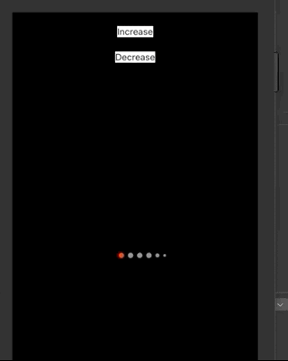
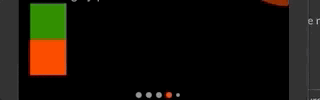
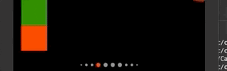
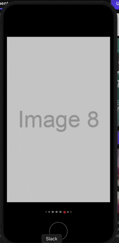
react-native-animated-dots-carousel
Advanced tools
Package to configure your dots pagination carousel just like Instagram does


Package to configure you dots pagination carousel just like Instagram does. With this package you could make whatever configuration you might need on your projects.

Installation can be done through npm or yarn:
For React < 17, use version 1.0.2 or below
npm i react-native-animated-dots-carousel --save
yarn add react-native-animated-dots-carousel
In order to use version 2.0.0 or above, you will need react-native-reanimated >= 3.0.0 and react-native-gesture-handle >= 2.0.0 and React >= 17
const { width } = Dimensions.get('window');

const images = [
  { id: '1', uri: 'https://via.placeholder.com/800x400.png?text=Image+1' },
  { id: '2', uri: 'https://via.placeholder.com/800x400.png?text=Image+2' },
  { id: '3', uri: 'https://via.placeholder.com/800x400.png?text=Image+3' },
  { id: '4', uri: 'https://via.placeholder.com/800x400.png?text=Image+4' },
  { id: '5', uri: 'https://via.placeholder.com/800x400.png?text=Image+5' },
  { id: '6', uri: 'https://via.placeholder.com/800x400.png?text=Image+6' },
  { id: '7', uri: 'https://via.placeholder.com/800x400.png?text=Image+7' },
  { id: '8', uri: 'https://via.placeholder.com/800x400.png?text=Image+8' },
  { id: '9', uri: 'https://via.placeholder.com/800x400.png?text=Image+9' },
  { id: '10', uri: 'https://via.placeholder.com/800x400.png?text=Image+10' },
];

export default function App() {
  const [index, setIndex] = React.useState<number>(0);
  const scrollViewRef = React.useRef<ScrollView>(null);

  const handleScroll = (event: NativeSyntheticEvent<NativeScrollEvent>) => {
    const contentOffsetX = event.nativeEvent.contentOffset.x;
    const finalIndex = Math.floor(contentOffsetX / width);
    setIndex(finalIndex);
  };

  return (
    <GestureHandlerRootView style={{ flex: 1 }}>
      <SafeAreaView style={styles.container}>
        <ScrollView
          ref={scrollViewRef}
          onScroll={handleScroll}
          scrollEventThrottle={16}
          horizontal
          pagingEnabled
          showsHorizontalScrollIndicator={false}
          style={{
            width: '100%',
            height: 300,
          }}
        >
          {images.map((image) => (
            <View
              key={image.id}
              style={{
                width: width,
                justifyContent: 'center',
                alignItems: 'center',
              }}
            >
              <Image
                source={{ uri: image.uri }}
                style={{
                  width: '100%',
                  height: '100%',
                  resizeMode: 'cover',
                }}
              />
            </View>
          ))}
        </ScrollView>
        <View style={{ marginTop: 20 }}>
          <AnimatedDotsCarousel
            length={images.length}
            scrollableDotsConfig={{
              setIndex,
              onNewIndex: (newIndex) => {
                scrollViewRef?.current?.scrollTo?.({
                  x: newIndex * width,
                  animated: false,
                });
              },
              containerBackgroundColor: 'rgba(230,230,230, 0.5)',
              container: {
                alignItems: 'center',
                borderRadius: 15,
                height: 30,
                justifyContent: 'center',
                paddingHorizontal: 15,
               }
            }}
            currentIndex={index}
            maxIndicators={4}
            interpolateOpacityAndColor={true}
            activeIndicatorConfig={{
              color: 'red',
              margin: 3,
              opacity: 1,
              size: 8,
            }}
            inactiveIndicatorConfig={{
              color: 'white',
              margin: 3,
              opacity: 0.5,
              size: 8,
            }}
            decreasingDots={[
              {
                config: { color: 'white', margin: 3, opacity: 0.5, size: 6 },
                quantity: 1,
              },
              {
                config: { color: 'white', margin: 3, opacity: 0.5, size: 4 },
                quantity: 1,
              },
            ]}
          />
        </View>
      </SafeAreaView>
    </GestureHandlerRootView>
  );
}

const styles = StyleSheet.create({
  container: {
    flex: 1,
    alignItems: 'center',
    justifyContent: 'center',
    backgroundColor: 'black',
  },
});
export interface DotConfig {
  size: number;
  opacity: number;
  color: string;
  margin: number;
  borderWidth?: number;
  borderColor?: string;
}
export interface DecreasingDot {
  quantity: number;
  config: DotConfig;
}

export interface ScrollableDotConfig {
  setIndex: Dispatch<SetStateAction<number>>;
  onNewIndex?: (index: number) => void;
  containerBackgroundColor: string;
  scrollableDotsContainer?: StyleProp<ViewStyle>;
}
| Prop | Type | Required(Default Value) | Description |
|---|---|---|---|
length | number | required | Length of the list you want to associate with the carousel dots |
currentIndex | number | required | Current index of the list. |
maxIndicators | number | required | This number represents how many indicators you want to show, without decreasing size. Counting inactive indicators and the active indicator |
activeIndicatorConfig | DotConfig | required | This is an object with the configuration of the active indicator |
inactiveIndicatorConfig | DotConfig | required | This is an object with the configuration of the inactive indicator |
decreasingDots | DecreasingDot[] | required | This is a list where you have to define the quantiy per element and the dot config. The quantity represents how many dots with this config you want per side (simetrically). The size of this elements should be decreasing size if you want this to look nice. |
verticalOrientation | boolean | false | If you want this oriented vertically or horizontally. Default is horizontally |
interpolateOpacityAndColor | boolean | true | Default is true. With this setted to true you will be able to see an animation everytime the activeDot change. |
duration | number | 500 | Duration of the dots transition |
scrollableDotsConfig | ScrollableDotConfig | optional | This is used if you want the Scrollable Gesture animation on the dots (as in the first gif of the README), read the example of using in order to understand how to implement it |
setIndex: Setter function returned by useState, it should be the setter function associated to the index handler that you have for your carouselonNewIndex: Function that will receive the new index every time it changes while scrolling, you should use this function to update your Carousel to the correct index or for whatever else you wantcontainerBackgroundColor: It is the background color that you will use for your container (it will show when you are doing the gesture, check the gifs above this README)container: It is the way you want that container shown on the gifs above to look like, how much border you want on it, the padding, the margins, etc.See the open issues for a list of proposed features (and known issues).
Contributions are what make the open source community such an amazing place to be learn, inspire, and create. Any contributions you make are greatly appreciated.
git checkout -b feature/AmazingFeature)git commit -m 'Add some AmazingFeature')git push origin feature/AmazingFeature)Distributed under the MIT License. See LICENSE for more information.
Project Link: https://github.com/felire/react-native-animated-dots-carousel
FAQs
Package to configure your dots pagination carousel just like Instagram does
The npm package react-native-animated-dots-carousel receives a total of 6,881 weekly downloads. As such, react-native-animated-dots-carousel popularity was classified as popular.
We found that react-native-animated-dots-carousel demonstrated a healthy version release cadence and project activity because the last version was released less than a year ago. It has 1 open source maintainer collaborating on the project.
Did you know?

Socket for GitHub automatically highlights issues in each pull request and monitors the health of all your open source dependencies. Discover the contents of your packages and block harmful activity before you install or update your dependencies.
Security News
Deno 2.6 introduces deno audit with a new --socket flag that plugs directly into Socket to bring supply chain security checks into the Deno CLI.

Security News
New DoS and source code exposure bugs in React Server Components and Next.js: what’s affected and how to update safely.

Security News
Socket CEO Feross Aboukhadijeh joins Software Engineering Daily to discuss modern software supply chain attacks and rising AI-driven security risks.