Security News
The Changelog Podcast: Practical Steps to Stay Safe on npm
Learn the essential steps every developer should take to stay secure on npm and reduce exposure to supply chain attacks.
react-native-awesome-pin
Advanced tools
A highly interactive and customisable PIN code screen for React Native.
A highly interactive and customizable PIN code screen for React Native.
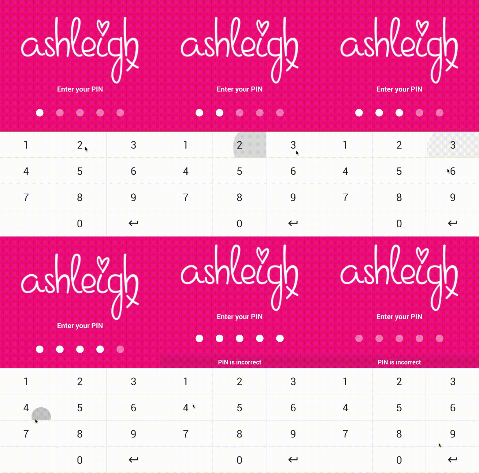
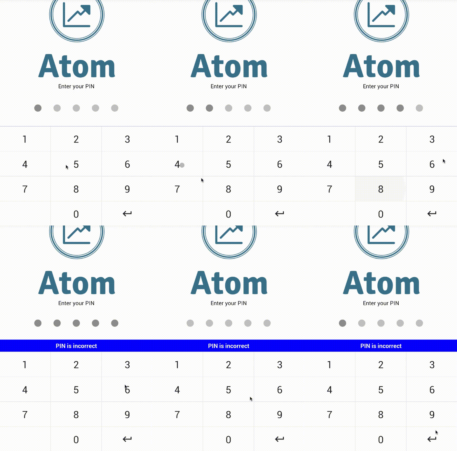
Plug and play PIN screen with dozens of props (can be themed to suit your brand).
Keyboard and PIN components can be used independently for more fine-grained customization.
Animations and micro-feedback included to create a great user experience.


To get started install via npm:
npm install react-native-awesome-pin --save
The <PinScreen /> will take up the full view. It is a plug and play component... pass your
logo, tagline, background colour, callback function and start verifying PINs.
Import:
import { PinScreen } from "react-native-awesome-pin";
Then add it to your code:
<PinScreen
    onRef={ ref => (this.pinScreen = ref) }
    tagline='Please enter your PIN'
    logo={ require('../../img/mylogohere.png') }
    containerStyle={{ backgroundColor: '#AAA' }}
    keyDown={ this.recievePin.bind(this) }
/>

// Callback function which receives the current PIN value
recievePin(pin){
   // Check if the PIN is correct here
}
You need to add a ref to your PinScreen, this allows you to throw an error from the
parent component when a PIN is incorrect. Errors can be thrown using the throwError(message)
method. Keyboard errors can be cleared using clearError()
recievePin(pin){
   // Clear error on interaction
   this.pinScreen.clearError();

   if(pin != '56771'){
       this.pinScreen.throwError('Your PIN is incorrect');
   }
}

The on-screen keyboard can be used separately if you do not want to use the plug
and play <PinScreen /> component.
Import:
import { PinKeyboard } from "react-native-awesome-pin";
Then add it to your code:
<PinKeyboard
    onRef={ref => (this.keyboard = ref)}
    keyDown={this.keyDown.bind(this)}
/>

// Callback function which receives the key pressed
keyDown(key){
   // Key pressed
}
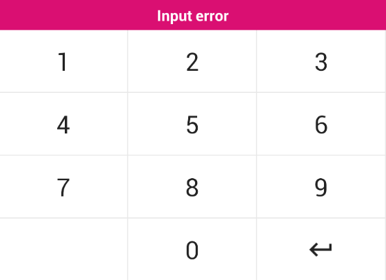
The <PinKeyboard /> also has a throwError(message) method. This will create a popup above the
keyboard displaying the given error message. The style of the popup can be customized through props.

The PIN input circles can be used separately if you do not want to use the plug
and play <PinScreen /> component. They come with a shake animation and configurable
device vibration.
Import:
import { PinInput } from "react-native-awesome-pin";
Then add it to your code:
<PinInput
  onRef={(ref) => (this.pins = ref)}
  numberOfPins={5}
  numberOfPinsActive={2}
/>
The <PinInput /> has a shake() method which can be called through the reference this.pins.shake().
This will perform a shake animation and vibration if enabled. A callback can be passed through props which
will be fired when the animation is complete. See props below.
The <PinScreen /> is a great plug and play solution for a PIN screen.
| Prop | Type | Optional | Default | Description |
|---|---|---|---|---|
| onRef | string | No | onRef allows you to call the throwError(message) method. | |
| keyDown | string | No | Callback function triggered when a key is pressed. Returns the current PIN value. | |
| tagline | string | Yes | 'Enter your PIN' | Tagline which sits above the PINS. |
| logo | object | Yes | Logo to place at top of screen. | |
| numberOfPins | number | Yes | 5 | Number of pins to render. |
| keyVibration | bool | Yes | true | Should vibration be enabled for key press. |
| shakeVibration | bool | Yes | true | Should vibration be enabled for shake. |
| headerBackgroundColor | string | Yes | #e2e2e2 | Header colour for the SafeAreaView. |
| footerBackgroundColor | string | Yes | #fff | Footer colour for the SafeAreaView. |
| ItemFooter | element | Yes | A footer component to render below the PinScreen. | |
| containerStyle | object | Yes | See PinScreen.js | Style applied to the container. Background colour can be set here. |
| logoStyle | object | Yes | Style applied to your logo. | |
| taglineStyle | object | Yes | See PinScreen.js | Style applied to the tagline. |
| pin | string | Yes | The pin value. | |
| pinContainerStyle | object | Yes | See PinInput.js | Style applied to PINS container. |
| pinStyle | object | Yes | See PinInput.js | Style applied to each circle PIN. |
| pinActiveStyle | object | Yes | See PinInput.js | Style applied to each circle PIN when it is active. |
| keyboard | array | Yes | See PinKeyboard.js | 4 x 3 matrix containing the value for each key. Image or text. |
| keyboardStyle | object | Yes | See PinKeyboard.js | Style applied to the keyboard. |
| keyboardDisabledStyle | object | Yes | See PinKeyboard.js | Style applied when the keyboard is disabled. |
| disableRippleEffect | bool | Yes | false | Disables the ripple effect from the keys. |
| keyStyle | object | Yes | See PinKeyboard.js | Style applied to each key on the keyboard. |
| keyTextStyle | object | Yes | See PinKeyboard.js | Style applied to the text inside each key. |
| keyImageStyle | object | Yes | See PinKeyboard.js | Style applied to image in a key. If an image is passed. |
| errorStyle | object | Yes | See PinKeyboard.js | Style applied to popup error. Can set the background colour here. |
| errorTextStyle | object | Yes | See PinKeyboard.js | Style applied to the text inside the popup error. |
The <PinKeyboard /> uses two arrays to allow you to set keys and define custom functions for each key. This is not the most fine-tune solution and will be upgraded
in the future.
| Prop | Type | Optional | Default | Description |
|---|---|---|---|---|
| onRef | string | No | onRef allows you to call the throwError(message) method. | |
| keyDown | string | No | Callback function triggered when a key is pressed. Returns the key value. | |
| keyboard | array | Yes | See PinKeyboard.js | 4 x 3 matrix containing the value for each key. Image or text. |
| keyboardFunc | array | Yes | See PinKeyboard.js | 4 x 3 matrix containing custom functions for each key. Pass null for no function. |
| keyboardStyle | object | Yes | See PinKeyboard.js | Style applied to the keyboard. |
| keyboardDisabledStyle | object | Yes | See PinKeyboard.js | Style applied when the keyboard is disabled. |
| disableRippleEffect | bool | Yes | false | Disables the ripple effect from the keys. |
| keyStyle | object | Yes | See PinKeyboard.js | Style applied to each key on the keyboard. |
| keyTextStyle | object | Yes | See PinKeyboard.js | Style applied to the text inside each key. |
| keyImageStyle | object | Yes | See PinKeyboard.js | Style applied to image in a key. If an image is passed. |
| errorStyle | object | Yes | See PinKeyboard.js | Style applied to popup error. Can set the background colour here. |
| errorTextStyle | object | Yes | See PinKeyboard.js | Style applied to the text inside the popup error. |
| Prop | Type | Optional | Default | Description |
|---|---|---|---|---|
| onRef | any | No | onRef allows you to call the shake() method. | |
| numberOfPins | number | Yes | 5 | Number of pins to render. |
| numberOfPinsActive | number | Yes | 0 | Number of active pins. You can pass the pin.length here. |
| vibration | bool | Yes | true | Should vibration be enabled on shake? |
| animationShakeCallback | func | Yes | A callback triggered when the pin shake animation has finished. | |
| containerStyle | object | Yes | See PinInput.js | Style applied to PINS container. |
| pinStyle | object | Yes | See PinInput.js | Style applied to each circle PIN. |
| pinActiveStyle | object | Yes | See PinInput.js | Style applied to each circle PIN when it is active. |
If you want to issue a PR, go ahead ;)
This project is licensed under the MIT License
Thanks goes to these wonderful people (emoji key):
Gerwim 🐛 🤔 | Luke Brandon Farrell 💻 📖 🤔 👀 |
This project follows the all-contributors specification. Contributions of any kind welcome!
FAQs
A highly interactive and customisable PIN code screen for React Native.
We found that react-native-awesome-pin demonstrated a not healthy version release cadence and project activity because the last version was released a year ago. It has 5 open source maintainers collaborating on the project.
Did you know?

Socket for GitHub automatically highlights issues in each pull request and monitors the health of all your open source dependencies. Discover the contents of your packages and block harmful activity before you install or update your dependencies.

Security News
Learn the essential steps every developer should take to stay secure on npm and reduce exposure to supply chain attacks.

Security News
Experts push back on new claims about AI-driven ransomware, warning that hype and sponsored research are distorting how the threat is understood.

Security News
Ruby's creator Matz assumes control of RubyGems and Bundler repositories while former maintainers agree to step back and transfer all rights to end the dispute.