Checkbox Component
This package was created with the intention of simplifying the use of the box, it is the lightest functional box among all libraries.
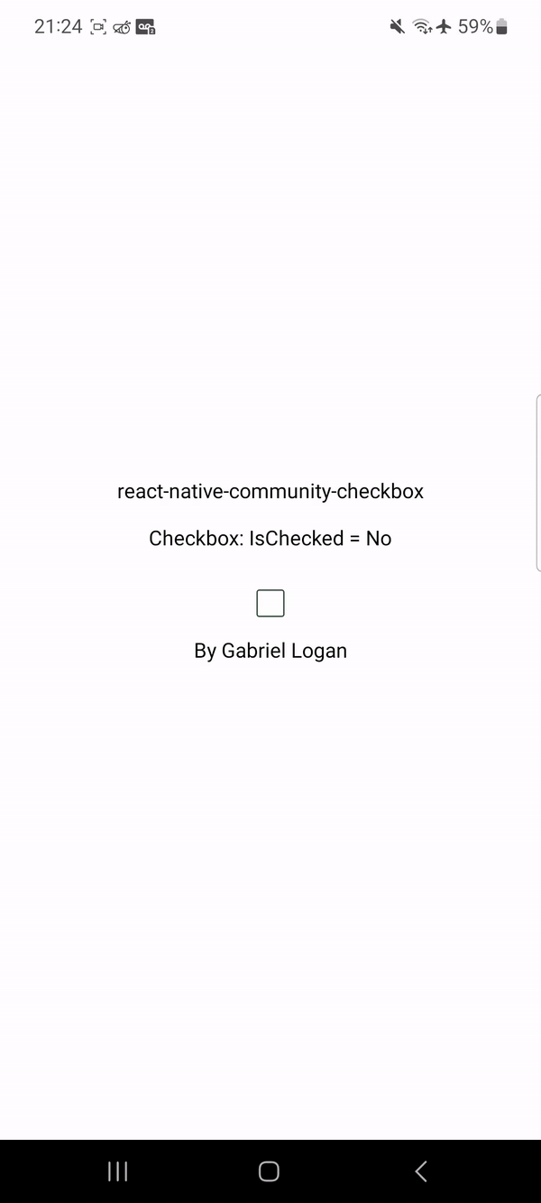
The Checkbox component is a customizable checkbox component for React Native and Expo projects.
Installation
To use the Checkbox component in your React Native project, follow these steps:
- Install the required dependencies by running the following command:
npm install react-native-community-checkbox
yarn add react-native-community-checkbox
- Import the
Checkbox component in your desired file:
import Checkbox from 'react-native-community-checkbox';
Usage
To use the Checkbox component, you need to provide the following props:
Here's an example of how to use the Checkbox component:
import React from "react";
import { View } from "react-native";

import Checkbox from 'react-native-community-checkbox';

function App() {
	const [isChecked, setChecked] = React.useState(false);

	return (
		<View>
			<Checkbox isChecked={isChecked} setChecked={setChecked} />
		</View>
	);
}
Customization
Optional !!!
You can customize the Checkbox component by providing custom styles as props. Here's an example of how to customize the checkbox:
import React from "react";
import { View } from "react-native";
import Checkbox from 'react-native-community-checkbox';
interface StylesCheckbox {
width?: number;
height?: number;
borderColor?: string;
borderWidth?: number;
borderRadius?: number;
activeBackgroundColor?: string;
inactiveBackgroundColor?: string;
fillPercentage?: number;
}
function App() {
const [isChecked, setChecked] = React.useState(false);
const stylesCheckbox: StylesCheckbox = {
width: 25,
height: 25,
borderColor: "#000",
borderWidth: 2,
borderRadius: 5,
activeBackgroundColor: "#000",
inactiveBackgroundColor: "#FFF",
fillPercentage: 85
};
return (
<View>
<Checkbox isChecked={isChecked} setChecked={setChecked} styles={stylesCheckbox} />
</View>
);
}