react-native-dropdownalert
Advanced tools

Comparing version 1.9.0 to 1.10.0
@@ -75,3 +75,2 @@ | ||
| duration: 450, | ||
| visible: false, | ||
| type: 'info', | ||
@@ -145,3 +144,3 @@ message: '', | ||
| renderDropDown() { | ||
| if (this.state.visible) { | ||
| if (this.state.isOpen) { | ||
| var style = this.props.containerStyle | ||
@@ -172,3 +171,2 @@ if (!style['flexDirection'] && !style['alignItems']) { | ||
| return ( | ||
| <Modal animationType='fade' transparent={true} visible={this.state.visible} onRequestClose={this.dismiss}> | ||
| <Animated.View style={{ | ||
@@ -181,2 +179,6 @@ transform: [{ | ||
| }], | ||
| position: 'absolute', | ||
| top: 0, | ||
| left: 0, | ||
| right: 0 | ||
| }}> | ||
@@ -194,6 +196,5 @@ {this.renderStatusBar(statusBarBackgroundColor)} | ||
| </Animated.View> | ||
| </Modal> | ||
| ) | ||
| } else { | ||
| return (<View />) | ||
| return null | ||
| } | ||
@@ -241,5 +242,4 @@ } | ||
| } | ||
| if (this.state.visible == false) { | ||
| if (this.state.isOpen == false) { | ||
| this.setState({ | ||
| visible: true, | ||
| type: type, | ||
@@ -265,5 +265,4 @@ message: message, | ||
| setTimeout(function() { | ||
| if (this.state.visible) { | ||
| if (this.state.isOpen) { | ||
| this.setState({ | ||
| visible: false, | ||
| isOpen: false | ||
@@ -270,0 +269,0 @@ }) |
| { | ||
| "name": "react-native-dropdownalert", | ||
| "version": "1.9.0", | ||
| "version": "1.10.0", | ||
| "description": "A dropdown alert that allows you to display bits of information to your user.", | ||
@@ -5,0 +5,0 @@ "main": "DropdownAlert.js", |
@@ -9,10 +9,6 @@ ## react-native-dropdownalert | ||
| A dropdown alert that allows you to display bits of information to your users. Try 1 of 3 pre-defined types or roll your own custom type (see props below). The user can tap the alert to close it or it will close automatically after 4 seconds or you can choose how long (see closeInterval prop). | ||
| A way to display bits of information to your users. You can try 1 of 3 pre-defined types or roll your own. The user can tap the alert to close it or close automatically after 4 seconds if too short or long, see ```closeInterval``` prop. | ||
| ### Announcement >= v1.9.0 | ||
| To make this highly customizable and scalable a few props have been removed (**see props below**). New style props have been added to take over the work and provide more flexibly. | ||
| ### Installation | ||
| --- | ||
| ```bash | ||
| ``` | ||
| npm i react-native-dropdownalert --save | ||
@@ -22,9 +18,5 @@ ``` | ||
| ### Demo | ||
| --- | ||
| 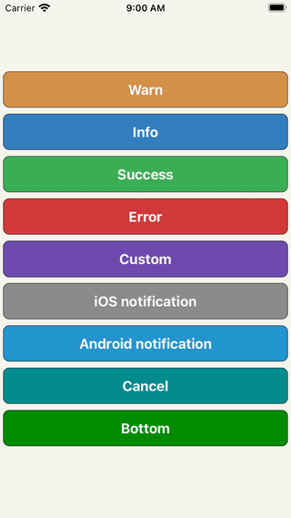 | ||
| ### Usage | ||
| --- | ||
| ```javascript | ||
@@ -37,3 +29,4 @@ | ||
| <View> | ||
| <DropdownAlert ref={'dropdown'} onClose={this.onClose} /> | ||
| // !!! Make sure it's the last component in your document tree. | ||
| <DropdownAlert ref={(ref) => this.dropdown = ref} onClose={this.onClose} /> | ||
| </View> | ||
@@ -46,3 +39,3 @@ ) | ||
| // Inform the user of the error. | ||
| this.refs.dropdown.alert('error', 'Error', err) | ||
| this.dropdown.alert('error', 'Error', err) | ||
| } | ||
@@ -55,8 +48,7 @@ } | ||
| // ... | ||
| ``` | ||
| ### Types | ||
| --- | ||
| | Info | Warn | Error | Custom | ||
| | info | warn | error | custom | ||
| | ------------ | ------------- | ------------ |------------ |------------ | | ||
@@ -66,24 +58,18 @@ | | || | ||
| ### Props | ||
| --- | ||
| | Name | Type | Description | Default | Status | ||
| | Name | Type | Description | Default | ||
| | ------------ | ------------- | ------------ |------------ |------------ | | ||
| | ```closeInterval``` | Number | dismiss alert at a certain time in milliseconds | 4000 | Available | ||
| | ```backgroundColor``` | String | background color of view | steelblue | Removed (use containerStyle) | ||
| | ```imageUri``` | String | network image | '' | Available | ||
| | ```imageSrc``` | Number | local image | null | Available | ||
| | ```textColor``` | String | color for title and message | white | Removed (use messageStyle or titleStyle) | ||
| | ```fontFamily``` | String | font for title and message | HelveticaNeue | Removed (use messageStyle or titleStyle) | ||
| | ```startDelta``` | Number | where view starts at | -200 | Available | ||
| | ```endDelta``` | Number | where view ends at | 0 | Available | ||
| | ```statusBarHidden``` | Boolean | status bar visibility | false | Removed | ||
| | ```onClose``` | Function | Fires when alert dismisses either by user or ```closeInterval``` & will pass this: ```data = {type, title, message}``` | null | Available | ||
| | ```containerStyle``` | View.propTypes.style | look & feel of container for custom type only | ```{ padding: 12, flexDirection: 'row', alignItems: 'center', backgroundColor: 'dimgray' }``` | Available | ||
| | ```titleStyle``` | Text.propTypes.style | look & feel of title for all types | ```{ fontSize: 16, textAlign: 'left', fontWeight: 'bold', color: 'white', backgroundColor: 'transparent' }``` | Available | ||
| | ```messageStyle``` | Text.propTypes.style | look & feel of message for all types | ```{ fontSize: 14, textAlign: 'left', fontWeight: 'bold', color: 'white', backgroundColor: 'transparent' }``` | Available | ||
| | ```imageStyle``` | Image.propTypes.style | look & feel of image for all types | ```{ padding: 8, width: 36, height: 36 }``` | Available | ||
| | ```titleNumOfLines``` | Number | number of lines (set to 0 for unlimited) | 1 | Available | ||
| | ```messageNumOfLines``` | Number | number of lines (set to 0 for unlimited) | 3 | Available | ||
| | ```closeInterval``` | Number | dismiss alert at a certain time in milliseconds | 4000 | ||
| | ```imageUri``` | String | network image | '' | ||
| | ```imageSrc``` | Number | local image | null | ||
| | ```startDelta``` | Number | where view starts at | -200 | ||
| | ```endDelta``` | Number | where view ends at | 0 | ||
| | ```onClose``` | Function | Fires when alert dismisses either by user or ```closeInterval``` & will pass this: ```data = {type, title, message}``` | null | ||
| | ```containerStyle``` | View.propTypes.style | look & feel of container for custom type only | ```{ padding: 12, flexDirection: 'row', alignItems: 'center', backgroundColor: 'dimgray' }``` | ||
| | ```titleStyle``` | Text.propTypes.style | look & feel of title for all types | ```{ fontSize: 16, textAlign: 'left', fontWeight: 'bold', color: 'white', backgroundColor: 'transparent' }``` | ||
| | ```messageStyle``` | Text.propTypes.style | look & feel of message for all types | ```{ fontSize: 14, textAlign: 'left', fontWeight: 'bold', color: 'white', backgroundColor: 'transparent' }``` | ||
| | ```imageStyle``` | Image.propTypes.style | look & feel of image for all types | ```{ padding: 8, width: 36, height: 36 }``` | ||
| | ```titleNumOfLines``` | Number | number of lines (set to 0 for unlimited) | 1 | ||
| | ```messageNumOfLines``` | Number | number of lines (set to 0 for unlimited) | 3 | ||
| > Inspired by: [RKDropdownAlert](https://github.com/cwRichardKim/RKDropdownAlert) |
Worsened metrics
- Total package byte prevSize
- decreased by-3.79%
22289
- Lines of code
- decreased by-0.31%
320
- Number of lines in readme file
- decreased by-16.67%
70