react-native-dropdownalert


A way to display bits of information to your users. You can try 1 of 3 pre-defined types or roll your own. The user can tap the alert to close it or close automatically after 4 seconds if too short or long, see closeInterval prop.
Installation
npm i react-native-dropdownalert --save
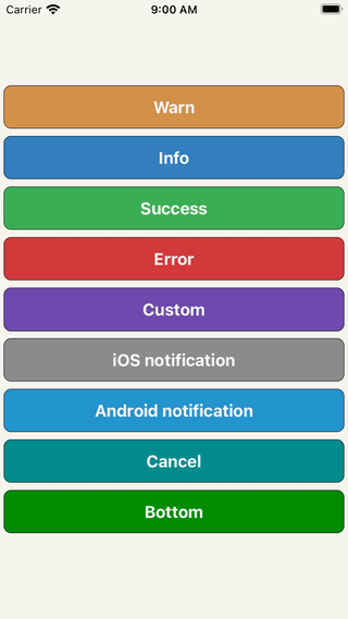
Demo
Usage
import DropdownAlert from 'react-native-dropdownalert'
render() {
return (
<View>
// !!! Make sure it's the last component in your document tree.
<DropdownAlert ref={(ref) => this.dropdown = ref} onClose={this.onClose} />
</View>
)
}
handleServerResponse(err, response) {
if (err != null) {
this.dropdown.alert('error', 'Error', err)
}
}
onClose(data) {
}
Types
| info | warn | error | custom
| ------------ | ------------- | ------------ |------------ |------------ |
| |
| |
| |
|
Props
| Name | Type | Description | Default
| ------------ | ------------- | ------------ |------------ |------------ |
| closeInterval | Number | dismiss alert at a certain time in milliseconds | 4000
| imageUri | String | network image | ''
| imageSrc | Number | local image | null
| startDelta | Number | where view starts at | -200
| endDelta | Number | where view ends at | 0
| onClose | Function | Fires when alert dismisses either by user or closeInterval & will pass this: data = {type, title, message} | null
| containerStyle | View.propTypes.style | look & feel of container for custom type only | { padding: 12, flexDirection: 'row', alignItems: 'center', backgroundColor: 'dimgray' }
| titleStyle | Text.propTypes.style | look & feel of title for all types | { fontSize: 16, textAlign: 'left', fontWeight: 'bold', color: 'white', backgroundColor: 'transparent' }
| messageStyle | Text.propTypes.style | look & feel of message for all types | { fontSize: 14, textAlign: 'left', fontWeight: 'bold', color: 'white', backgroundColor: 'transparent' }
| imageStyle | Image.propTypes.style | look & feel of image for all types | { padding: 8, width: 36, height: 36 }
| titleNumOfLines | Number | number of lines (set to 0 for unlimited) | 1
| messageNumOfLines | Number | number of lines (set to 0 for unlimited) | 3
Inspired by: RKDropdownAlert


