What is react-native-modal?
react-native-modal is a customizable modal component for React Native applications. It provides a variety of features to create modals with different animations, styles, and behaviors.
What are react-native-modal's main functionalities?
Basic Modal
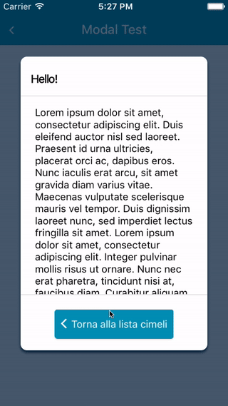
This code demonstrates a basic modal that can be toggled on and off with a button. The modal contains a simple text and a button to hide the modal.
import React, { useState } from 'react';
import { View, Text, Button } from 'react-native';
import Modal from 'react-native-modal';
const BasicModalExample = () => {
const [isModalVisible, setModalVisible] = useState(false);
const toggleModal = () => {
setModalVisible(!isModalVisible);
};
return (
<View style={{ flex: 1, justifyContent: 'center', alignItems: 'center' }}>
<Button title="Show Modal" onPress={toggleModal} />
<Modal isVisible={isModalVisible}>
<View style={{ flex: 1, justifyContent: 'center', alignItems: 'center' }}>
<Text>Hello!</Text>
<Button title="Hide Modal" onPress={toggleModal} />
</View>
</Modal>
</View>
);
};
export default BasicModalExample;
Custom Animation
This code demonstrates a modal with custom animations. The modal slides in from the left and slides out to the right.
import React, { useState } from 'react';
import { View, Text, Button } from 'react-native';
import Modal from 'react-native-modal';

const CustomAnimationModalExample = () => {
  const [isModalVisible, setModalVisible] = useState(false);

  const toggleModal = () => {
    setModalVisible(!isModalVisible);
  };

  return (
    <View style={{ flex: 1, justifyContent: 'center', alignItems: 'center' }}>
      <Button title="Show Modal" onPress={toggleModal} />
      <Modal isVisible={isModalVisible} animationIn="slideInLeft" animationOut="slideOutRight">
        <View style={{ flex: 1, justifyContent: 'center', alignItems: 'center' }}>
          <Text>Custom Animation!</Text>
          <Button title="Hide Modal" onPress={toggleModal} />
        </View>
      </Modal>
    </View>
  );
};

export default CustomAnimationModalExample;
Backdrop Customization
This code demonstrates a modal with a customized backdrop. The backdrop color is set to red with an opacity of 0.8.
import React, { useState } from 'react';
import { View, Text, Button } from 'react-native';
import Modal from 'react-native-modal';

const BackdropCustomizationModalExample = () => {
  const [isModalVisible, setModalVisible] = useState(false);

  const toggleModal = () => {
    setModalVisible(!isModalVisible);
  };

  return (
    <View style={{ flex: 1, justifyContent: 'center', alignItems: 'center' }}>
      <Button title="Show Modal" onPress={toggleModal} />
      <Modal isVisible={isModalVisible} backdropColor="red" backdropOpacity={0.8}>
        <View style={{ flex: 1, justifyContent: 'center', alignItems: 'center' }}>
          <Text>Custom Backdrop!</Text>
          <Button title="Hide Modal" onPress={toggleModal} />
        </View>
      </Modal>
    </View>
  );
};

export default BackdropCustomizationModalExample;
Other packages similar to react-native-modal
react-native-modalbox
react-native-modalbox is another modal component for React Native. It provides similar functionalities such as custom animations and backdrop customization. However, react-native-modalbox is known for its simplicity and ease of use, making it a good choice for developers who need basic modal functionalities without extensive customization options.
react-native-popup-dialog
react-native-popup-dialog is a highly customizable dialog component for React Native. It offers a wide range of features including custom animations, backdrop customization, and various dialog types (e.g., alert, confirm). Compared to react-native-modal, react-native-popup-dialog provides more built-in dialog types and is more focused on creating different types of dialogs rather than just modals.
react-native-root-modal
react-native-root-modal is a modal component that allows you to render modals at the root level of your application. This package is useful for creating global modals that can be triggered from anywhere in the app. While it offers similar functionalities to react-native-modal, react-native-root-modal is more focused on providing a global modal solution.
