
Security News
Bun 1.2.19 Adds Isolated Installs for Better Monorepo Support
Bun 1.2.19 introduces isolated installs for smoother monorepo workflows, along with performance boosts, new tooling, and key compatibility fixes.
react-native-modals
Advanced tools
React Native Modals Library for iOS & Android.
Just click on ⭐️ button 😘
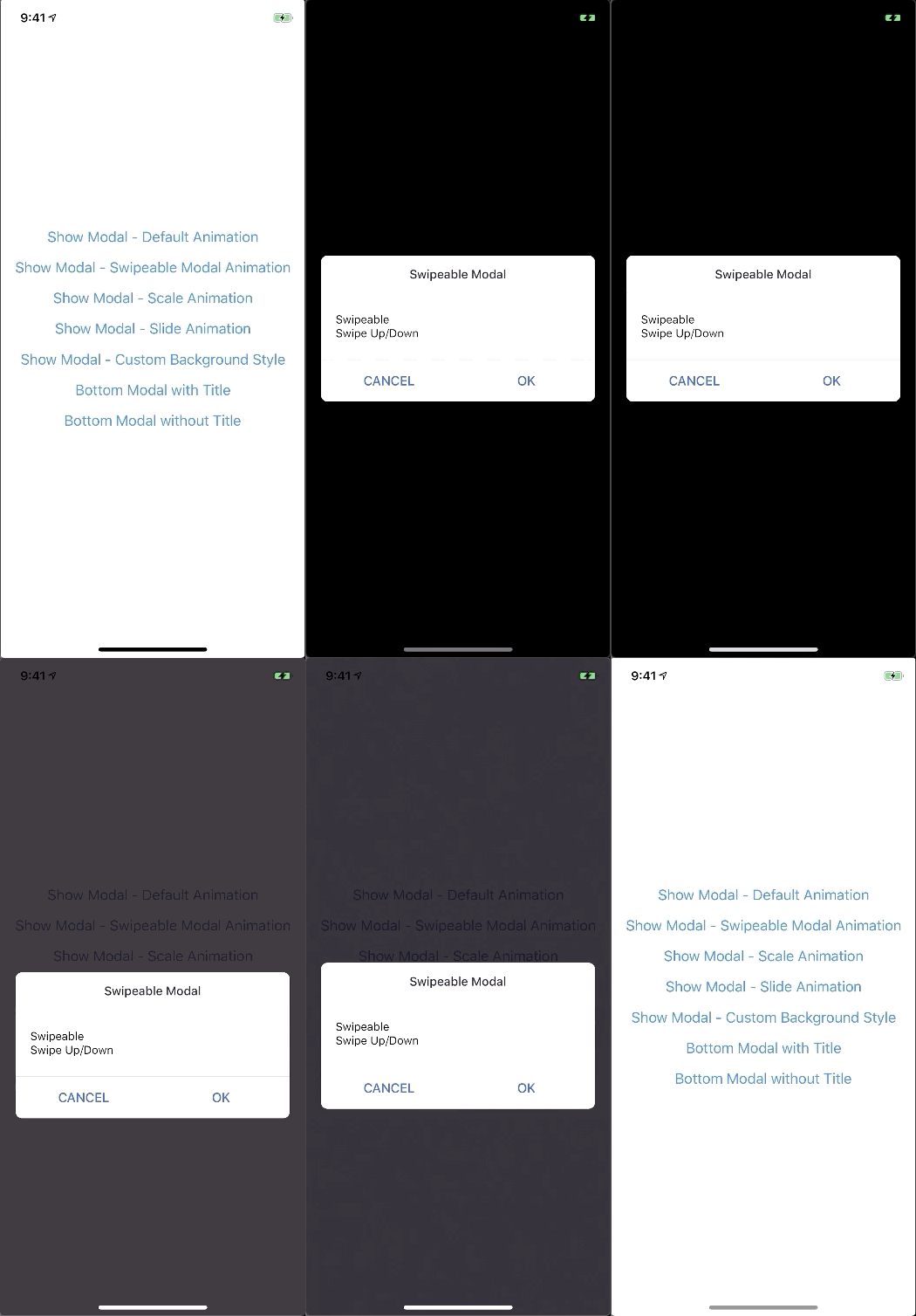
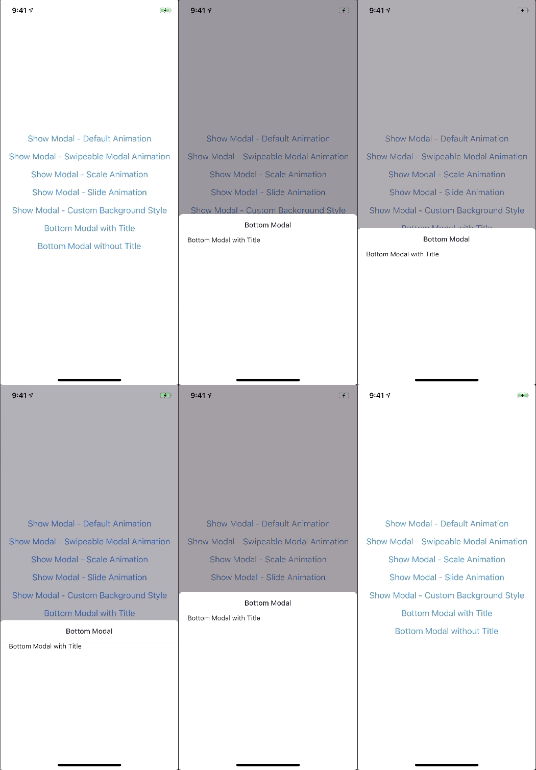
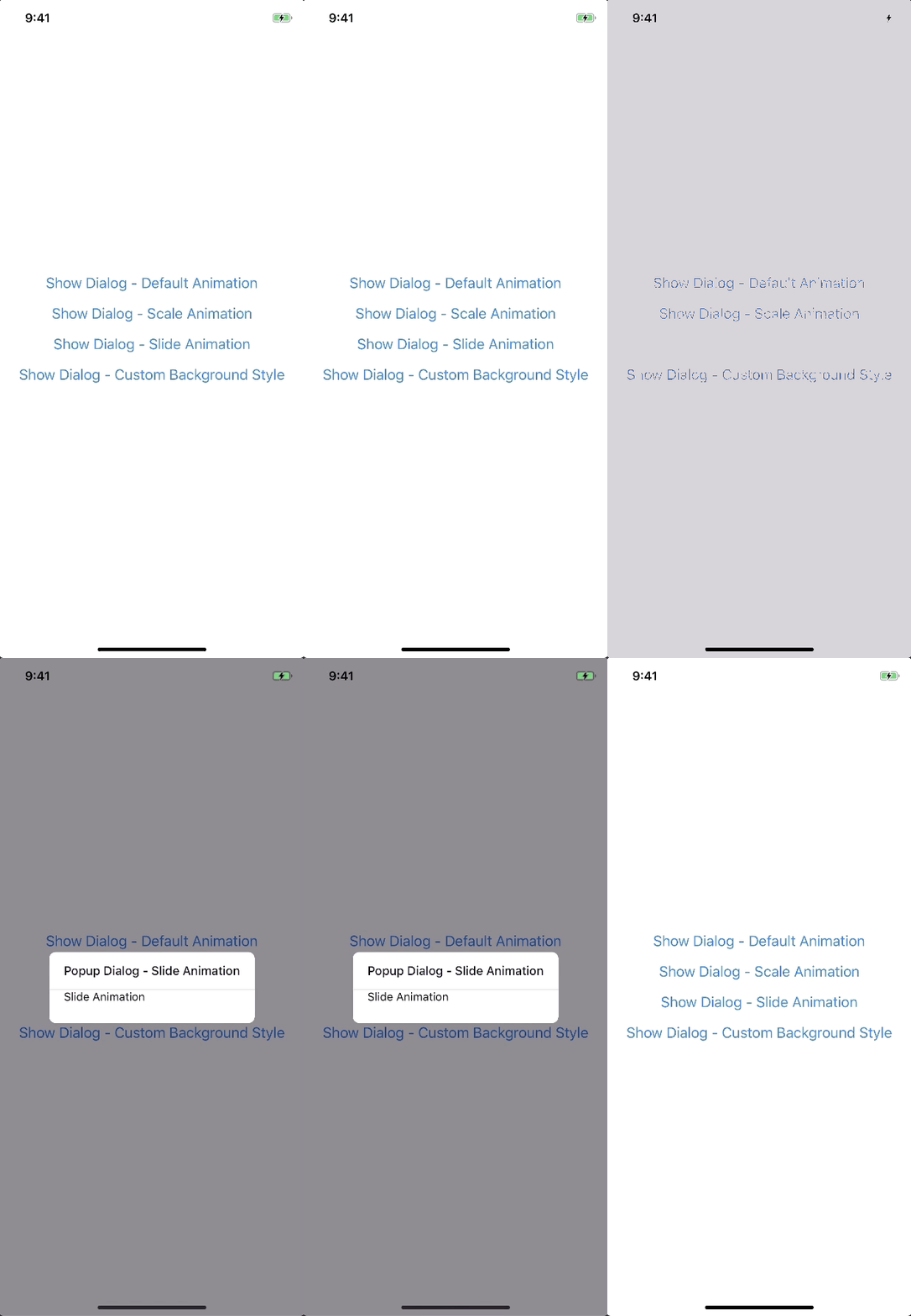
A lot of backward incompatible changes in v0.22.0. Please, Read the Docs before upgrading to v0.22.0
npm install --save react-native-modals
# OR
yarn add react-native-modals
The Component can not be used until ModalPortal is mounted.
You should register in your app root. For example:
import { ModalPortal } from 'react-native-modals';
import { Provider } from 'react-redux';

const Root = () => {
  return (
    <Provider store={store}>
      <App />
      <ModalPortal />
    </Provider>
  );
}
import { Modal, ModalContent } from 'react-native-modals';
import { Button } from 'react-native'

<View style={styles.container}>
  <Button
    title="Show Modal"
    onPress={() => {
      this.setState({ visible: true });
    }}
  />
  <Modal
    visible={this.state.visible}
    onTouchOutside={() => {
      this.setState({ visible: false });
    }}
  >
    <ModalContent>
      {...}
    </ModalContent>
  </Modal>
</View>
show
import { ModalPortal } from 'react-native-modals';

const id = ModalPortal.show((
  <View>
    {...}
  </View>
));
update
ModalPortal.update(id, {
  children: (
    <View>
      <Text>Updated</Text>
    </View>
  ),
});
dismiss
ModalPortal.dismiss(id);
dismissAll
ModalPortal.dismissAll(id);
import { Modal, SlideAnimation, ModalContent } from 'react-native-modals';

<View style={styles.container}>
  <Modal
    visible={this.state.visible}
    modalAnimation={new SlideAnimation({
      slideFrom: 'bottom',
    })}
  >
    <ModalContent>
      {...}
    </ModalContent>
  </Modal>
</View>
import { Modal, ModalContent } from 'react-native-modals';
import { Button } from 'react-native'

<View style={styles.container}>
  <Modal
    visible={this.state.visible}
    swipeDirection={['up', 'down']} // can be string or an array
    swipeThreshold={200} // default 100
    onSwipeOut={(event) => {
      this.setState({ visible: false });
    }}
  >
    <ModalContent>
      {...}
    </ModalContent>
  </Modal>
</View>
import { Modal, ModalTitle, ModalContent } from 'react-native-modals';

<View style={styles.container}>
  <Modal
    visible={this.state.visible}
    modalTitle={<ModalTitle title="Modal Title" />}
  >
    <ModalContent>
      {...}
    </ModalContent>
  </Modal>
</View>
import { Modal, ModalFooter, ModalButton, ModalContent } from 'react-native-modals';

<View style={styles.container}>
  <Modal
    visible={this.state.visible}
    footer={
      <ModalFooter>
        <ModalButton
          text="CANCEL"
          onPress={() => {}}
        />
        <ModalButton
          text="OK"
          onPress={() => {}}
        />
      </ModalFooter>
    }
  >
    <ModalContent>
      {...}
    </ModalContent>
  </Modal>
</View>
| Prop | Type | Default | Note |
|---|---|---|---|
visible | boolean | false | |
rounded | boolean | true | |
useNativeDriver | boolean | true | |
children | any | ||
modalTitle? | React Element | You can pass a modalTitle component or pass a View for customizing titlebar | |
width? | Number | Your device width | The Width of modal, you can use fixed width or use percentage. For example 0.5 it means 50% |
height? | Number | 300 | The Height of modal, you can use fixed height or use percentage. For example 0.5 it means 50% |
modalAnimation? | FadeAnimation | animation for modal | |
modalStyle? | any | ||
containerStyle? | any | null | For example: { zIndex: 10, elevation: 10 } |
animationDuration? | Number | 200 | |
overlayPointerEvents? | String | Available option: auto, none | |
overlayBackgroundColor? | String | #000 | |
overlayOpacity? | Number | 0.5 | |
hasOverlay? | Boolean | true | |
onShow? | Function | You can pass shown function as a callback function, will call the function when modal shown | |
onDismiss? | Function | You can pass onDismiss function as a callback function, will call the function when modal dismissed | |
onTouchOutside? | Function | () => {} | |
onHardwareBackPress? | Function | () => true | Handle hardware button presses |
onMove? | Function | () => {} | |
onSwiping? | Function | () => {} | |
onSwipeRelease? | Function | () => {} | |
onSwipingOut? | Function | () => {} | |
onSwipeOut? | Function | ||
swipeDirection? | string or Array<string> | [] | Available option: up, down, left, right |
swipeThreshold? | number | 100 | |
footer? | React Element | null | for example: <View><Button text="DISMISS" align="center" onPress={() => {}}/></View> |
| Prop | Type | Default | Note |
|---|---|---|---|
title | String | ||
style? | any | null | |
textStyle? | any | null | |
align? | String | center | Available option: left, center, right |
hasTitleBar? | Bool | true |
| Prop | Type | Default | Note |
|---|---|---|---|
children | any | ||
style? | any | null |
| Prop | Type | Default | Note |
|---|---|---|---|
children | ModalButton | ||
bordered? | Boolean | true | |
style? | any | null |
| Prop | Type | Default | Note |
|---|---|---|---|
text | String | ||
onPress | Function | ||
align? | String | center | Available option: left, center, right |
style? | any | null | |
textStyle? | any | null | |
activeOpacity? | Number | 0.6 | |
disabled? | Boolean | false | |
bordered? | Boolean | false |
| Prop | Type | Default | Note |
|---|---|---|---|
visible | Boolean | ||
opacity | Number | 0.5 | |
onPress? | Function | ||
backgroundColor? | string | #000 | |
animationDuration? | Number | 200 | |
pointerEvents? | String | null | Available option: auto, none |
useNativeDriver? | Boolean | true |
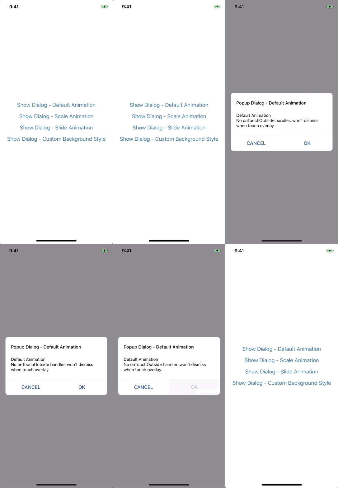
new FadeAnimation({
  initialValue: 0, // optional
  animationDuration: 150, // optional
  useNativeDriver: true, // optional
})
| Param | Type | Default | Note |
|---|---|---|---|
initialValue | Number | 0 | |
animationDuration? | Number | 150 | |
useNativeDriver? | Boolean | true |
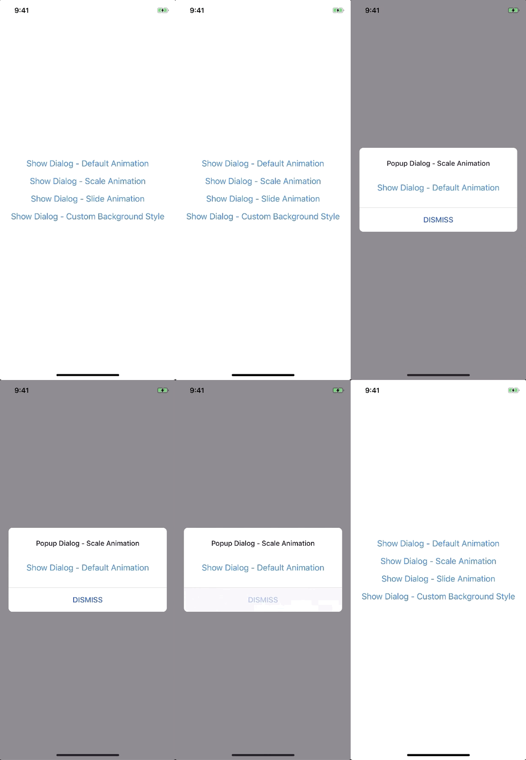
new ScaleAnimation({
  initialValue: 0, // optional
  useNativeDriver: true, // optional
})
| Param | Type | Default | Note |
|---|---|---|---|
initialValue | Number | 0 | |
useNativeDriver | Boolean | true |

new SlideAnimation({
  initialValue: 0, // optional
  slideFrom: 'bottom', // optional
  useNativeDriver: true, // optional
})
| Param | Type | Default | Note |
|---|---|---|---|
initialValue | Number | 0 | |
slideFrom | String | bottom | Available option: top, bottom, left, right |
useNativeDriver | Boolean | true |
import { Animated } from 'react-native';
import { Animation } from 'react-native-modals';

class CustomAnimation extends Animation {
  in(onFinished) {
    Animated.spring(this.animate, {
      toValue: 1,
      useNativeDriver: this.useNativeDriver,
    }).start(onFinished);
  }

  out(onFinished) {
    Animated.spring(this.animate, {
      toValue: 0,
      useNativeDriver: this.useNativeDriver,
    }).start(onFinished);
  }

  getAnimations() {
    return {
      transform: [{
        translateY: this.animate.interpolate({
          inputRange: [0, 1],
          outputRange: [800, 1],
        }),
      }],
    };
  }
}
yarn
yarn run build
yarn test
FAQs
React Native Modals Library for IOS & Android.
The npm package react-native-modals receives a total of 1,385 weekly downloads. As such, react-native-modals popularity was classified as popular.
We found that react-native-modals demonstrated a not healthy version release cadence and project activity because the last version was released a year ago. It has 1 open source maintainer collaborating on the project.
Did you know?

Socket for GitHub automatically highlights issues in each pull request and monitors the health of all your open source dependencies. Discover the contents of your packages and block harmful activity before you install or update your dependencies.

Security News
Bun 1.2.19 introduces isolated installs for smoother monorepo workflows, along with performance boosts, new tooling, and key compatibility fixes.

Security News
Popular npm packages like eslint-config-prettier were compromised after a phishing attack stole a maintainer’s token, spreading malicious updates.

Security News
/Research
A phishing attack targeted developers using a typosquatted npm domain (npnjs.com) to steal credentials via fake login pages - watch out for similar scams.