Research
Security News
Malicious npm Package Typosquats react-login-page to Deploy Keylogger
Socket researchers unpack a typosquatting package with malicious code that logs keystrokes and exfiltrates sensitive data to a remote server.
react-native-segmented-picker
Advanced tools
Readme
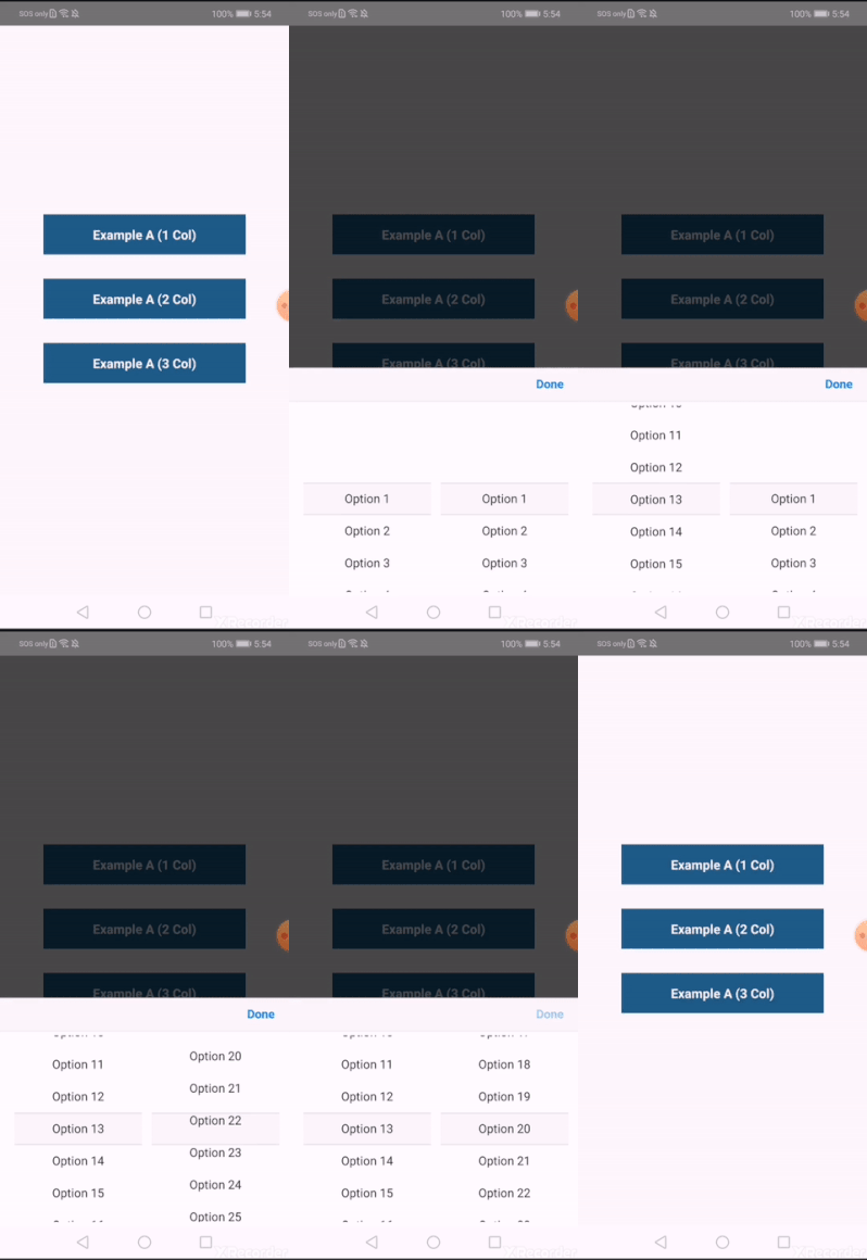
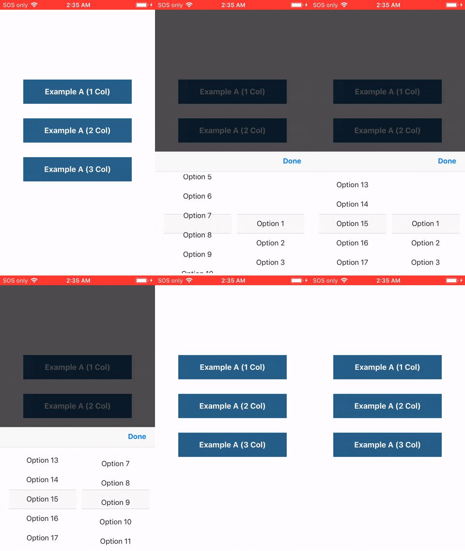
A pure JavaScript implementation of the iOS style wheel spinner dropdown picker that is typically used for date and time selection.
react-native link not required).

$ yarn add react-native-segmented-picker
# or
# $ npm install --save react-native-segmented-picker
import React, { Component } from 'react';
import SegmentedPicker from 'react-native-segmented-picker';

class Example extends Component {
  constructor(props) {
    super(props);
    this.segmentedPicker = React.createRef();
  }

  componentDidMount() {
    // Can alternatively be shown with the `visible` prop for redux etc.
    this.segmentedPicker.show();
  }

  onConfirm = (selections) => {
    console.info(selections);
    // => { column1: { label: 'Option 1' }, column2: { label: 'Option 3' } }
  }

  render() {
    return (
      <SegmentedPicker
        ref={this.segmentedPicker}
        onConfirm={this.onConfirm}
        options={{
          column1: [
            { label: 'Option 1' },
            { label: 'Option 2' },
          ],
          column2: [
            { label: 'Option 3', key: 'option_3' },
          ],
        }}
      />
    );
  }
}
Further examples can be found in ./examples/src.
| Prop | Description | Default |
|---|---|---|
options | Data to be populated into the picklists. {columnId: [{label: '', key: ''}, ...], ...} | |
visible | Not used by default. Set to true or false to manually handle visibility. | null |
defaultSelections | Eg: {columnId: 'label string to auto-select', ...} | {} |
confirmText | Text displayed in the top right hand corner. | 'Done' |
size | Fixed percentage of the screen to render the picklist container over. | 40 |
confirmTextColor | Color of the confirmText button. | '#0A84FF' |
toolbarBackground | Background color of the top container where the confirmText is displayed. | '#FAFAF8' |
toolbarBorderColor | Bottom border color of the toolbarContainer. | '#E7E7E7' |
listItemTextColor | Color of the text for each item in the picklist. | '#282828' |
selectionMarkerBackground | Background color of the container which overlays the current selected item. | '#F8F8F8' |
selectionMarkerBorderColor | Border color (top and bottom) of the selection marker overlay. | '#DCDCDC' |
containerBackground | Background color of the inner SegmentedPicker container. | '#FFFFFF' |
| Event Prop | When and how? |
|---|---|
onValueChange={(columnId, value) => ...} | Emitted each time a picklist value is modified by a user. |
onCancel={(selections) => ...} | Emitted when a user touches out of the modal, or presses the hardware back button on Android. |
onConfirm={(selections) => ...} | Emitted when a user presses the confirm text button. |
Remember that you will need to set a ref for the <SegmentedPicker /> component in order to use the methods outlined below.
Display the Segmented Picker modal over all other content on the screen. This is the preferred method of showing a <SegmentedPicker /> so that you don't have to manually hide the component after listening to the onCancel and onConfirm events.
Note that this method will have no effect if the visible prop is set.
Hide the Segmented Picker modal from the screen. Generally should not be required, as this method is automatically called by this library after events where visibility should be toggled off.
Programmatically select a label from a list column while the component is displaying.
{string} label: Eg 'Option 1'{string} columnId: Eg 'column1'{boolean=true} animated: Scroll or snap to the item?{boolean=true} emitEvent: Specify whether to emit the onValueChange event.{boolean=false} zeroFallback Select the first list item if not found.Programmatically select an array index from a list column while the component is displaying. This method will give you better performance than the above if you already know the index of the item that you want to select.
{number} index: Eg 0{string} columnId: Eg 'column1'{boolean=true} animated: Scroll or snap to the item?{boolean=true} emitEvent: Specify whether to emit the onValueChange event.Returns the current selected items as they appear in the UI. This is the same method that's used internally when the onCancel and onConfirm events are fired.
This is an open source project. Bug fixes, improvements and the addition of useful new features to this package are greatly appreciated.
yarn install.feature/my-thing or bugfix/terrible-thing.yarn run test still passes.master outlining what your change is and how you tested it.Made with love in Melbourne Adam McArthur.
FAQs
Unknown package
We found that react-native-segmented-picker demonstrated a not healthy version release cadence and project activity because the last version was released a year ago. It has 1 open source maintainer collaborating on the project.
Did you know?

Socket for GitHub automatically highlights issues in each pull request and monitors the health of all your open source dependencies. Discover the contents of your packages and block harmful activity before you install or update your dependencies.

Research
Security News
Socket researchers unpack a typosquatting package with malicious code that logs keystrokes and exfiltrates sensitive data to a remote server.

Security News
The JavaScript community has launched the e18e initiative to improve ecosystem performance by cleaning up dependency trees, speeding up critical parts of the ecosystem, and documenting lighter alternatives to established tools.

Product
Socket now supports four distinct alert actions instead of the previous two, and alert triaging allows users to override the actions taken for all individual alerts.