React Native Segmented Picker


A pure JavaScript implementation of the iOS style wheel spinner dropdown picker that is typically used for date and time selection.
- Supports one or many columns (list segments).
- Show any data in the picklists, not just dates and times.
- Customisable colors and sizing.
- Does not rely on native dependencies (
react-native link not required). - Works with apps built on Expo.
Installation
$ yarn add react-native-segmented-picker
Usage
import React, { Component } from 'react';
import SegmentedPicker from 'react-native-segmented-picker';
class Example extends Component {
constructor(props) {
super(props);
this.segmentedPicker = React.createRef();
}
componentDidMount() {
this.segmentedPicker.current.show();
}
onConfirm = (selections) => {
console.info(selections);
}
render() {
return (
<SegmentedPicker
ref={this.segmentedPicker}
onConfirm={this.onConfirm}
options={{
column1: [
{ label: 'Option 1' },
{ label: 'Option 2' },
],
column2: [
{ label: 'Option 3', key: 'option_3' },
],
}}
/>
);
}
}
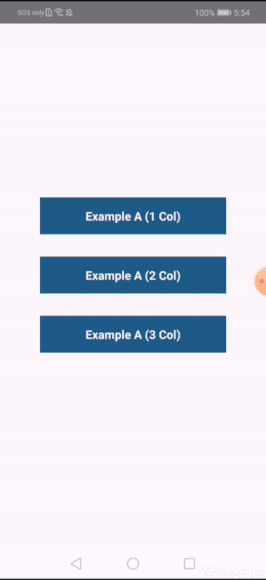
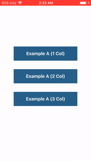
Further examples can be found in ./examples/src.
Props, Events & Methods Reference
Props
| Prop | Description | Default |
|---|
options | Data to be populated into the picklists. {columnId: [{label: '', key?: '', testID?: ''}, ...], ...} | |
visible | Not used by default. Set to true or false to manually handle visibility. | null |
defaultSelections | Eg: {columnId: 'label string to auto-select', ...} | {} |
confirmText | Text displayed in the top right hand corner. | 'Done' |
size | Fixed percentage of the screen to render the picklist container over. | 45 |
confirmTextColor | Color of the confirmText button. | '#0A84FF' |
toolbarBackground | Background color of the top container where the confirmText is displayed. | '#FAFAF8' |
toolbarBorderColor | Bottom border color of the toolbarContainer. | '#E7E7E7' |
listItemTextColor | Color of the text for each item in the picklist. | '#282828' |
selectionMarkerBackground | Background color of the container which overlays the current selected item. | '#F8F8F8' |
selectionMarkerBorderColor | Border color (top and bottom) of the selection marker overlay. | '#DCDCDC' |
containerBackground | Background color of the inner SegmentedPicker container. | '#FFFFFF' |
Event Props
| Event Prop | When and how? |
|---|
onValueChange={(columnId, value) => ...} | Emitted each time a picklist value is modified by a user. |
onCancel={(selections) => ...} | Emitted when a user touches out of the modal, or presses the hardware back button on Android. |
onConfirm={(selections) => ...} | Emitted when a user presses the confirm text button. |
Methods
Remember that you will need to set a ref for the <SegmentedPicker /> component in order to use the methods outlined below.
ref.show();
Display the Segmented Picker modal over all other content on the screen. This is the preferred method of showing a <SegmentedPicker /> so that you don't have to manually hide the component after listening to the onCancel and onConfirm events.
Note that this method will have no effect if the visible prop is set.
ref.hide();
Hide the Segmented Picker modal from the screen. Generally should not be required, as this method is automatically called by this library after events where visibility should be toggled off.
ref.selectLabel(label, columnId, animated=true, emitEvent=true, zeroFallback=false);
Programmatically select a label from a list column while the component is displaying.
{string} label: Eg 'Option 1'{string} columnId: Eg 'column1'{boolean=true} animated: Scroll or snap to the item?{boolean=true} emitEvent: Specify whether to emit the onValueChange event.{boolean=false} zeroFallback Select the first list item if not found.
ref.selectIndex(index, columnId, animated=true, emitEvent=true);
Programmatically select an array index from a list column while the component is displaying. This method will give you better performance than the above if you already know the index of the item that you want to select.
{number} index: Eg 0{string} columnId: Eg 'column1'{boolean=true} animated: Scroll or snap to the item?{boolean=true} emitEvent: Specify whether to emit the onValueChange event.
ref.getCurrentSelections();
Returns the current selected items as they appear in the UI. This is the same method that's used internally when the onCancel and onConfirm events are fired.
Recipes
This section contains some code examples of common requirements and frequently asked questions.
1. Dynamically Changing Columns
A common use case is to have one of your columns change it's list options based off the selection in another column. In other words, implementing Column B as a function of Column A. The below example shows one possible way to achieve this using the onValueChange() event.
import React, { Component } from 'react';
import SegmentedPicker from 'react-native-segmented-picker';

const options = {
  categories: [{ label: 'Fruits' }, { label: 'Vegetables' }],
  items: {
    Fruits: [{ label: 'Apples' }, { label: 'Oranges' }],
    Vegetables: [{ label: 'Carrots' }, { label: 'Potatoes' }],
  },
};

class Demo extends Component {
  constructor(props) {
    super(props);
    this.state = {
      selections: {
        categories: options.categories[0],
        items: undefined,
      },
    };
  }

  onValueChange = (columnId, { label }) => {
    this.setState((prevState) => ({
      selections: {
        ...prevState.selections,
        [columnId]: label,
      },
    }));
  };

  generateOptions = () => {
    const { categories, items } = options;
    const { selections } = this.state;
    return {
      categories,
      items: items[selections.categories],
    };
  };

  render() {
    const { selections: { categories, items } } = this.state;
    return (
      <SegmentedPicker
        options={this.generateOptions()}
        onValueChange={this.onValueChange}
        defaultSelections={{ categories, items }}
      />
    );
  }
}
2. End-To-End (E2E) Testing
This library automatically sets testID attributes on elements so that you can interact with the picker UI during E2E testing (with tools such as Detox).
import { TEST_IDS } from 'react-native-segmented-picker';
TEST_IDS.PICKER: The entire segmented picker container (useful to check if visible).TEST_IDS.CONFIRM_BUTTON: "Done" confirmation button in the top right hand corner.TEST_IDS.CLOSE_AREA: Darkened area outside of the picker which hides the component when tapped.${`TEST_IDS.COLUMN`}columnId: ScrollView for a specific picker column.${`TEST_IDS.COLUMN`}columnId_optionKeyOrLabel: Specific picker item button within a column.
You can see full examples of our own E2E Detox testing suite here.
Contributions
This is an open source project. Bug fixes, improvements and the addition of useful new features to this package are greatly appreciated.
- Fork and clone the repository from GitHub.
- Setup:
yarn install. - Checkout a new branch, eg:
feature/my-thing or bugfix/terrible-thing. - After making any changes, make sure that
yarn test still passes. - Are there new unit test(s) that you could write to capture your changes?
- Submit a pull request to
master outlining what your change is and how you tested it.
Made with love in Melbourne by Adam McArthur.


