react-native-tree-multi-select
⚡️Super-fast Tree view with multi-selection capabilities, using checkboxes and search filtering.


Installation
Using yarn:
yarn add react-native-tree-multi-select
using npm:
npm install react-native-tree-multi-select
Dependencies that need to be installed for this library to work:
- @shopify/flash-list
- Icon Library (One of the following):
- For Expo Apps (including Expo Go): No additional setup is needed. This library automatically uses
@expo/vector-icons, which is included in the Expo SDK.
- For Non-Expo React Native Apps: Install react-native-vector-icons (
>=7.1.0) to enable icon support.
Make sure to follow the native-related installation instructions for these dependencies if you are using bare workflow.
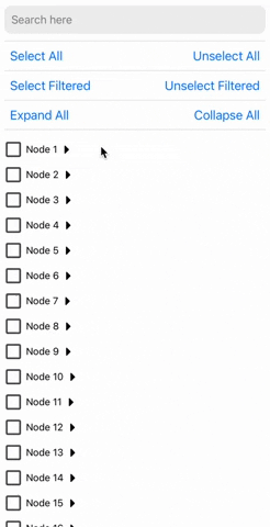
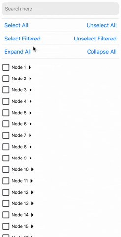
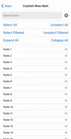
Highlighted Features
- ⚡ Fast: Designed with performance in mind for smooth scrolling and quick selections.
- 🛠️ Highly Customizable: Modify styles, behavior, and use your custom list component to suit your application's needs.
- 🔍 Filterable: Quickly filter through tree nodes and option to select and un-select only the filtered tree nodes.
- ✅ Well Tested: Comprehensive test coverage to ensure reliability and stability.
- 📚 Well Documented: Detailed documentation to get you started and an example app to demo all the features.
- 🌳 Multi-Level Selection: Select individual nodes or entire branches with ease.
- 📦 Supports Large Datasets: Efficiently handles large trees without much performance degradation.
- 🔒 TypeScript Support: Full TypeScript support for better developer experience.
- 💻 Cross-Platform: Works seamlessly across iOS, Android, and web (with React Native Web).
Usage
import {
TreeView,
type TreeNode,
type TreeViewRef
} from 'react-native-tree-multi-select';
const myData: TreeNode[] = [...];
export function TreeViewUsageExample(){
const treeViewRef = React.useRef<TreeViewRef | null>(null);
function triggerSearch(text: string){
treeViewRef.current?.setSearchText(text, ["name"]);
}
const handleSelectionChange = (
_checkedIds: string[],
_indeterminateIds: string[]
) => {
};
const handleExpanded = (expandedIds: string[]) => {
};
const expandAllPress = () => treeViewRef.current?.expandAll?.();
const collapseAllPress = () => treeViewRef.current?.collapseAll?.();
const expandNodes = (idsToExpand: string[]) => treeViewRef.current?.expandNodes?.(
idsToExpand
);
const collapseNodes = (idsToCollapse: string[]) => treeViewRef.current?.collapseNodes?.(
idsToCollapse
);
const onSelectAllPress = () => treeViewRef.current?.selectAll?.();
const onUnselectAllPress = () => treeViewRef.current?.unselectAll?.();
const onSelectAllFilteredPress = () => treeViewRef.current?.selectAllFiltered?.();
const onUnselectAllFilteredPress = () => treeViewRef.current?.unselectAllFiltered?.();
const selectNodes = (idsToExpand: string[]) => treeViewRef.current?.selectNodes?.(
idsToSelect
);
const unselectNodes = (idsToCollapse: string[]) => treeViewRef.current?.unselectNodes?.(
idsToUnselect
);
return(
<TreeView
ref={treeViewRef}
data={myData}
onCheck={handleSelectionChange}
onExpand={handleExpanded}
/>
);
}
Properties
TreeViewProps<ID = string>
The TreeViewProps interface defines the properties for the tree view component.
data | TreeNode<ID = string>[] | Yes | An array of TreeNode objects |
onCheck | (checkedIds: ID[], indeterminateIds: ID[]) => void | No | Callback when a checkbox state changes |
onExpand | (expandedIds: ID[]) => void | No | Callback when a node is expanded |
preselectedIds | ID[] | No | An array of ids that should be pre-selected |
preExpandedIds | ID[] | No | An array of ids that should be pre-expanded |
selectionPropagation | SelectionPropagation | No | Control Selection Propagation Behavior. Choose whether you want to auto-select children or parents. |
initialScrollNodeID | ID | No | Set node ID to scroll to intiially on tree view render. |
indentationMultiplier | number | No | Indentation (marginStart) per level (defaults to 15) |
treeFlashListProps | TreeFlatListProps | No | Props for the flash list |
checkBoxViewStyleProps | BuiltInCheckBoxViewStyleProps | No | Props for the checkbox view |
CheckboxComponent | ComponentType<CheckBoxViewProps> | No | A custom checkbox component. |
ExpandCollapseIconComponent | ComponentType<ExpandIconProps> | No | A custom expand/collapse icon component |
ExpandCollapseTouchableComponent | ComponentType<TouchableOpacityProps> | No | A custom expand/collapse touchable component |
CustomNodeRowComponent | React.ComponentType<NodeRowProps<ID>> | No | Custom row item component |
Notes
- The
ID type parameter allows flexibility in specifying the type of node identifiers (e.g., string, number, or custom types).
- ℹ️ If
CustomNodeRowComponent is provided then below props are not applied:
indentationMultipliercheckBoxViewStylePropsCheckboxComponentBuiltInCheckBoxViewStylePropsExpandCollapseIconComponentExpandCollapseTouchableComponent.
- ⚠️ If the tree view doesn't scroll if rendered in a complex nested scroll view/s then try setting the
renderScrollComponent value in treeFlashListProps to ScrollView from react-native-gesture-handler.
TreeNode<ID = string>
The TreeNode interface defines the properties for individual item of the tree view
id | ID (default: string) | Yes | Unique identifier for the node |
name | string | Yes | The display name of the node |
children | TreeNode<ID>[] | No | An array of child TreeNode<ID> objects |
[key: string] | any | No | Any additional properties for the node
(May be useful to perform search on) |
TreeViewRef<ID = string>
The TreeViewRef interface defines the properties for the ref object of the tree view component
selectAll | () => void | Selects all nodes |
unselectAll | () => void | Unselects all nodes |
selectAllFiltered | () => void | Selects all filtered nodes |
unselectAllFiltered | () => void | Unselects all filtered nodes |
expandAll | () => void | Expands all nodes |
collapseAll | () => void | Collapses all nodes |
expandNodes | (ids: ID[]) => void | Expands specified nodes |
collapseNodes | (ids: ID[]) => void | Collapses specified nodes |
selectNodes | (ids: ID[]) => void | Selects specified nodes |
unSelectNodes | (ids: ID[]) => void | Unselects specified nodes |
setSearchText | (searchText: string, searchKeys?: string[]) => void | Set the search text and optionally the search keys. Default search key is "name"
Recommended to call this inside a debounced function if you find any performance issue otherwise. |
scrollToNodeID | (params: ScrollToNodeParams<ID>) => void; | Scrolls the tree view to the node of the specified ID. |
getChildToParentMap | () => Map<ID, ID> | Get the child to parent tree view map. |
ScrollToNodeParams
nodeId | ID | Yes | Node ID to expand and scroll to. |
expandScrolledNode | boolean | No | Whether to expand scrolled node to reveal its children. Defaults to false. |
animated | boolean | No | Control if scrolling should be animated. |
viewOffset | number | No | A fixed number of pixels to offset the scrolled node position. |
viewPosition | number | No | A value of 0 places the scrolled node item at the top, 1 at the bottom, and 0.5 centered in the middle. |
SelectionPropagation
The SelectionPropagation interface defines the selection propagation behaviour of the tree view
toChildren | boolean | No | Whether to propagate selection to children nodes. Defaults to true. |
toParents | boolean | No | Whether to propagate selection to parent nodes. Defaults to true. |
TreeFlatListProps
All properties of FlashListProps(from @shopify/flash-list) except for data and renderItem
BuiltInCheckBoxViewStyleProps
This interface allows you to customize the style of the built-in checkbox component that is rendered in the tree view by default. Overriden if CustomNodeRowComponent is used.
outermostParentViewStyle | StyleProp<ViewStyle> | No | Optional style modifier for the outermost parent view. |
checkboxParentViewStyle | StyleProp<ViewStyle> | No | Optional style modifier for the checkbox parent view. |
textTouchableStyle | StyleProp<ViewStyle> | No | Optional style modifier for the text touchable style. |
checkboxProps | CheckboxProps | No | Optional props for the checkbox component. |
textProps | TextProps
(React Native) | No | Optional props for the text component. |
CheckboxProps
All properties of CheckboxProps(from @futurejj/react-native-checkbox) except for onPress and status
CheckBoxViewProps
value | CheckboxValueType | Yes | The current value of the checkbox |
onValueChange | (value: boolean) => void | Yes | Function to be called when the checkbox is pressed |
text | string | Yes | The display text besides the checkbox |
CheckboxValueType
Type: boolean OR "indeterminate"
ExpandIconProps
| isExpanded | boolean | Yes | Indicates if the icon is expanded |
NodeRowProps<ID = string>
node | TreeNode | Yes | The node to be rendered |
level | number | Yes | The depth of the node in the tree |
checkedValue | CheckboxValueType | Yes | The current value of the checkbox |
isExpanded | boolean | Yes | Whether the node is expanded or not |
onCheck | () => void | Yes | Function to be called when the checkbox is pressed |
onExpand | () => void | Yes | Function to be called when the expand button is pressed |
🙌 Planned features
If you do not see what you want in the planned feature list, raise a feature request.
💡 Some Expo Snack Examples
- Radio button like selection in tree view: Snack link
- Display count of number of checked nodes: Snack link
Contributing
See the contributing guide to learn how to contribute to the repository and the development workflow.
License
MIT
🙏 Support the project


❤️ Thanks to