Product
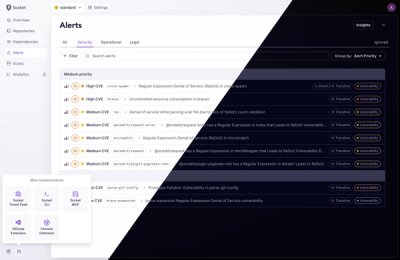
A Fresh Look for the Socket Dashboard
We’ve redesigned the Socket dashboard with simpler navigation, less visual clutter, and a cleaner UI that highlights what really matters.
By André Staltz, Jeppe Hasseriis, Nolan Lawson - Jun 23, 2025
react-native-ui-lib
Advanced tools
[](https://stand-with-ukraine.pp.ua)


UI Toolset & Components Library for React Native


We are working on upgrading our UI Library to support the new React Native Architecture. Currently, we support React Native 0.73, and we plan to support React Native 0.77 next. While we don’t have a timeline yet, this is part of our roadmap.
Download our Expo demo app
(You will need the Expo App)
or open link in your devices
[expo ] exp://exp.host/@vn.chemgio/rnuilib?release-channel=default
See setup instructions here.
See breaking changes
please use react-native-ui-lib
please use react-native-ui-lib@^3.0.0
Load your foundations and presets (colors, typography, spacings, etc...)
// FoundationConfig.js

import {Colors, Typography, Spacings} from 'react-native-ui-lib';

Colors.loadColors({
  primaryColor: '#2364AA',
  secondaryColor: '#81C3D7',
  textColor: '##221D23',
  errorColor: '#E63B2E',
  successColor: '#ADC76F',
  warnColor: '##FF963C'
});

Typography.loadTypographies({
  heading: {fontSize: 36, fontWeight: '600'},
  subheading: {fontSize: 28, fontWeight: '500'},
  body: {fontSize: 18, fontWeight: '400'}
});

Spacings.loadSpacings({
  page: 20,
  card: 12,
  gridGutter: 16
});
Set default configurations to your components
// ComponentsConfig.js

import {ThemeManager} from 'react-native-ui-lib';

// with plain object
ThemeManager.setComponentTheme('Card', {
  borderRadius: 8
});

// with a dynamic function
ThemeManager.setComponentTheme('Button', (props, context) => {
  // 'square' is not an original Button prop, but a custom prop that can
  // be used to create different variations of buttons in your app
  if (props.square) {
    return {
      borderRadius: 0
    };
  }
});
Use it all together. Your configurations will be applied on uilib components so you can use them easily with modifiers.
// MyScreen.js

import React, {Component} from 'react';
import {View, Text, Card, Button} from 'react-native-ui-lib';

class MyScreen extends Component {
  render() {
    return (
      <View flex padding-page>
        <Text heading marginB-s4>
          My Screen
        </Text>
        <Card height={100} center padding-card marginB-s4>
          <Text body>This is an example card </Text>
        </Card>

        <Button label="Button" body bg-primaryColor square></Button>
      </View>
    );
  }
}
FAQs
[](https://stand-with-ukraine.pp.ua)
The npm package react-native-ui-lib receives a total of 15,694 weekly downloads. As such, react-native-ui-lib popularity was classified as popular.
We found that react-native-ui-lib demonstrated a healthy version release cadence and project activity because the last version was released less than a year ago. It has 6 open source maintainers collaborating on the project.
Did you know?

Socket for GitHub automatically highlights issues in each pull request and monitors the health of all your open source dependencies. Discover the contents of your packages and block harmful activity before you install or update your dependencies.
Product
We’ve redesigned the Socket dashboard with simpler navigation, less visual clutter, and a cleaner UI that highlights what really matters.

Industry Insights
Terry O’Daniel, Head of Security at Amplitude, shares insights on building high-impact security teams, aligning with engineering, and why AI gives defenders a fighting chance.

Security News
MCP spec updated with structured tool output, stronger OAuth 2.1 security, resource indicators, and protocol cleanups for safer, more reliable AI workflows.