Product
Introducing Enhanced Alert Actions and Triage Functionality
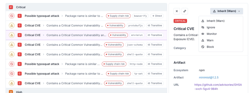
Socket now supports four distinct alert actions instead of the previous two, and alert triaging allows users to override the actions taken for all individual alerts.
react-native-vector-icons
Advanced tools
Package description
The react-native-vector-icons package provides a set of customizable icons for React Native applications. It includes a variety of icon sets and allows for easy integration and customization of icons in your app.
Basic Icon Usage
This feature allows you to use icons from various icon sets like FontAwesome. You can specify the icon name, size, and color.
import Icon from 'react-native-vector-icons/FontAwesome';
const MyComponent = () => (
<Icon name="rocket" size={30} color="#900" />
);Icon Button
You can use icons as buttons by wrapping them in a TouchableOpacity component. This makes the icon interactive.
import Icon from 'react-native-vector-icons/FontAwesome';
import { TouchableOpacity } from 'react-native';

const MyComponent = () => (
  <TouchableOpacity>
    <Icon name="rocket" size={30} color="#900" />
  </TouchableOpacity>
);
Custom Icon Fonts
This feature allows you to create custom icon sets from Fontello or other similar services. You can then use these custom icons in your app.
import { createIconSetFromFontello } from 'react-native-vector-icons';
import fontelloConfig from './config.json';

const Icon = createIconSetFromFontello(fontelloConfig);

const MyComponent = () => (
  <Icon name="custom-icon" size={30} color="#900" />
);react-native-elements is a UI toolkit for React Native that includes a set of customizable components, including icons. It uses react-native-vector-icons under the hood but provides a more comprehensive set of UI components.
react-native-paper is a library that provides Material Design components for React Native. It includes an IconButton component that allows you to use icons from various icon sets, similar to react-native-vector-icons.
expo/vector-icons is a package provided by Expo that includes a set of customizable icons. It is similar to react-native-vector-icons but is specifically designed to work seamlessly with Expo projects.
Readme
Choose from 3000+ icons or use your own.
Perfect for buttons, logos and nav/tab bars. Easy to extend, style and integrate into your project.
react-native-iconsTabBarIOS.Icon component to create buttons.NavigatorIOS).width and height styles.$ npm install react-native-vector-icons --save
If you want to use any of the bundled icons, you need to add the icon fonts to your XCode project. Just follow these steps:
node_modules/react-native-vector-icons and select the folder Fonts (or just the ones you want). Make sure your app is checked under "Add to targets" and that "Create groups" is checked if you add the whole folder.Info.plist and add a property called Fonts provided by application (if you haven't added one already) and type in the files you just added. It will look something like this:
Note: you need to recompile your project after adding new fonts, also ensure that they also appear under Copy Bundle Resources in Build Phases.
If you want to use the TabBar integration, then you need to add RNVectorIcons.xcodeproj to Libraries and add libRNVectorIcons.a to Link Binary With Libraries under Build Phases. More info and screenshots about how to do this is available in the React Native documentation.
Note: Android support requires React Native 0.12 or later
Copy the whole Fonts folder to android/app/src/main/assets.
Edit android/settings.gradle to look like this:
rootProject.name = 'MyApp'

include ':app'

//Add the following two lines:
include ':react-native-vector-icons'
project(':react-native-vector-icons').projectDir = new File(rootProject.projectDir, '../node_modules/react-native-vector-icons/android')
Edit android/app/build.gradle (note: app folder) to look like this:
apply plugin: 'com.android.application'

android {
  compileSdkVersion 23
  buildToolsVersion "23.0.1"

  defaultConfig {
    applicationId "com.myapp"
    minSdkVersion 16
    targetSdkVersion 22
    versionCode 1
    versionName "1.0"
    ndk {
      abiFilters "armeabi-v7a", "x86"
    }
  }
  buildTypes {
    release {
      minifyEnabled false
      proguardFiles getDefaultProguardFile('proguard-android.txt'), 'proguard-rules.pro'
    }
  }
}

dependencies {
  compile fileTree(dir: 'libs', include: ['*.jar'])
  compile 'com.android.support:appcompat-v7:23.0.0'
  compile 'com.facebook.react:react-native:0.12.+'

  // Add this line:
  compile project(':react-native-vector-icons')
}
Edit your MainActivity.java (deep in android/app/src/main/java/...) to look like this:
package com.myapp;

// Add this line:
import com.oblador.vectoricons.VectorIconsPackage;

import android.app.Activity;
....

public class MainActivity extends Activity implements DefaultHardwareBackBtnHandler {

  private ReactInstanceManager mReactInstanceManager;
  private ReactRootView mReactRootView;

  @Override
  protected void onCreate(Bundle savedInstanceState) {
    super.onCreate(savedInstanceState);
    mReactRootView = new ReactRootView(this);

    mReactInstanceManager = ReactInstanceManager.builder()
      .setApplication(getApplication())
      .setBundleAssetName("index.android.bundle")
      .setJSMainModuleName("index.android")
      .addPackage(new MainReactPackage())

      // and this line:
      .addPackage(new VectorIconsPackage())

      .setUseDeveloperSupport(BuildConfig.DEBUG)
      .setInitialLifecycleState(LifecycleState.RESUMED)
      .build();

    mReactRootView.startReactApplication(mReactInstanceManager, "MyApp", null);

    setContentView(mReactRootView);
  }
  ...
}
You can either use one of the bundled icons or roll your own custom font. Currently available options for bundled icon sets are:
Entypo by Daniel Bruce (411 icons)EvilIcons by Alexander Madyankin & Roman Shamin (v1.7.6, 68 icons)FontAwesome by Dave Gandy (v4.4, 585 icons)Foundation by ZURB, Inc. (v3.0, 283 icons)Ionicons by Ben Sperry (v2.0.1, 733 icons)MaterialIcons by Google, Inc. (v2.0, 796 icons)Octicons by Github, Inc. (v2.4.1, 178 icons)Zocial by Sam Collins (v1.0, 100 icons)var Icon = require('react-native-vector-icons/FontAwesome');
var myIcon = (<Icon name="rocket" size={30} color="#900" style={styles.icon} />)
Either use the size attribute or a style with fontSize, defaults to 12. Sets the height of the icon, width depends on the icon aspect ratio, but will most likely be the same.
Either use the color attribute or a style with color, defaults to black.
Most style properties will work as expected, you might find it useful to play around with these:
backgroundColorborderWidthborderColorborderRadiuspaddingmargincolorfontSizeflexDirectionjustifyContentalignItemsBy combining some of these you can create for example:


It's possible to nest the icons, any child content will appear after the icon, see the button example below.
Convenient way to plug this in into other components that rely on bitmap images rather than scalable vector icons. Takes the arguments name, size and color as described above.
Icon.getImageSource('user', 20, 'red').then((source) => this.setState({ userIcon: source }));
For a complete example check out the TabBarExample project.
Simply use Icon.TabBarItem instead of TabBarIOS.Item. This is an extended component that works exactly the same but with three additional properties:
iconName name of the default icon (similar to TabBarIOS.Item icon).selectedIconName name of the default icon (similar to TabBarIOS.Item selectedIcon). Optional.iconSize size of the icon, defaults to 30. Optional.For example usage see Examples/TabBarExample or the examples section below. Don't forget to import and link to this project as described above if you are going to use the TabBar integration.
Use Icon.getImageSource to get an image source object and pass it as you would with backButtonIcon, leftButtonIcon or rightButtonIcon.
Note: Since NavigatorIOS doesn't rerender with new state and the async nature of getImageSource you must not use it with initialRoute until the icon is rendered, but any view added by push should be fine. Easiest way is to simple add an if statment at the beginning of you render method like this:
  render: function() {
    if(!this.state.myIcon) {
      return false;
    }
    return (<NavigatorIOS ... />);
  }
Development belongs to open-source community - not used by the React Native team on their apps. A result of this is that there is currently a backlog of unresolved bugs, nobody who uses this has stepped up to take ownership for it yet.
You are probably better off with Navigator.NavigationBar or react-native-navbar.
createIconSet(glyphMap, fontFamily[, fontFile])Returns your own custom font based on the glyphMap where the key is the icon name and the value is either a UTF-8 character or it's character code. fontFamily is the name of the font NOT the filename. Open the font in Font Book.app or similar to learn the name. Optionally pass the third fontFile argument for android support, it should be a path to the font file in you asset folder.
var { createIconSet } = require('react-native-vector-icons');
var glyphMap = { 'icon-name': 1234, test: '∆' };
var Icon = createIconSet(glyphMap, 'FontName');
createIconSetFromFontello(config[, fontFamily[, fontFile]])Convenience method to create a custom font based on a fontello config file. Don't forget to import the font as described above and drop the config.json somewhere convenient in your project.
var { createIconSetFromFontello } = require('react-native-vector-icons');
var fontelloConfig = require('./config.json');
var Icon = createIconSetFromFontello(fontelloConfig);
Try the IconExplorer project in Examples/IconExplorer folder, there you can also search for any icon.

var React = require('react-native');
var Icon = require('react-native-vector-icons/Ionicons');

var ExampleView = React.createClass({
  render: function() {
    return <Icon name="person" size={30} color="#4F8EF7" />;
  }
};
Full example in TabBarExample project in Examples/TabBarExample folder.
var React = require('react-native');
var {
  View,
  Text,
  TabBarIOS,
} = React;
var Icon = require('react-native-vector-icons/Ionicons');

var TabBarView = React.createClass({
  render: function() {
    return (
      <TabBarIOS>
        <Icon.TabBarItem
          title="Home"
          iconName="ios-home-outline"
          selectedIconName="ios-home"
          }}>
          <View style={styles.tabContent}><Text>Home Tab</Text></View>
        </Icon.TabBarItem>
      </TabBarIOS>
    );
  }
};
By nesting a <Text> element and assigning padding and background color you can achieve a button like appearance. To register taps, just wrap it with a Touchable* component.

var Icon = require('react-native-vector-icons/FontAwesome')

var styles = StyleSheet.create({
  icon: {
    fontSize: 20,
    color: 'white',
    paddingVertical: 5,
    paddingHorizontal: 8,
    borderRadius: 4,
    backgroundColor: '#3b5998',
  },
  text: {
    marginLeft: 10,
    color: 'white',
    fontWeight: '600',
  },
});
var button = (
  <Icon name="facebook" style={styles.icon}>
    <Text style={styles.text}>Login with Facebook</Text>
  </Icon>
);
If you already have a icon font with associated CSS file then you can easily generate a icon set with the generate-icon script.
./node_modules/.bin/generate-icon path/to/styles.css --componentName=MyIcon --fontFamily=myicon > Components/MyIcon.js
Any flags not listed below, like --componentName and --fontFamily, will be passed on to the template.
-p, --prefixCSS selector prefix [default: ".icon-"]
-t, --templateTemplate in lodash format [default: "./template/iconSet.tpl"]
For default template please provide --componentName and --fontFamily.
-o, --outputSave output to file, defaults to STDOUT
This project is licenced under the MIT License.
Any bundled fonts are copyright to their respective authors and mostly under MIT or SIL OFL.
FAQs
Customizable Icons for React Native with support for NavBar/TabBar, image source and full styling.
The npm package react-native-vector-icons receives a total of 446,509 weekly downloads. As such, react-native-vector-icons popularity was classified as popular.
We found that react-native-vector-icons demonstrated a healthy version release cadence and project activity because the last version was released less than a year ago. It has 1 open source maintainer collaborating on the project.
Did you know?

Socket for GitHub automatically highlights issues in each pull request and monitors the health of all your open source dependencies. Discover the contents of your packages and block harmful activity before you install or update your dependencies.

Product
Socket now supports four distinct alert actions instead of the previous two, and alert triaging allows users to override the actions taken for all individual alerts.

Security News
Polyfill.io has been serving malware for months via its CDN, after the project's open source maintainer sold the service to a company based in China.

Security News
OpenSSF is warning open source maintainers to stay vigilant against reputation farming on GitHub, where users artificially inflate their status by manipulating interactions on closed issues and PRs.